If you have been reading my blog for a while, you know how much I love Houston interior designers - they are the ones who inspired me all those years ago and still do today. They are ones who make me feel so insecure, but at the same time, give me the confidence to design. They are the ones who introduced me to English Country House design and then led me back toward French design. Somewhere along the way we added Belgian Luxe and Swedish into the mix. You know their names – they know their names. I’m sure they are sick of me constantly talking about them and showing their work, but I can’t help it. Their aesthetics are the basis of this blog and it would be hard to separate the two.
One designer, Carol Glasser, has been particularly discussed here – so much so – that I’m embarrassed to even say her name. Behind the scenes, she has been SO gracious to me – I can’t tell you how nice she is – how nice ALL the Houston designers are. Truly, truly, a nice bunch of very talented ladies. So indulge me Carol, one more time, but I’m sure you knew it was going to happen.
Carol’s newest house is for sale. There have been rumors of private showings but the house has never been on HAR before now, that is. And – WHAT A TREAT!!!! We finally get to go upstairs of her gorgeous ivy covered Georgian house – we can see the exteriors too – and WOW! The outside is serenely beautiful and the upstair bedrooms, well, there are a few surprises!!! Yes!! I adore surprises!!!
I loved and still love her former house – a much smaller one – I once called it One Perfect House. And it was. But honestly – this newer one is even more perfect. The kitchen is better, that’s for sure, and so is the keeping room. And there are so many more rooms to love. The dining room is also definitely better – there wasn’t really one before!!
The house was built in 1956 and it has 5-6 bedrooms and 4 1/2 baths in 7,231 sq. ft. Listing price is $7,695,000.
Some of the rooms you will be familiar with, but some are totally new that you have never seen before. So – as a special treat this weekend, while you are off spending some quiet time away on your own – enjoy this. I know I did.
And Carol, thank you again, as always!!!!!!
Drinking Game Word: Perfection
Get out a glass a wine and take a sip each time I write Perfection. Just don’t drink and drive though. OK, got your wine ready?
The first outside view of the house. The original part of the house is shown here, covered in ivy. The house was added on to at the back and then another building was added at the side of the garage, which is seen on the right. I love how Carol grew the ivy on the house. The landscaping is basically all box and ivy. The dining room is seen to the right and the living room is on the left of the front door.
The house is located on the most prestigious street in Houston, the grand boulevard River Oaks. It’s off the street down a small cul de sac which makes it a bit more private. Here is the side view. Apparently, the back yard is at the side, since the house was added on to at the back of the original house.
And, an even larger view of the side yard. At the very back, you can see the newer building – where the media room (in white slips with blue striped shades) is located and a bedroom is above it. The garage is on the other side of the addition. The stair hall is where the three French doors are. The blue study is to the left of the stair hall. The living room is to the right of the French doors.
The house looks so grand from this elevation. I had so idea how beautiful the property was! OK OK – I’ve driven by and snooped, of course! But you can’t see this part of the house, only the very front from the cul de sac. Of course I’ve snooped!!
Actually – the property looks very Belgian to me. It looks like a country estate in Belgium, not Houston.
Ready to go inside?
Now this is interesting because for some photoshoots, Carol has changed the furniture around a bit. I love the Swedish antique bench on the side – I’d never seen that before and I LOVE the console, mirror and Santos on top. The colors in the front of the house are apricot, persimmon, yellow and aqua. Notice how the rug brings in all the colors.
A close up of the beautiful console.
The view into the living room.
For this photoshoot, Carol moved the settee from the stairhall. It looks good, but I prefer the way it really is set up.
The gorgeous living room! I love, love, love this! The apricot velvet sofa, the blue linen stripes, the checks – and the floral curtains. Talk about a study in fabrics. And those antique Swedish chests against the wall – those lamps – all to die from!!!! Perfection!!!
From a magazine shoot, a little tighter view.
Close up of the mantel and gorgeous mirror.
Her accessories are very spare, but each piece is fabulous.
Notice this beautiful painted chair with gilt accents.
And the surprise against the front wall – this armless antique sofa with a print fabric and pillows made of antique textiles. Beyond fabulous. Incredible. Hashtag: #don’tsayhoustonisonlywhitelinen
And across from the living room at front is the dining room all in aqua. Love the shades and checks.
I love the row of candles – so simple!
From the magazine shoot – you can just see the china cabinet in the mirror.
An early shot of the two engravings over the buffet, I love these, maybe even more than the mirror. And I just realized, these chandeliers were once in Pam Pierce’s house. OK, OK, I can’t help it. I didn’t go looking for that information!
Close up of the linen fabrics and the twin mirrors and demilunes.
The Swedish demi lune and oriental pottery.
Through the entry hall is the grand stair hall – two stories high. The oushak repeats the colors found throughout the house. A Swedish demilune table sits in the middle of the room. The kitchen and dining room are accessed through this door on the right.
A new view – never seen before – shows the putti on the upper floor. I had wondered where those went to!!! The master bedroom is through the open door upstairs.
From another photoshoot – showing the study through the open door.
And here is where the settee usually sits – in the stair hall!
The study/library as seen in HAR. Wow! The walls are painted aqua and the furniture is deep apricot. I love the long desk. And the faded rug!
The view from the stair hall into the study.
Anther view shows floral curtains. Love the antique tufted chairs, the mirror, the accessories. It’s all just perfection!
The kitchen and keeping room is located on the other side of the stairway room past the dining room. These rooms overlook the driveway side of the house. And in this brand new picture, we see the right side of the room, finally – the shelf filled with antique wicker covered bottles and baskets. I would guess the large beam is where the original house ended at one time? Is this kitchen in Houston or the Cotswolds'? It is, of course, PERECTION!! Mostly in aqua, the one fabric seen throughout is a Bennison print. Notice the old doors she installed along the right side of the room.
And looking the other direction towards the keeping room. You can see the old brick floor here.
From the magazine, the keeping room.
A close up of the keeping room with the Bennison fabric covered furniture.
Another view of the keeping room.
A different photoshoot – wonderful console and beautiful lamps.
So pretty. I love the kitchen chairs.
Close up of Carol’s styling. Perfection!
Close up of the range hood. Through the doorway on the right, you can see into the dining room.
The china cabinet. Notice the stair hall is accessed through this doorway.
Upstairs the main house is this master bedroom with the sitting area and fireplace. Done in green and cream – the ceiling is pitched with a beautiful chandelier. This room is located at the back side of the house.
Another view – in a different photoshoot.
Close up of the sofa and curtain fabric mixed with checks.
These two French chairs came from the last house’s living room. Love the mantel!
View of the bed and the French bench.
A view of the French armoire in aqua peeling paint. The stairhall is through the open door.
One of the master bathrooms with a marble tub and wonderful French day bed.
Another view of the bathtub with its tiny chandelier.
There are old shutters instead of doors here.
And the marble shower in another bathroom with heated towel racks.
And for a total surprise – all new bedrooms never seen before! I love this one! And look at the fabric! The Bowood linen which covers the chair and the French headboard!! Love the French armoire. Well, what can I say? Perfection!!!!
And this bedroom – so perfect in lilac and white with French iron beds and a wonderful desk along with a Swedish gray secretary. Wow!!! Love, love, love!!!
Now, we will go to the back part of the house that is connected to the main house through the keeping room.
Between the two areas is this wistera covered pergola. Carol has set up an outside eating area here - perfect for late night drinks and cigars – if you smoke. To the left is the study and to the right is the large media room.
And in the newer section – the large media room, done in all white slipcovers and denim pillows with striped blinds. I remember my first glimpse of the new home was a picture of this room and I was so surprised! I thought Carol had gone all white. Knowing how colorful her house is, this is really funny to think of today.
Another photoshoot of the media room – notice how it opens to the poolside.
A close up of Carol’s wonderful styling – confit pots filled with white roses, a must, along with antique Santos.
And in another new photograph – the covered porch off the media room – overlooks the side yard and swimming pool. Looks like a Belgian house from this view!
And! Surprise! What a shock!! Another new photograph of the suite above the media room in the newer section of the house. The room is furnished in the Bennison Roses fabric that once filled Carol’s master bedroom in her former house. I was so surprised – I hadn’t realized she saved all this fabric, but why not? It is made to last a lifetime and more and you can see how wonderful it looks here. Perfection!!
And off the Bennison bedroom is this balcony, which overlooks the yard.
I hope you have enjoyed this final look at Carol Glasser’s Houston house! I know she lives part time in Santa Barbara, so I’m sure this home is just a bit too big now.
The most exciting thing? Where will she be going next? I only hope I’m still here blogging away when her new place is published!!!! Hurry Carol!
A huge thank you to Carol Glasser. She can be reached HERE.
For more information on purchasing this house, go HERE.
For Long Time Readers–A Special Treat!
Ideas From A Talented Interior Designer
I am obsessed with before and after pictures where small, dated and unattractive beach condominiums are turned into chic, beautiful vacation spots. For years Ben and I rented the ugliest condos at the beach and the entire time we were there I would think of what I would do to update it if we owned it. I would try to make our rentals more attractive for our stay – I would pack loose slipcovers and bright, trendy pillows. As soon as we arrived – I would go around the condo and put all the accessories and tacky wall hangings in a back closet. A few years ago, I wrote a story about my feeble attempts at making a rental unit look more homey. HERE.
This is the reason why when I spotted a blog story about a vacation condo makeover I was completely obsessed! The condo was similar in size and style to what Ben and I rent at the beach – but, the After photographs were incredible. I loved what the designer did and when I looked at her portfolio, I found that I loved her aesthetic. I was in awe of her abilities to completely update her condo – and to be honest, I was a little jealous too! I saw her choices and knew I would probably have never thought to do what she had done.
At the time I asked her if I could feature her condo and we decided to wait until her new web site went online, etc, etc. Cut to some time later – and here we finally are! A new website to go along with this story about Jennifer Schoenberger of Jennifer Schoenberger Design. Jennifer lives outside of Atlanta, Georgia and she writes the charming blog – Vreeland Road HERE.
Today, I am so excited to show her condo along with some of her own home!
Enjoy!
BEACH HOUSE
First, let’s look at the beach condo in Florida that caught my attention a few years ago. At first, Jennifer kept the identity of the client a secret, but later, she admitted that she and her husband actually owned it themselves. It is a small, one bedroom unit, with bunk beds that provide additional sleeping arrangements.
The unit came with an ocean view – and was a great price – which made it all the more attractive. The problem of one bedroom was solved with the bunk beds, and so Jennifer embarked on the total redo.
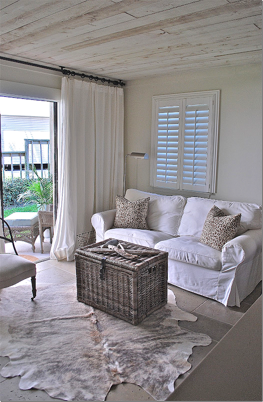
She made two design decisions that became the focal point of the unit and really turned the ugly into chic. First, on the floors she laid Peacock Pavers stone flooring – it’s a creamy tile that is beach friendly and beautiful. Next, she put rough hewn cedar planks on the ceiling, replacing the popcorn that was previously there. The ceilings are stunning. They look like driftwood and are a perfect choice for the beach – plus they add so much atmosphere and décor. They are just fabulous.
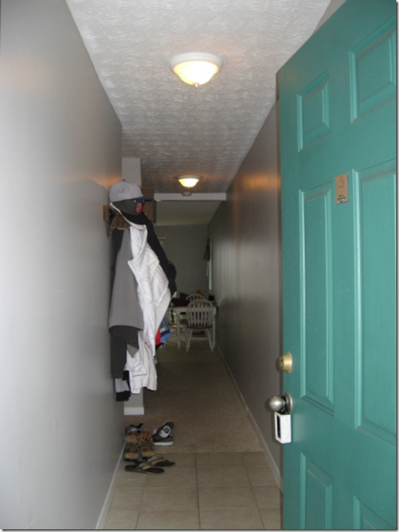
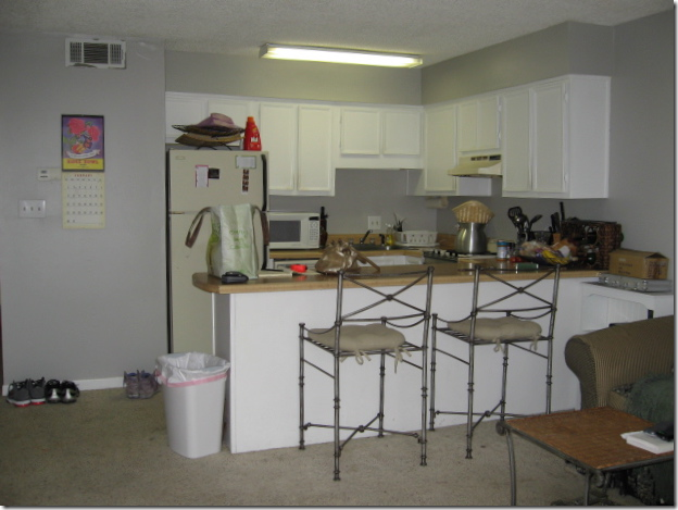
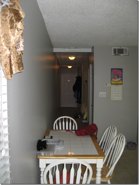
BEFORE: When you enter the unit, you go down a long hall – the bunks are on the left, past the hanging jackets. At the end of the hall is the living room/kitchen. Notice the dingy, once-was-white carpet past the tiled foyer and the popcorn ceiling. Now, look at this same space today:
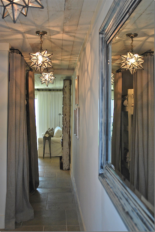
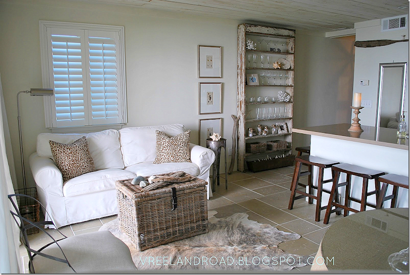
Wow. The star lanterns make a huge statement – available HERE. Notice the pavers – how they flow from the hall to the living area. At the left are the bunk beds – hiding behind a linen curtain (from Ikea!) unlined and breezy. She repainted the black mirror on the right to look more beachy. And – notice the planked ceiling! What a huge difference!!! I love the row of lanterns and the shadows they make are so lively in this enclosed space - another great choice Jennifer made.
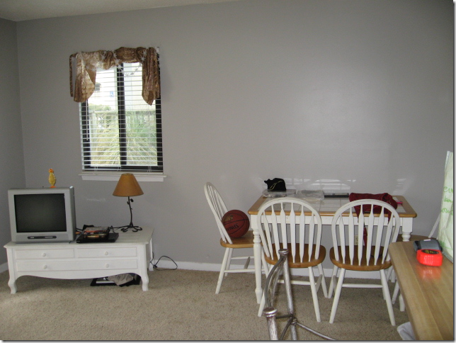
Here is the living/dining area.
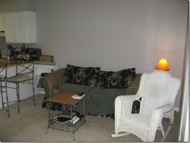
The other side of the room.
And a before picture of the kitchen, which was completely gutted.
This is the view looking down the hall to the front door – the bunks are on the right.
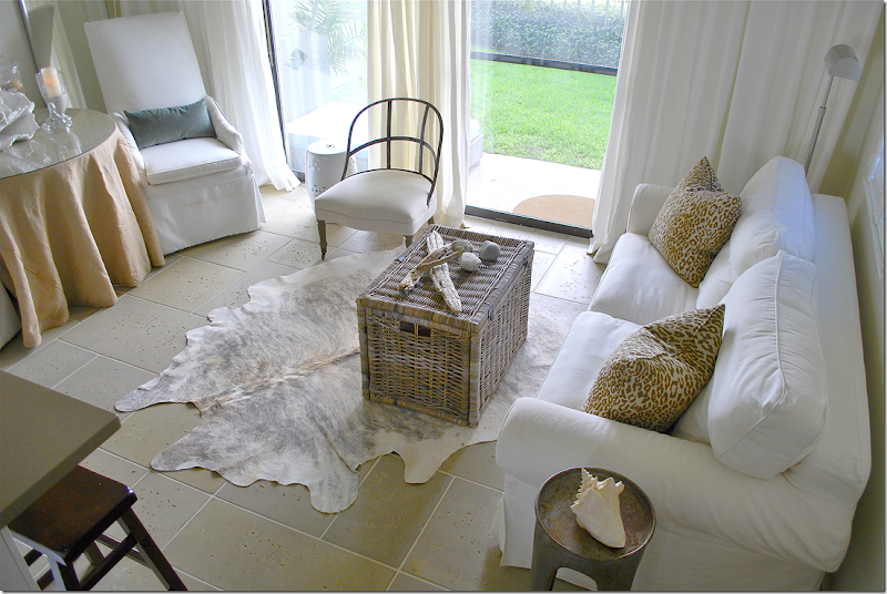
And after: Jennifer used a white slipcover sofa along one wall with a skirted table and two taller slipped chairs along the other side wall. The Kubu basket doubles as a coffee table and adds a beachy vibe. After splurging on the basics – the tiled floor and cedar ceiling, she was thrifty with the décor, though it doesn’t show. The sofa, hide rug, baskets and curtains all came from Ikea!! Doesn’t it look wonderful? The two chairs are from Lee Industries while the burlap skirted table is from Ballard Designs. The custom pillows in a cheetah print and velvet add just a touch of luxe.
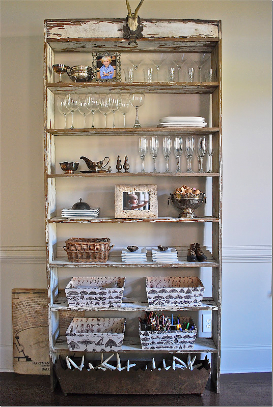
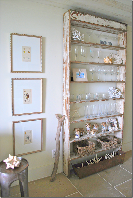
Another view – this shows the antique piece that divides the living room from the hall. It’s a wonderful piece. And like I always say – one antique piece of furniture in a room is so important to the décor. The shelf adds so much and it makes all the other furniture look that much nicer – it is a stunner.
The chippy shelf has just enough paint left on it – it looks like a piece of driftwood. The shelf is very functional and holds the Ikea glasses and plates.
An earlier view – with different styling. I love the wood stick next to it and the shell prints.
This picture gives you a nice view of the planked ceilings. Aren’t the Ikea curtains perfect??
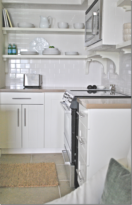
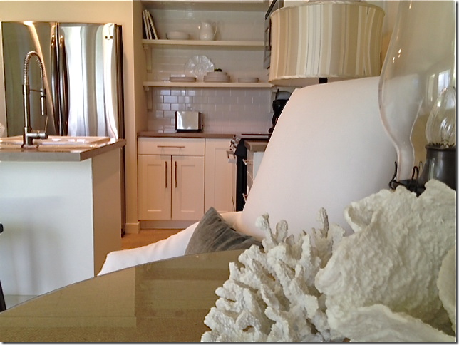
And here’s a look at the kitchen. The footprint remained basically the same – but it was completely gutted. The wall that separated the two areas was removed – instead there is an island that allows traffic to move easier. And the island is much more open than the bar wall that was there before. Upper cabinets were removed and the refrigerator was given a built in look.
The subway tile was continued up the wall for a more finished look. Something to remember: run backsplashes up as high as you can. Again – it really is a great look.
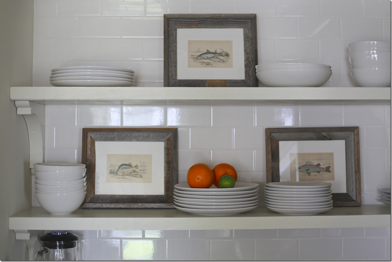
A look at the more recent styling job. Jennifer added fish prints to break up the expanse of white.
And here- you can see how she enclosed the refrigerator in the cabinetry, giving it the look of a built in. I did this in my kitchen too – it’s much cheaper than buying a Sub-Zero!
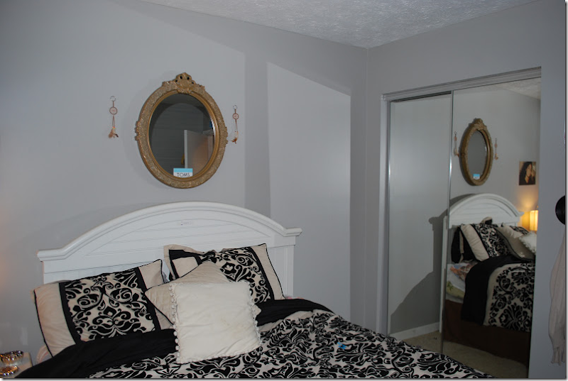
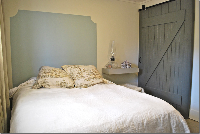
Before: the bedroom had a wall of sliding glass doors.
And after – Jennifer installed a rolling barn door with a z-motif. This opens up the closet – makes it much easier to get inside it. She painted on a headboard and installed a shelf, instead of a nightstand. Along the window are floor to ceiling linen curtains.
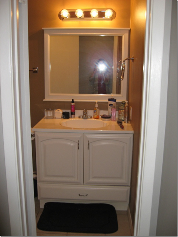
Before: The bathroom was also gutted – she added a shower door and new sink.
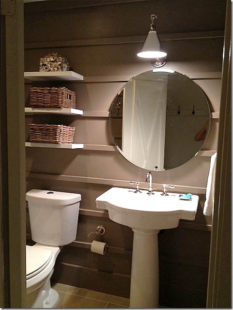
The bathroom today - Jennifer painted it dark to make it more dramatic and added molding strips along the walls. a simple vanity sink was added, along with a new pendant light and hanging shelves.
And, on the door – she added molding strips – in an X shape.
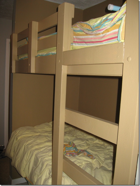
Here is a look at the bunk beds, before.
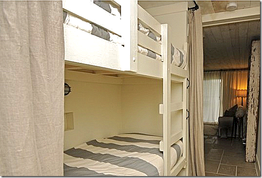
And today - behind the Ikea linen curtains, she added a light at each bunk and West Elm sheets, along with a new paint job.
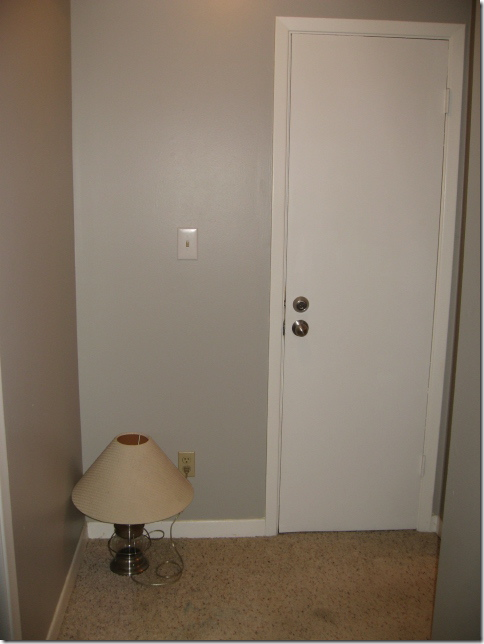
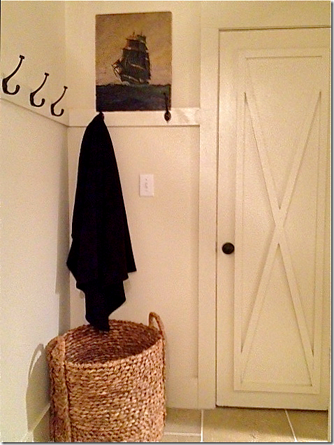
This before and after says it all. The laundry room door, at the end of the hall, was truly nothing to look at.
But with paint and the x molding on the door, along with a strip of molding with hooks on it – and a large wicker basket, the space is styled for a magazine. The X on all the doors was created by using 1 x 2 trim molding.
It is all these touches – like the x motif, the wood planked ceiling, the redesigned kitchen, the barn door on the closet – that really shows Jennifer’s abilities.
By the way – if you would like to rent this condo – in Seagrove Beach, Florida, go HERE for more information.
Jennifer’s House
After living in their house for 10 years, Jennifer and her husband are moving to a new place! Renovating and styling a new house will provide lots of material for her blog (lucky!!) and I can’t wait to see what she does with her new home. She sent me some pictures of the house they are selling – and again, these pictures show off her great style.
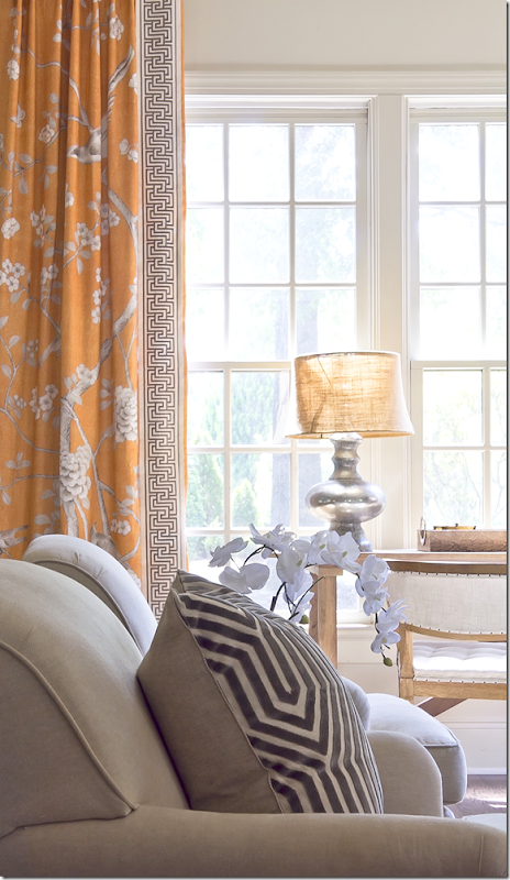
In the family room, the curtains and trim are by Mary McDonald’s fabric line for F. Schumacher. Love!!! Also, the pillow is another McDonald fabric.
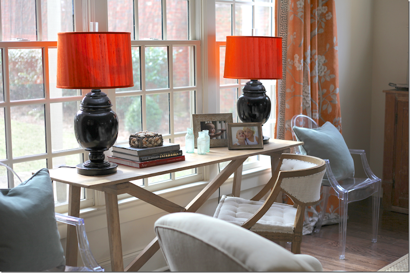
Against the large window, light blue pillows against the deep apricot of the fabric.
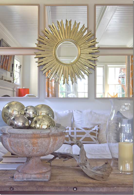
The couch sits under a mass of mirrors with a sunburst mirror layered over them. Another great idea for filling up a large expanse of wall.
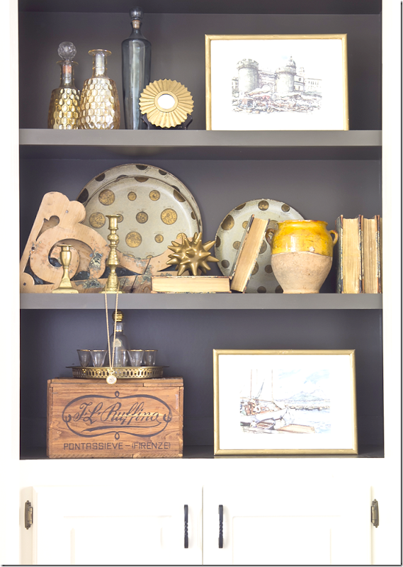
An example of Jennifer’s styling. She painted the shelves dark which shows off her accessories much better than plain white walls.
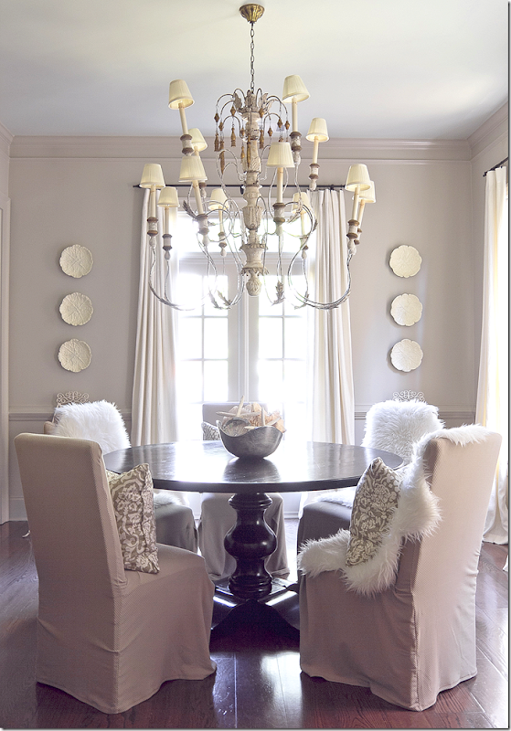
The dining room is a study in gray. An oversized fixture is the focal point.
Jennifer and I share a love of symmetry. I feel better when a design is symmetrically balanced.
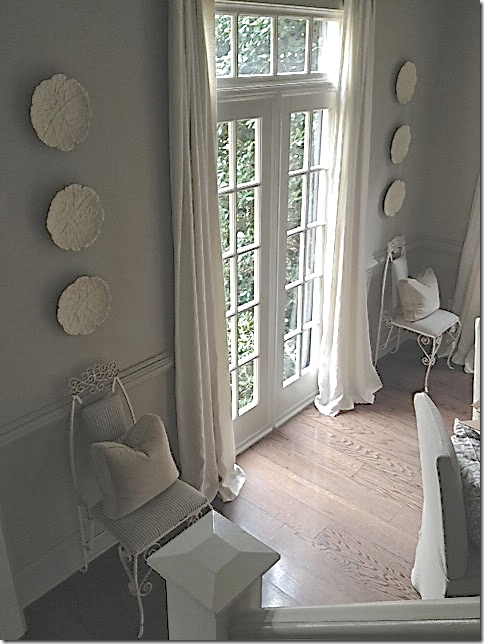
Flanking the front window is a pair of French vintage chairs. I love this touch of fun!
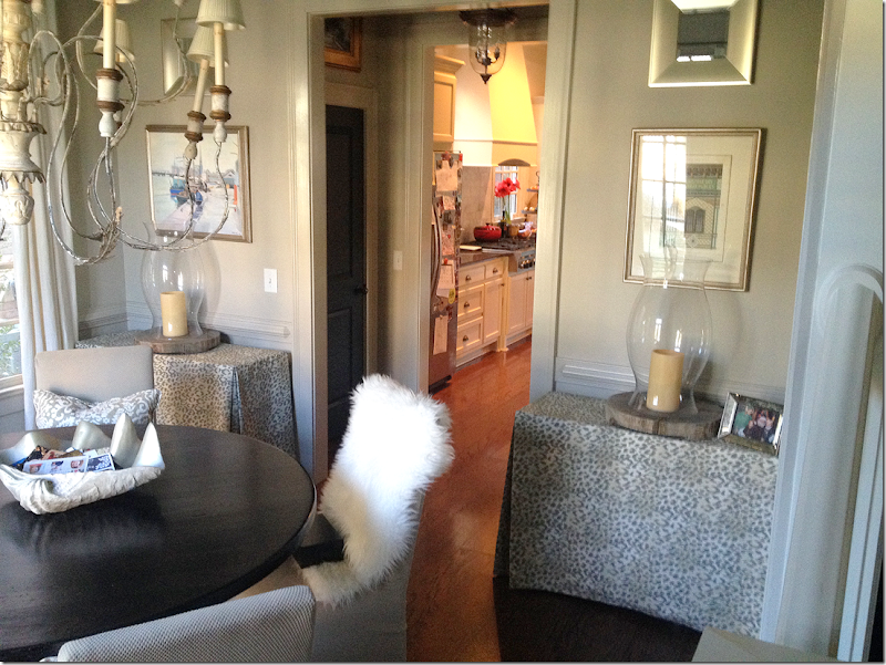
And flanking the door that leads to the kitchen are a pair of skirted rectangular tables.
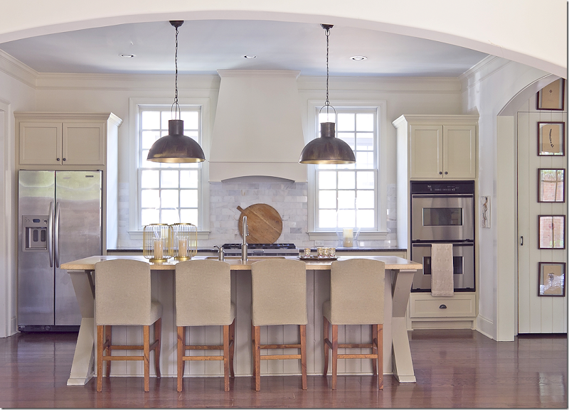
Jennifer’s kitchen is stunning. Again – a study in symmetry. I love the way the windows flank the stove hood and the appliances are on either side of them. The pendants are perfectly placed in front of each picture. The kitchen opens to the family room through an enlarged arch.
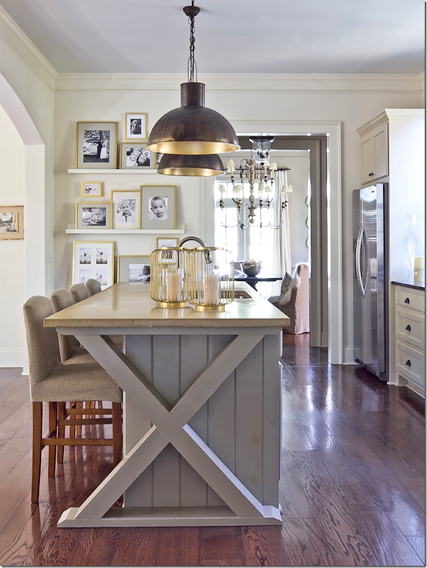
And, at the end of the island is Jennifer’s favorite X motif! Love it!!
Jennifer had beadboard installed in small hallways to add interest.
The Keeping Room has a large banquette that sits in front of the window. A wall of sheer curtains is on the left.
In front of the banquette is two chairs that sit by the fireplace.
And, a night view of the keeping room – looking towards the back French door.
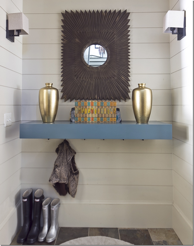
Jennifer recently updated the mud room, making it a bit more contemporary with new sconces and a hanging shelf.
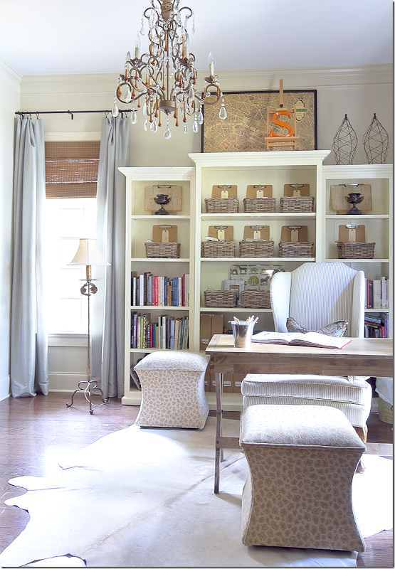
Jennifer’s office – I love the two stools instead of chairs. And the crystal chandelier is a good juxtaposition to all the rough luxe.
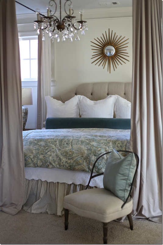
In Jennifer’s bedroom – she added a canopy by attaching hardware to the ceiling. This is a simple way to get a canopy bed and such a great idea.
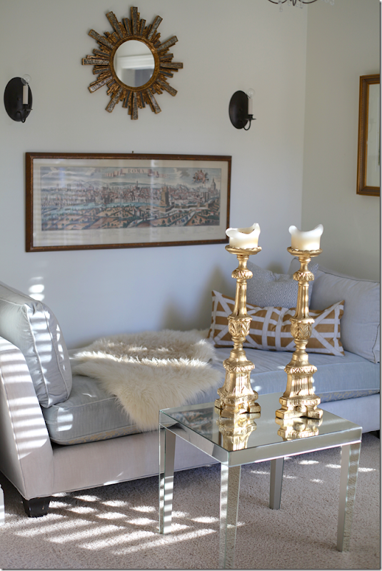
And the sitting area in her bedroom with symmetrical wall hangings.
Finally, her bathroom with a set of Ikea framed prints and a linen curtain. Love the light over the mirror.
This photograph is from Jennifer’s portfolio. To see more of her work, be sure to visit her Web site – HERE. From there, you can access her blog.
A HUGE thank you to Jennifer Schoenberger for letting us peruse her portfolio. I hope you got a few ideas for your own house!! I know I did!

![image_thumb[1] image_thumb[1]](http://lh6.ggpht.com/-5ZoCQLGU43g/U1ItjP1LraI/AAAAAAACUV8/Yumo2oE9E7A/image_thumb%25255B1%25255D_thumb.png?imgmax=800)
![image_thumb[3] image_thumb[3]](http://lh4.ggpht.com/-tuRvW8U-Cr8/U1ItnINlhFI/AAAAAAACUWM/fj8gZRw4Zmg/image_thumb%25255B3%25255D_thumb.png?imgmax=800)
![image_thumb[5] image_thumb[5]](http://lh6.ggpht.com/-w-rXtvzeoVE/U1Itp69Q_GI/AAAAAAACUWc/MWf3x-guDGQ/image_thumb%25255B5%25255D_thumb.png?imgmax=800)
![image_thumb[7] image_thumb[7]](http://lh5.ggpht.com/-gSo6YBLwg24/U1IttMCOVwI/AAAAAAACUWs/c_H0RLTpgs8/image_thumb%25255B7%25255D_thumb.png?imgmax=800)
![image_thumb[60] image_thumb[60]](http://lh4.ggpht.com/-OKM0reVWWIw/U1Itv1hC0lI/AAAAAAACUW8/rznjvGxDC8s/image_thumb%25255B60%25255D_thumb.png?imgmax=800)
![image_thumb[58] image_thumb[58]](http://lh3.ggpht.com/-wBwNykX81Xc/U1ItzAXAzMI/AAAAAAACUXM/FTLhcSXhn6U/image_thumb%25255B58%25255D_thumb.png?imgmax=800)
![image_thumb[170] image_thumb[170]](http://lh6.ggpht.com/-86Q3naR7-pM/U1It2IiH19I/AAAAAAACUXc/AVxANLixx3o/image_thumb%25255B170%25255D_thumb.png?imgmax=800)
![image_thumb[18] image_thumb[18]](http://lh5.ggpht.com/-GVfrbZyc08E/U1It5SZBi2I/AAAAAAACUXs/tJJnB4AT8u0/image_thumb%25255B18%25255D_thumb.png?imgmax=800)
![image_thumb[177] image_thumb[177]](http://lh5.ggpht.com/-CZgxPrMVUZM/U1It85ELCbI/AAAAAAACUX8/Y8_eO9JylnI/image_thumb%25255B177%25255D_thumb.png?imgmax=800)
![image_thumb[179] image_thumb[179]](http://lh3.ggpht.com/-k84rbtBvut4/U1It_249G6I/AAAAAAACUYM/EX5Rs9vYDOQ/image_thumb%25255B179%25255D_thumb.png?imgmax=800)
![image_thumb[134] image_thumb[134]](http://lh4.ggpht.com/-qfazpU-qloA/U1IuDTewZzI/AAAAAAACUYc/V8xCCWdVUFM/image_thumb%25255B134%25255D_thumb.png?imgmax=800)
![image_thumb[65] image_thumb[65]](http://lh5.ggpht.com/-p0pAvFydoXo/U1IuGEIOMwI/AAAAAAACUYs/pixqaHqjq8I/image_thumb%25255B65%25255D_thumb.png?imgmax=800)
![image_thumb[67] image_thumb[67]](http://lh5.ggpht.com/-wNakYkH4H_Q/U1IuI_wb70I/AAAAAAACUY8/DrlPKyNATSg/image_thumb%25255B67%25255D_thumb.png?imgmax=800)
![image_thumb[36] image_thumb[36]](http://lh6.ggpht.com/-Ip-vs_lJ6nI/U1IuMKCjssI/AAAAAAACUZM/2ur54GtJMdM/image_thumb%25255B36%25255D_thumb.png?imgmax=800)
![image_thumb[181] image_thumb[181]](http://lh3.ggpht.com/-nEJB64Iwy4o/U1IuPaLPNwI/AAAAAAACUZc/U2ZueIpcFGE/image_thumb%25255B181%25255D_thumb.png?imgmax=800)
![image_thumb[183] image_thumb[183]](http://lh4.ggpht.com/-_hDmsQoSDnI/U1IuSy3u-NI/AAAAAAACUZs/ApHL0wxSsY0/image_thumb%25255B183%25255D_thumb.png?imgmax=800)
![image_thumb[55] image_thumb[55]](http://lh3.ggpht.com/-LT-WzjlY0iM/U1IuVawXm-I/AAAAAAACUZ8/3Ow1XkJAHMY/image_thumb%25255B55%25255D_thumb.png?imgmax=800)
![image_thumb[40] image_thumb[40]](http://lh6.ggpht.com/-_q4AjmWaauo/U1IuX12AYyI/AAAAAAACUaM/s01s-KbFLfw/image_thumb%25255B40%25255D_thumb.png?imgmax=800)
![image_thumb[94] image_thumb[94]](http://lh6.ggpht.com/-P9ntaUzLyZM/U1IuaTKOr1I/AAAAAAACUac/SyjF-oM4uUI/image_thumb%25255B94%25255D_thumb.png?imgmax=800)
![image_thumb[44] image_thumb[44]](http://lh4.ggpht.com/-95fztU6rCM8/U1IudDnxm9I/AAAAAAACUas/dba0BkkWF_o/image_thumb%25255B44%25255D_thumb.png?imgmax=800)
![image_thumb[45] image_thumb[45]](http://lh5.ggpht.com/--iUffGXwzOk/U1IugC2-bEI/AAAAAAACUa8/TtSA6L4t4Ww/image_thumb%25255B45%25255D_thumb.png?imgmax=800)
![image_thumb[173] image_thumb[173]](http://lh3.ggpht.com/-J32JHZWgrck/U1IujN7gTMI/AAAAAAACUbM/8QFzZYY8QSU/image_thumb%25255B173%25255D_thumb.png?imgmax=800)
![image_thumb[47] image_thumb[47]](http://lh4.ggpht.com/-ZBu0zzIfbl8/U1IulSUMeZI/AAAAAAACUbc/0dy3HIhNNuw/image_thumb%25255B47%25255D_thumb.png?imgmax=800)
![image_thumb[49] image_thumb[49]](http://lh3.ggpht.com/-DXTa9pkUcvw/U1IuolJifvI/AAAAAAACUbs/tc3OSNy6GUk/image_thumb%25255B49%25255D_thumb.png?imgmax=800)
![image_thumb[50] image_thumb[50]](http://lh4.ggpht.com/-Edzd1IbXXy0/U1IuqUTYQCI/AAAAAAACUb8/kW0ZXAYLVSk/image_thumb%25255B50%25255D_thumb.png?imgmax=800)
![image_thumb[69] image_thumb[69]](http://lh3.ggpht.com/-WqEQvul-Hzc/U1IutPNgP5I/AAAAAAACUcM/VgUKOJL2GEQ/image_thumb%25255B69%25255D_thumb.png?imgmax=800)
![image_thumb[53] image_thumb[53]](http://lh5.ggpht.com/-LgYe81bx4KQ/U1IuwRJtcFI/AAAAAAACUcc/HqPYg8B6dVw/image_thumb%25255B53%25255D_thumb.png?imgmax=800)
![image_thumb[86] image_thumb[86]](http://lh6.ggpht.com/-aCIFISg96Y4/U1Iu0rmVjDI/AAAAAAACUcs/QXkc9NL8t7E/image_thumb%25255B86%25255D_thumb.png?imgmax=800)
![image_thumb[184] image_thumb[184]](http://lh4.ggpht.com/-hAsv3ZrV_ZY/U1Iu4aSYGLI/AAAAAAACUc8/Y-ui0A8slVA/image_thumb%25255B184%25255D_thumb.png?imgmax=800)
![image_thumb[185] image_thumb[185]](http://lh5.ggpht.com/-HgRGUfFM9l0/U1Iu8Bhmi4I/AAAAAAACUdM/uVvCCU_DjWo/image_thumb%25255B185%25255D_thumb.png?imgmax=800)
![image_thumb[89] image_thumb[89]](http://lh3.ggpht.com/-KGzVlqRVBao/U1Iu-0Qp6qI/AAAAAAACUdc/jd-sHsY0PmU/image_thumb%25255B89%25255D_thumb.png?imgmax=800)
![image_thumb[187] image_thumb[187]](http://lh3.ggpht.com/-lDAo74cO4ok/U1IvCDmglUI/AAAAAAACUds/pLSihDrnV-M/image_thumb%25255B187%25255D_thumb.png?imgmax=800)
![image_thumb[189] image_thumb[189]](http://lh4.ggpht.com/-XONLOVdf6Qo/U1IvFxwaiII/AAAAAAACUd8/94EqMC3n-5s/image_thumb%25255B189%25255D_thumb.png?imgmax=800)
![image_thumb[191] image_thumb[191]](http://lh4.ggpht.com/-JB4FMZBzyQc/U1IvJCytgyI/AAAAAAACUeM/WteDmVKrS_s/image_thumb%25255B191%25255D_thumb.png?imgmax=800)
![image_thumb[156] image_thumb[156]](http://lh6.ggpht.com/-VqLvyHq3gig/U1IvNCjTRBI/AAAAAAACUec/562c646Vc3M/image_thumb%25255B156%25255D_thumb.png?imgmax=800)
![image_thumb[93] image_thumb[93]](http://lh5.ggpht.com/-p94BtmljmiU/U1IvPp9cxZI/AAAAAAACUes/QQSKCjfFWFs/image_thumb%25255B93%25255D_thumb.png?imgmax=800)
![image_thumb[102] image_thumb[102]](http://lh3.ggpht.com/-_UQ7qEYgUjI/U1IvS5UhRgI/AAAAAAACUe8/KLowCZZOA6k/image_thumb%25255B102%25255D_thumb.png?imgmax=800)
![image_thumb[193] image_thumb[193]](http://lh4.ggpht.com/-wyy0U2ngCMA/U1IvWJ-hhlI/AAAAAAACUfM/cBnc_Pj8AtM/image_thumb%25255B193%25255D_thumb.png?imgmax=800)
![image_thumb[195] image_thumb[195]](http://lh4.ggpht.com/-6EKiztcroT0/U1IvZk7zFpI/AAAAAAACUfc/DaHAe-mZFmA/image_thumb%25255B195%25255D_thumb.png?imgmax=800)
![image_thumb[197] image_thumb[197]](http://lh4.ggpht.com/-OfXDUNFXimw/U1IvdDZxclI/AAAAAAACUfs/-lvTD8BVJZY/image_thumb%25255B197%25255D_thumb.png?imgmax=800)
![image_thumb[104] image_thumb[104]](http://lh5.ggpht.com/-uorcO-crx6Q/U1Ivfmt8ijI/AAAAAAACUf8/UHcfCf2SbTo/image_thumb%25255B104%25255D_thumb.png?imgmax=800)
![image_thumb[106] image_thumb[106]](http://lh4.ggpht.com/-HRO0Hp5_ncY/U1Ivh94-0LI/AAAAAAACUgM/Boz-iwRXLoA/image_thumb%25255B106%25255D_thumb.png?imgmax=800)
![image_thumb[107] image_thumb[107]](http://lh4.ggpht.com/-lD2ZznMD2ko/U1Ivkso_5pI/AAAAAAACUgc/CBacm1lCYtM/image_thumb%25255B107%25255D_thumb.png?imgmax=800)
![image_thumb[175] image_thumb[175]](http://lh3.ggpht.com/-E0D6_yUFfVM/U1Ivn2Fd-tI/AAAAAAACUgs/2PTAYTDPbfY/image_thumb%25255B175%25255D_thumb%25255B2%25255D.png?imgmax=800)
![image_thumb[109] image_thumb[109]](http://lh4.ggpht.com/-2faBoBprxoA/U1Ivp4nGiaI/AAAAAAACUg8/yiP2zCHWpGw/image_thumb%25255B109%25255D_thumb.png?imgmax=800)
![image_thumb[110] image_thumb[110]](http://lh3.ggpht.com/-HpFDM5A9heY/U1IvtDvY_AI/AAAAAAACUhM/dNSg7T5YLD8/image_thumb%25255B110%25255D_thumb.png?imgmax=800)
![image_thumb[112] image_thumb[112]](http://lh4.ggpht.com/-2NE5MLFUwPA/U1IvwP4FtBI/AAAAAAACUhc/xgo-IIdjQ48/image_thumb%25255B112%25255D_thumb.png?imgmax=800)
![image_thumb[114] image_thumb[114]](http://lh3.ggpht.com/-NYrR8U0hqTg/U1Ivyxu9_9I/AAAAAAACUhs/3SUNmI6xpT8/image_thumb%25255B114%25255D_thumb.png?imgmax=800)
![image_thumb[116] image_thumb[116]](http://lh5.ggpht.com/-iGvkCmg8_io/U1Iv10bnyVI/AAAAAAACUh8/KJ1g7SEauiw/image_thumb%25255B116%25255D_thumb.png?imgmax=800)
![image_thumb[117] image_thumb[117]](http://lh4.ggpht.com/-_HipvJHuGoM/U1Iv5fTk6DI/AAAAAAACUiM/18sBgEiDsnA/image_thumb%25255B117%25255D_thumb.png?imgmax=800)
![image_thumb[121] image_thumb[121]](http://lh6.ggpht.com/-cE_yDh_RpLI/U1Iv8qT1klI/AAAAAAACUic/9Gcv-BT7QaA/image_thumb%25255B121%25255D_thumb.png?imgmax=800)
![image_thumb[160] image_thumb[160]](http://lh5.ggpht.com/-Gg-Ttv83FdQ/U1Iv_jPkeQI/AAAAAAACUis/n1pcYE7MrMk/image_thumb%25255B160%25255D_thumb.png?imgmax=800)
![image_thumb[158] image_thumb[158]](http://lh4.ggpht.com/-7u37_U5SVtU/U1IwDabQ7JI/AAAAAAACUi8/IwCt15BzMIw/image_thumb%25255B158%25255D_thumb.png?imgmax=800)
![image_thumb[122] image_thumb[122]](http://lh3.ggpht.com/-0vVJf_KGMWM/U1IwG5pVS2I/AAAAAAACUjM/OJxRcC82hPk/image_thumb%25255B122%25255D_thumb.png?imgmax=800)
![image_thumb[124] image_thumb[124]](http://lh5.ggpht.com/-HryLqP9VZQM/U1IwKC_WsHI/AAAAAAACUjc/8hdchDD-ANY/image_thumb%25255B124%25255D_thumb.png?imgmax=800)
![image_thumb[125] image_thumb[125]](http://lh6.ggpht.com/-Xl7756hcLYw/U1IwNZvWW0I/AAAAAAACUjs/JrM-DwbSCZU/image_thumb%25255B125%25255D_thumb.png?imgmax=800)
![image_thumb[127] image_thumb[127]](http://lh5.ggpht.com/-45qUnt_3RYo/U1IwQc_JcXI/AAAAAAACUj8/shM9JMQ3pfE/image_thumb%25255B127%25255D_thumb.png?imgmax=800)
