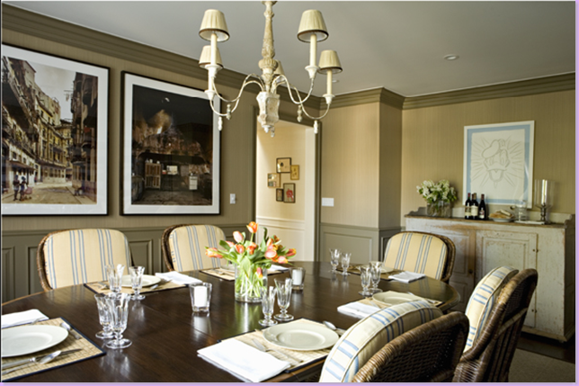
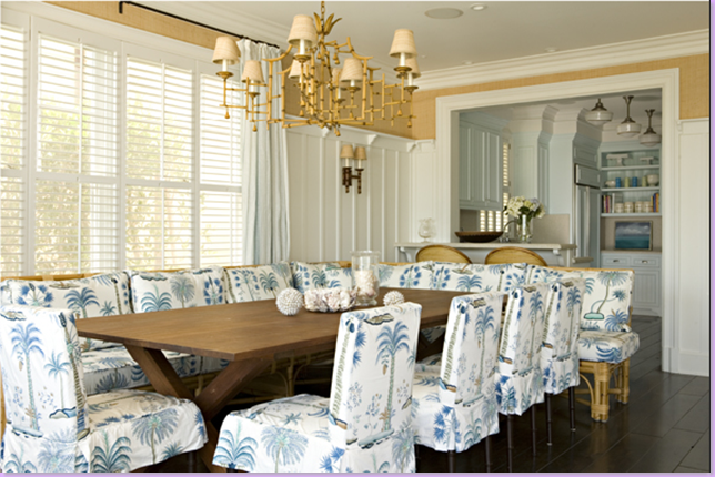
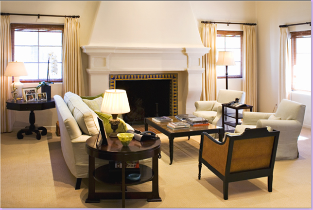
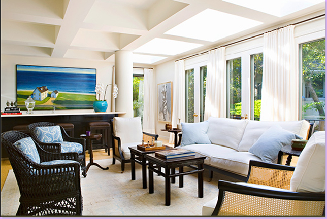
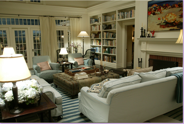
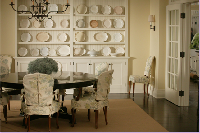
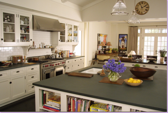
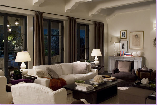
Since it's been all about "Something's Gotta Give" I thought that Nancy Meyers' follow up movie "The Holiday" needed a closer look. Just as the star of Something's Gotta Give was the Hamptons house itself, the star of the "The Holiday" wasn't really Cameron Diaz or Kate Winslet, but their two homes, one in Los Angeles and one in the English Countryside, respectively. And in another connection between the two movies, the production team was led Jon Hutman - but Beth Rubino, so wonderful on the set of SGG, was absent for The Holiday. And just as with Something's Gotta Give, Nancy Meyers' personal interior designer has photos of "The Holiday" houses on his web site, but he is not mentioned in the film credits. The Holiday, coming so soon after Something's Gotta Give received a lot of prepublicity hype concerning its premise: two women swap houses for the Christmas vacation and both find love. For lovers of the SGG house, a new Nancy Meyers movie about TWO houses was almost too good to be true !
"The Holiday" Los Angeles House:
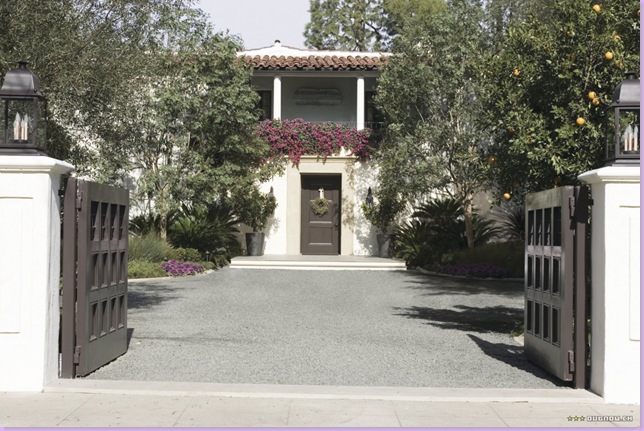
The exterior of the Los Angeles house is actually a well-known classic. Designed in 1928 by famed architect Wallace Neff for his own residence, the home is located in San Marino, Pasadena. The front gates close off the motor court from the street. White, with a red tiled Spanish roof, this house was used only for the exterior footage. The interiors were built on a sound stage.
The beautiful back yard. Notice the hanging balcony on the left - so charming! The outside stairs go up to the second floor. I love the window that is gated. This Neff home is so representative of Mediterranean styled Californian architecture and is the perfect star for the movie.
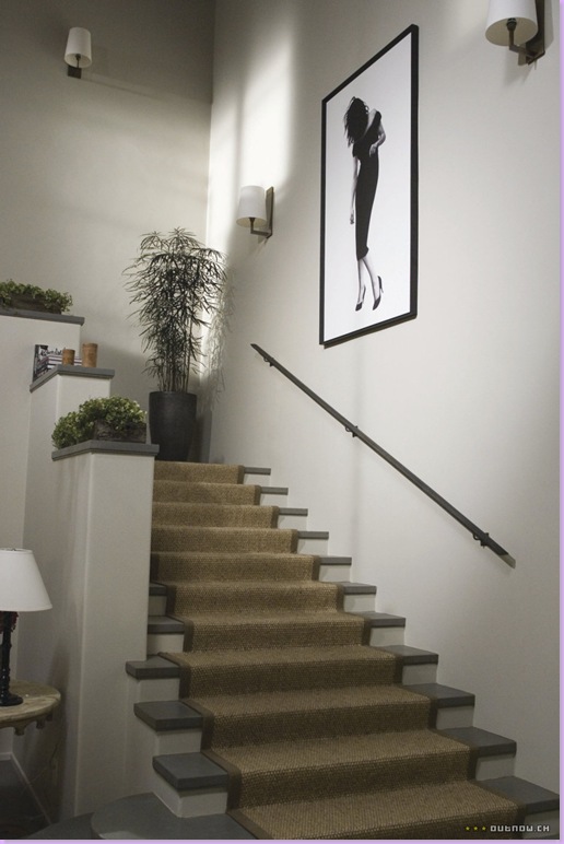
The entry way with its large, contemporary styled stairway. I love the seagrass runner, of course! Note the basic elements of this house: white, stucco appearing walls, dark - almost black hardwood floors mixed with slate floors. I don't know if the walls were actually stuccoed for the movie set. But in real life, stuccoed walls would be found in an older house like the Neff home. Since, this house is supposed to have been built in 1928, the interiors are made to look as though they were completely remodeled. Note: instead of copious overhead lighting, iron sconces are used throughout.
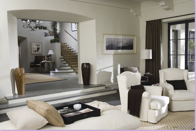
The main living room right off the two story entry hall. Note the table in the entry hall appears to be the same Rose Tarlow table used in SGG's master bedroom. In keeping true to the home's exterior and "age" note the thickness of the stucco walls leading from the entry into the living area. Another authentic element is the metal French doors, painted black.
The main living area: a textured checkerboard rug was used in this room, dressier and more contemporary than seagrass. The upholstery is a mix between traditional and contemporary designs. Note the sofa has square arms and clean lines making it more contemporary than the chairs which are rolled arm wing chairs in white, tight fitting slipcovers. The darker armchairs appear to mohair - another contemporary touch. The tables are a mix of classic and contemporary - and they are mostly dark. Flanking the limestone mantel are two painted wood pieces. A criticism: I think there are too many little accessories strewn about - larger, more dramatic pieces would be more pleasing. There is also an attempt to introduce organic forms into the room: note the wood free form table between the two white chairs. The most important element here is contrast, just as in the SGG house: there is high contrast between the white walls and white furniture and black floors and dark upholstery fabrics, furniture, and curtain fabrics.
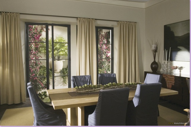
The formal dining room brings a pine colored table with matching sisal rug. Gray slipcovered chairs in a contemporary shape. Dark wood console, white curtains, white walls.
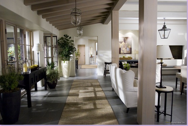
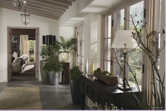
Down this corridor or inner loggia which is differentiated by the slanted wood rafter ceiling is the family area and kitchen. It appears that this loggia was once part of the outside and has been incorporated into the interior, judging by the rafter ceiling and the load bearing columns. Of course this is either Hollywood fantasy or the set decorators copied the interiors of the Neff house. The design elements that started in the front part of the house continue through here and throughout the rest of the house: black slate floors, white stucco walls, white slipcovered upholstery fabrics, dark wood furniture. Again, there is a mix of traditional and contemporary elements. On the left, there is an antique oriental console. Traditional lanterns play a big part in this room. I love the sofa: mine is an exact duplicate! Notice the ultra contemporary fireplace on the right.
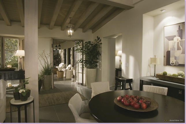
In the same room as above, the area next to the fireplace in the family room - kitchen area. Dark, wood, round table is circled by white, slipcovered armchairs. Through the iron french doors, you can see the covered patio area, furnished the same as the interiors.
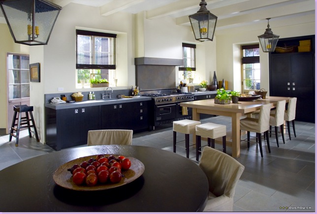
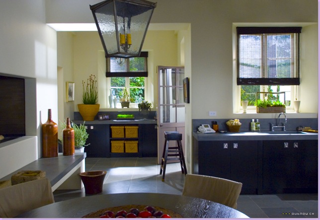
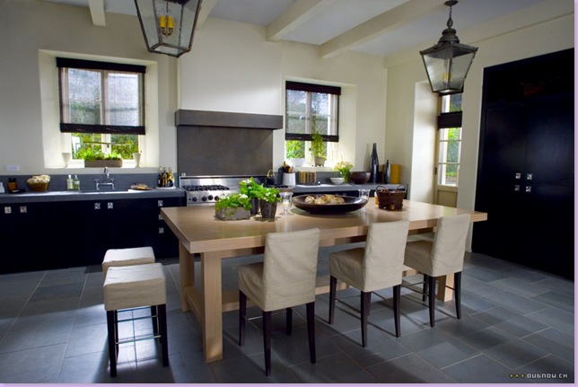
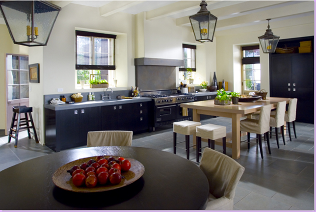
A view towards the kitchen area from the dining area: Large, french styled outdoor lanterns highlight the area. The entire room has an extra high ceiling with white rafters.
Looking back towards behind the kitchen to a contemporary butler's pantry. Wicker baskets take the place of drawers in the built in. The contemporary fireplace and raised hearth is on the left. Instead of dark fabric curtains, the designers opted for dark colored natural fiber shades over the large french windows.
Close up of the kitchen area of the large family room. The kitchen is only one long countertop. The table serves as the island. The refrigerator must be behind the two large black doors. No overhead cabinets add to the streamlined look. This is a kitchen built for a single woman, like Cameron Diaz who owns the home in the movie. The countertops appear to be trendy concrete.
The loggia, looking down the opposite way, with the oriental console on the right. Ahead is the media room.
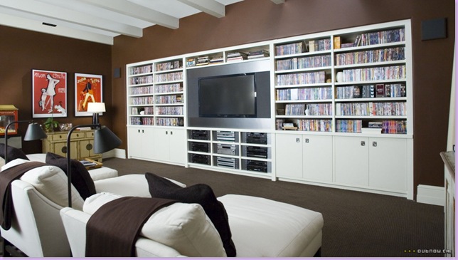
The media room, dark and cocoon like to watch Hollywood movies in: the ceiling retains the rafters, a reminder of the home's actual age and style. The walls are a deep chocolate brown, but the curtains are a white to provide that high contrast, as the white built in does. The floor is brown wall to wall carpet. Instead of a sofa, there is a line of four slipcovered, white chaises with brown pillows - what a great idea for a media room instead of those phony theatre seats you so often see!!! I love the black lamps behind each chaise and the brown cashmere throws. Oriental styled console is to the left. Also on the left, there appears to be that other over used theatre room prop: a popcorn machine!
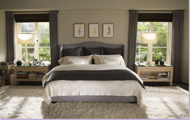
Upstairs, the white and brown theme is toned down with gray and white. The sheets are white as is the shaggy flokati area rug. The shape of the headboard mimics the shape of the upholstery pieces downstairs. The light colored nightstands mimic the organic colors from the dining and living rooms. Notice the curtain treatment: the roman shades are made out of a slightly darker fabric as the curtains. This is repeated on the bed: the bed is upholstered in the light gray and the pillows and spread are a deeper charcoal gray. The slight variations in the gray colors keeps the room from being boring. The shelves in the nightstand are piled high with nighttime reading, just what you would expect from a high powered film executive that Cameron Diaz plays.
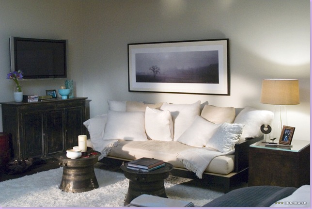
The sitting area of the bedroom has a contemporary daybed piled high with cushy down pillows. The two Oriental round decorative objects are used as coffee tables. To keep the room from being too slick, a rustic, black console is added to the mix.
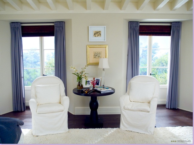
Across from the daybed are two white slipcovered armchairs and dark wood table, just as is found downstairs. The color is off in this picture for some reason - the gray appears blue! What is wonderful about the design of this house is that all the furniture is interchangeable from room to room. There is a continuity to the design throughout the house. If Cameron/Amanda ever decides to move, furniture from one room would work in another room just as perfectly - it all blends, it all meshes, which is a wonderful way to design a house. Notice the rafters in the ceiling and the iron windows which maintain the authenticity of the Mediterranean house.
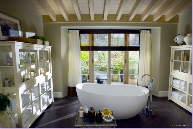
I suppose this bathroom is supposed to be one of the back rooms with a balcony. Maybe this is the room that the outdoor stairs leads to! Here the egg bathtub takes center stage. Rafters, chevron shaped hardwoods painted black, trendy medicine cabinets are used for storage instead of built in cabinets. The same shades used in the kitchen are used here. The curtains are cream and are trimmed on the lead edge in brown, along with a brown skirt on the bottom. This house fulfilled it's requirements perfectly as Cameron/Amanda's home - a successful single woman who is controlling and unfeeling. The home is not particularly warm and cozy, yet it is beautiful and impeccably dressed, just as Cameron/Amanda is. Though it is Christmas time, the house is hardly decorated at all, further describing to the viewer how cold and detached Cameron/Amanda really is. Many people favored this home over the Something's Gotta Give Hamptons house and though the two houses share some design elements, the feel is very different in each.
The English Countryside Cottage:
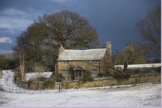
The Los Angeles house could not be more different than the cozy cottage of Kate Winslet/Iris! The facade of this house was built for the movie, though it is almost impossible to tell, it is so authentic. Isn't this just the most charming house and everything you would think you would find in the English countryside? A low stone wall encircles the house and a small gate with bells lets you into the property.
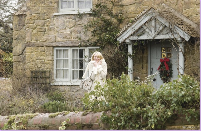
A small front porch and the front gate played parts in the movie and added to the country charm.
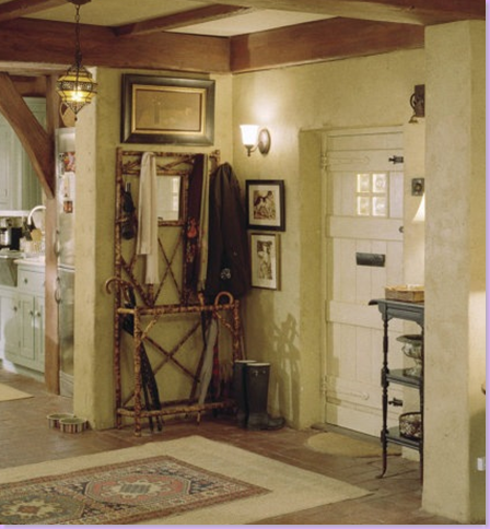
Inside the front door, an antique bamboo coat rack is piled with umbrellas and jackets. The set is so authentic down to the last detail - n0tice Kate/Iris's doggie dishes. Wellies stand next to the coat rack.
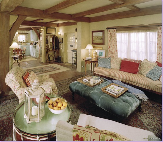
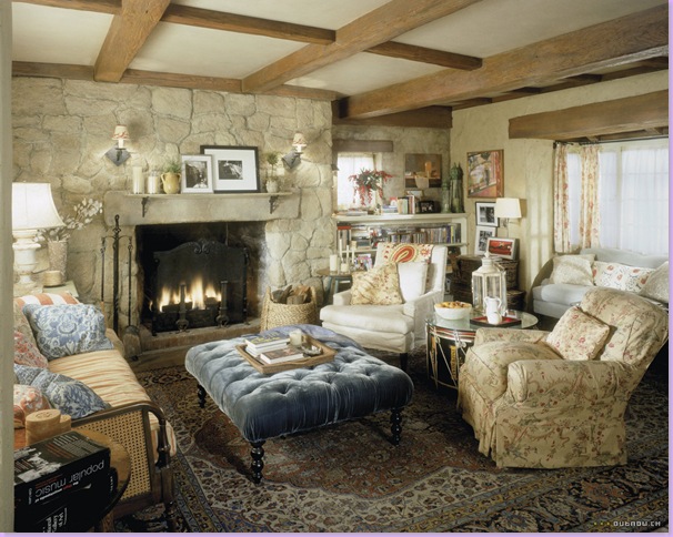
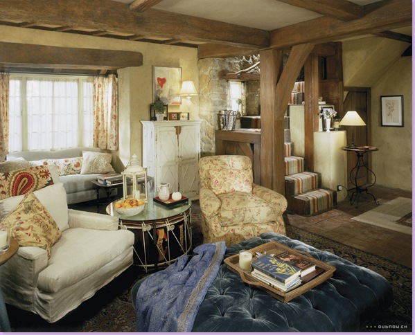
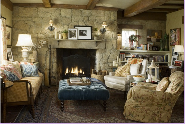
The ceiling is authentically low with wooden beams. The furniture is covered in the typical cluttered country home style of mix and match fabrics. A large tufted, blue velvet ottoman serves as a coffee table. The drapes are a linen flowered print, perhaps Colefax and Fowler. The pillows, or cushions as the English call them, are a jumble of mixed prints. The armchair is slipcovered and a drum serves are a side table. Charming as it can be!
The side wall of the cottage with the stone fireplace and bookshelf piled high. An old, threadbare oriental rug covers the brick floor.
Looking towards the back of the cottage, a glimpse of the small, tiny stairs with its striped runner.
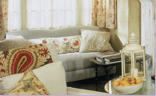
A close up view of the antique suzani on the back of the white chair. And on the sofa behind it, a Robert Kime fabric covers the lumbar pillow. In front of that sofa, an antique tole tray on an oriental stand doubles as a coffee table.
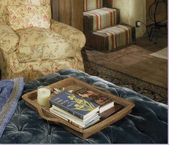
A close up of the slipcovered chair fabric - I'm just not sure whose it is. Does anyone know? And notice the top book on the basket tray is called "The Iris Book" after the Kate/Iris character. The stair runner is probably a Roger Oates piece.
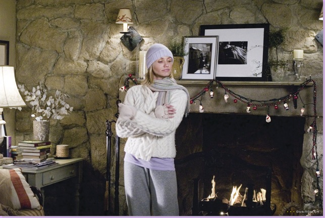
Cameron/Amanda in front of the living room fireplace in Kate/Iris' house. Notice that Iris didn't forget to decorate for Christmas! Of course she wouldn't, she is more caring and emotional than Amanda.
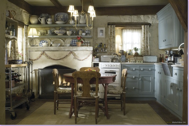
Across from the living room is the kitchen with the eat in area. Blue painted cabinets with painted wood knobs are again an authentic English cottage touch. The fireplace is topped with blue and white transferware and white ironstone. A modern Ikea style rack is on the left. Notice the teeny tiny range. And also be sure to notice on the right, the authentic skirted, metal sink. Seagrass covers the brick floor. The home is messy and cluttered exactly what one would expect the Kate/Iris character to own.
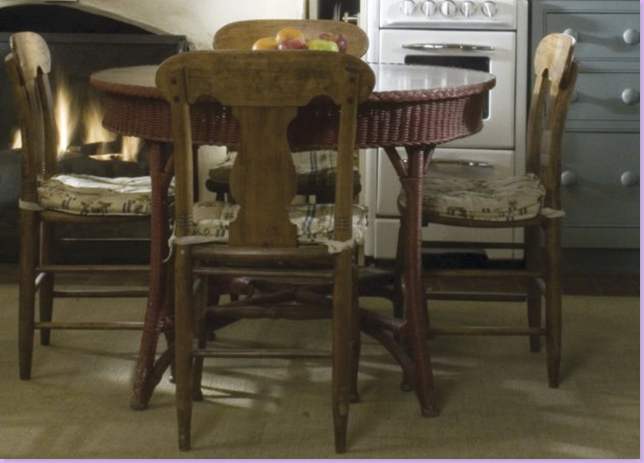
A close up of the charming red wicker dining table and its antique wood chairs.
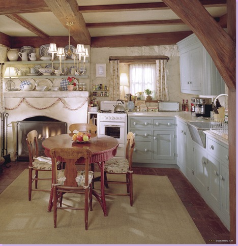
Another view of the charming eat in kitchen.
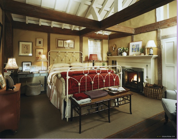
The upstairs bedroom with its ceiling open to the rafters. A large, white painted iron bed is piled high with warm blankets and cushy pillows. An antique bamboo table holds warm, cashmere throws. Wicker baskets throughout the house hold firewood. Included in the mix is a red painted chest and a blue painted desk.
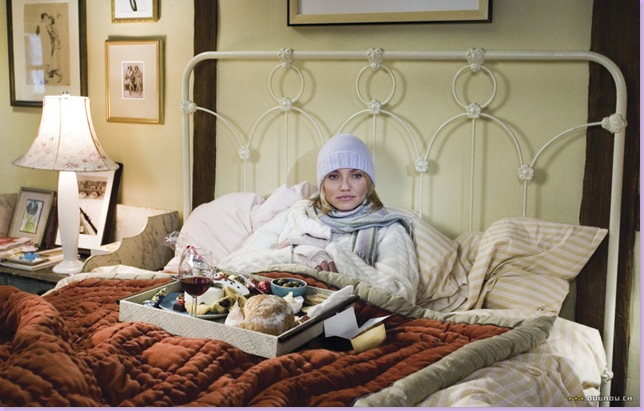
"What am I doing here? I want to go home!" Amanda says, freezing in Iris' bed, before she meets Iris' brother Jude Law - at which point she begins to have fun and chooses to stay for her vacation. Hey, if Jude Law was after me, I'd stay too!
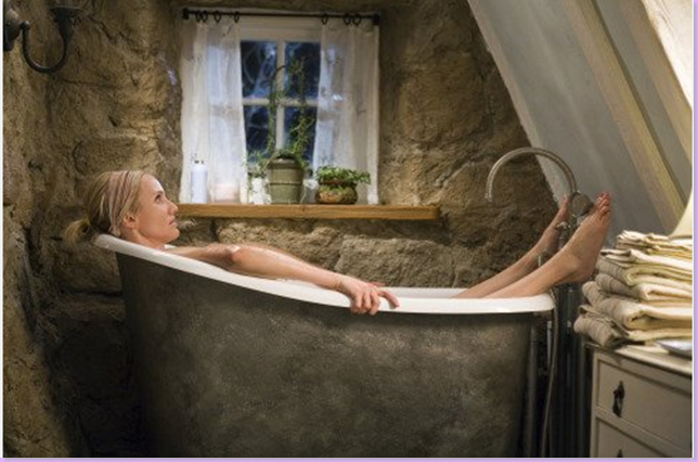
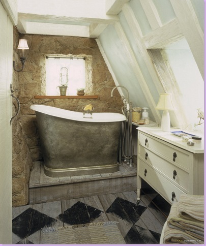
The oh-so-charming bathroom with the authentic metal tub. It's hard to believe this is a movie set! The floors are gray with painted black diamonds perfectly worn down. A white chest fills in for a built-in. On the left, notice the door's hardware.
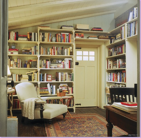
The library - I"m not sure exactly where this room is. It appears to be on the bottom floor, in a lean-to addition. Or, it could be next to the bedroom on the second floor. A lovely antique Edwardian chair sits next to a faux bois table on the left.
If you like this style of home, it would be relatively easy to duplicate. First you would need a small, charming cottage made of stone! No, seriously - it would take a mix of upholstered and slipcovered comfortable and squishy furniture covered with English linens and cotton tickings by Colefax and Fowler and Bennison, all in muted shades of red and green and blue. Creamy colored walls painted with Farrow and Ball in Dorset Cream. You would need accent antique bamboo and tole pieces, a large upholstered ottoman, gateleg tables, a mixed of landscapes and animal prints in antique frames. Lots of collections of smalls and transferware, ironstone, silver, candlesticks, walking sticks, tartanware, and porcelains. Threadbare oriental rugs in blue and red shades and seagrass matting, wall to wall. You don't need a designer for this look, you just need to collect and add to the clutter year after year.
Which house do you prefer, the English cottage or the L.A. Mediterranean with the contemporary interior?
The good news: Nancy Meyers is working on a new screenplay about a long term marriage, divorce, and relationship which she says will be completed this August. The starring roles call for one woman and two leading men. Sounds interesting! James Radin, her personal interior designer reports he is gearing up for a new movie set - is it Meyers new movie? I hope so!!!
Be sure to visit Linda Merrill at Silver Screen Surroundings who is also profiling Nancy Meyers this week.

