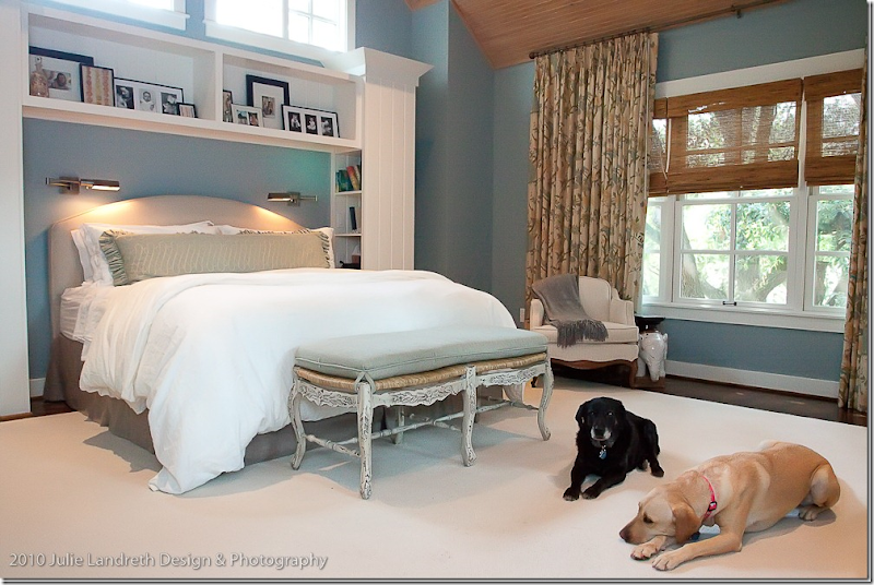
The Dutch Door House with its Eleria curtains.
When I first toured “The Dutch Door House” HERE (interiors by Lyndon West) I fell madly in love with the linen fabric in the master bedroom. I begged the homeowner to find out whose fabric it was and she obliged, emailing later to say it was a Robert Allen fabric, Eleria HERE. It turns out the Eleria is actually a very popular fabric, available in two colorways, Biscotti (above) and Green Tea. I ordered the different colored samples and waited for the perfect client to use it. I didn’t have to wait long.
A few months ago, a client of mine moved from her large, contemporary house in Bellaire to an inside the loop, traditional townhouse. Years ago, she had hired another interior designer when she first moved into the Bellaire house. But, some time later, I stepped in to help with small redecorating jobs - a study, a powder bath, and a master bedroom - each time trying to tone down the contemporary décor into something more traditional. After moving to the townhouse this summer, my client wanted to continue the shift from contemporary to traditional. When deciding what to take from the Bellaire house and what to sell – the decisions were easy: her old chenille covered sofa and love seat had seen better days and her glass coffee table was too contemporary. Her area rug was a beautiful wool patterned rug that, also, had seen better days and needed to be replaced. The modern looking end tables would meet the same fate.
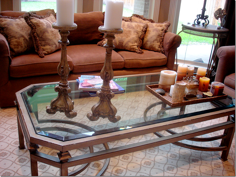
BEFORE: At the Bellaire house, the chenille sofa and love seat were showing their age, as was the rug.
The glass coffee table was too contemporary, as were both end tables. Everything in this picture was sold, except for the lamps and candlestick.
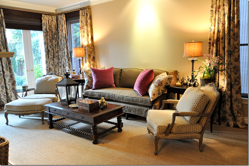
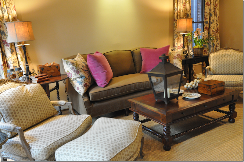
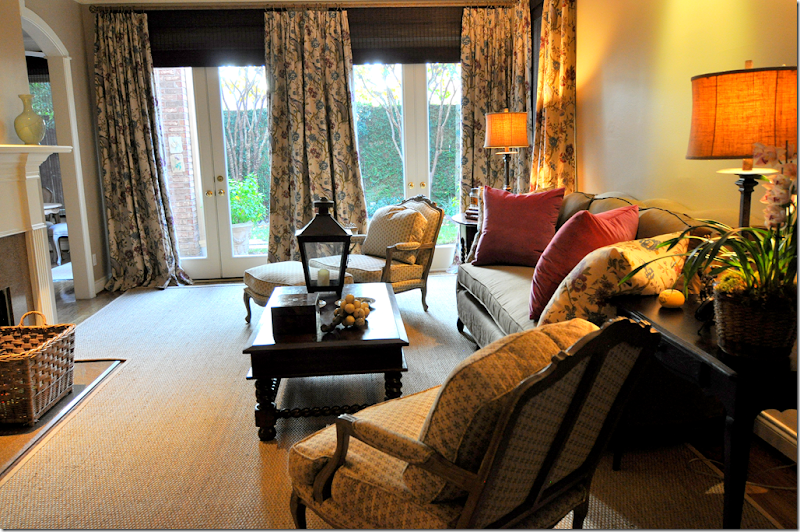
In deciding on a decorating scheme for the new townhouse, my client asked for warm and cozy, specifically, she wanted dark walls. And, she wanted to plan everything around two bergeres she owned that were upholstered in a brown and cream print. We decided on a dark taupe for the walls – Pratt and Lambert’s Toasted Wheat , a color I have used many times before. For the Hien Lam custom made slipcovered sofa, we used Pindler’s #1766 Vernon in Maple, a copper brown linen adding raspberry velvet pillows to pop color. After much begging and pleading, my client agreed to curtains and textured shades. We were on a tight budget and she didn’t want the extra expense of something that was not really essential. But, I firmly believe that window treatments are important to a design scheme and most interiors look better with them. The Eleria was the perfect choice for the curtains since we needed major yardage to cover all the windows and, for a linen, the price couldn’t be beat. Because the breakfast room is open to the living room, we also covered its pretty bay window with the Eleria. We then chose a brown textured shade to hang behind the curtains.
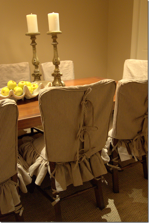
To end the last bit of contention – my client agreed to cover up her beautiful hardwoods with a custom cut seagrass rug that left just a few inches of the gleaming wood showing. I know, I know. But, if you want warm and cozy, nothing gives you that atmosphere more than seagrass. In the dining room, I chose another Pindler and Pindler linen, a stripe, #1767 Casablanca in Truffle, to slipcover the rush seat chairs. The dining room has no windows, so it needed some fabric to soften up all the hard edges of the wood table and chairs. I purposely chose overly detailed slips to add just a bit of femininity. Since we were on a strict budget, using all Pindler and Robert Allen fabrics helped tremendously to keep costs down. There are a few things still to be decided on – a mirror or art work over the sofa, and a buffet in the dining room. But for now, here’s the work in progress.
BEFORE: This is how the townhouse looked when my client bought it. The walls were a dark dusty rose and the curtains were a chintz. Fortunately for her, the former homeowners took all the curtains with them – but left the costly rods and rings. Now, all I had to do was convince my client that she needed to invest in window treatments, something many people think of as an unnecessary luxury. Here you can see how pretty the room is – arches lead to the long entry hall and stairs. The dining room is through the arch on the left of the fireplace. The kitchen is through the other arch at the right of the fireplace. Upstairs are two bedrooms and a study. The third story is a large bedroom.
AFTER: The custom slipcovered sofa has mutton legs and a triple arched back. The fabric is a Pindler and Pindler brown linen. The two bergeres were the homeowners and she wanted to work the entire scheme around their brown and cream upholstery. Yet to be decided on is art work or a mirror to go behind the sofa.
At the windows, we used 2 widths of fabric to create the full, lush look of the curtains. One width just doesn’t give you that beautiful fullness.
Curtains and shades by Custom Creations by Monica HERE.
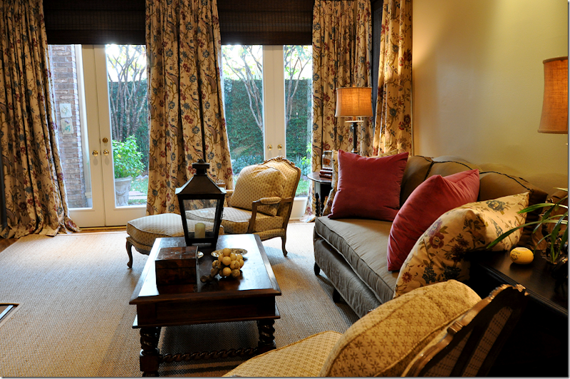
I bought the coffee table at an import store in the Rice Village. The antique gateleg table was moved from the study, while the antique French desk on the right came from a Cote de Texas sponsor – Bonnie Neiman HERE. To update her iron lamps, there are new burlap lampshades from Boxwood.
You can see into the breakfast room on the right side of the fireplace.
I brought out some oversized accessories to update the décor: a lantern from Olivine and alabaster grapes. The homeowner has some beautiful antique boxes inherited from the mother and grandmother which we also used. To keep the room from looking cluttered, we stored away many smaller accessories.
The dining room has no windows, so I covered the rush seat chairs in slips to make the room softer. The Pindler linen stripe has the same colors as found in the living room to tie both rooms together.
The homeowner’s mother made the dining room table out of used bowling alley wood! Still to be ordered is a buffet for the back wall.
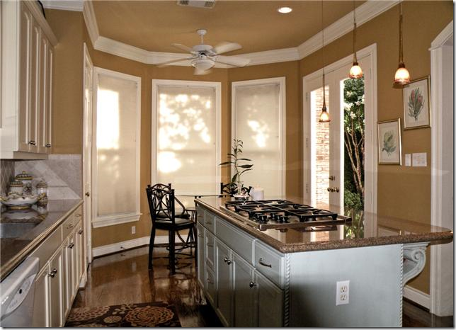
BEFORE: the kitchen has a small bay window in the breakfast area.
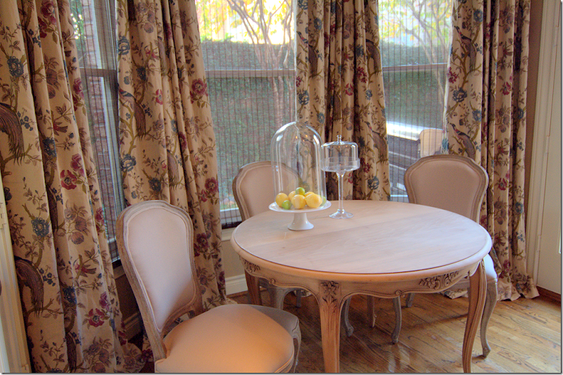
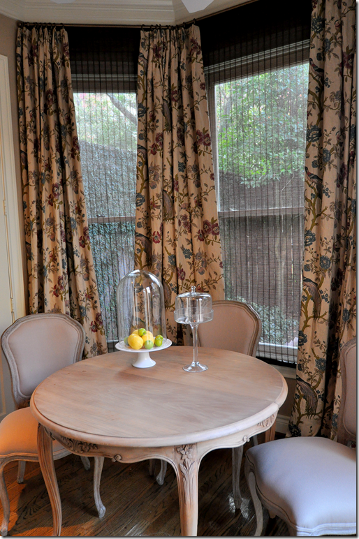
AFTER: Since the breakfast room opens to the living area – we used the same Eleria fabric here. The curtains dress up the area and make it seem more like a room, rather than a kitchen.
The antique table came from Eloquence HERE. The chairs are from Zentique. Both, to the trade.
Lastly, the round table opens up to a larger oval shape. The glass cloche and cake stand came from Indulge.
FINALLY:
I want to take the time to personally thank all of you who so kindly donated to Woodbourne’s Christmas Wish List.
For those who still wish to make a donation, there is time left do so. Please go HERE to read the details.

