COTE DE TEXAS

Suzanne Rheinstein: Our Guest!

41 comments


image

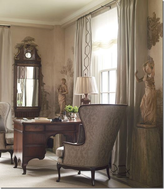
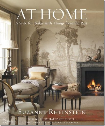
We’re back!   The Skirted Roundtable took a long  Christmas break, but just before we left we welcomed Suzanne Rheinstein as our guest.  Yes!  THE Suzanne Rheinstein.   She was in NYC at the time, visiting her daughter and staying in her fabulous apartment that is featured on the cover of her new book:  At Home.   What a way to start the new year with a guest like Suzanne.   She’s such a southern lady – born and raised in New Orleans - she is all about genteel manners and living a wonderful, full life surrounded by family and friends and beautiful things.  And believe me, she knows beautiful things.  Her NYC apartment and her Los Angeles house are both gorgeous, filled with beautiful 18th century antiques and wonderful art and accessories.   She believes in buying good things one at a time rather than just filling up a space with cheap copies.    Her houses certainly reflect this philosophy.  She and her husband have spent a lifetime collecting, editing,  and upgrading.    Each piece is exquisite, not an ashtray out of place.  It’s all so lovely, yet  tastefully understated.    Her house in L.A. is welcoming and inviting, not stuffy or precious, while her NYC apartment is sophisticated cool and calm, an oasis above the noisy city. 

I’ve been in love with Suzanne’s aesthetic for years and years.  Her L.A.  house appeals to me – in all its versions.  Over the years it has changed and evolved and at each stage it just gets better and better.    On the Roundtable, we talked with Suzanne about her homes, both of which are featured in her newly released book.   For me, At Home is one of the better décor books released this season.   It’s filled with her best projects, some of which have never been seen before.   Some of the houses that have been previously published are shown recently updated, including  her own L.A. house and the Virginian farm whose publication first put Suzanne on the map.    But, it’s her NYC apartment that is the standout of the book.  Seriously, it is the most gorgeous place I’ve seen in a long time.   The luscious grisaille mural in the living room, which was painted by Bob Christian is nothing if not mouthwatering.   During the interview,  Suzanne talks about that mural and Bob’s work and the apartment in general.   Without a doubt, it’s her finest work to date. 

If you have the time, be sure to click over to the Skirted Roundtable HERE and listen to the discussion!


1

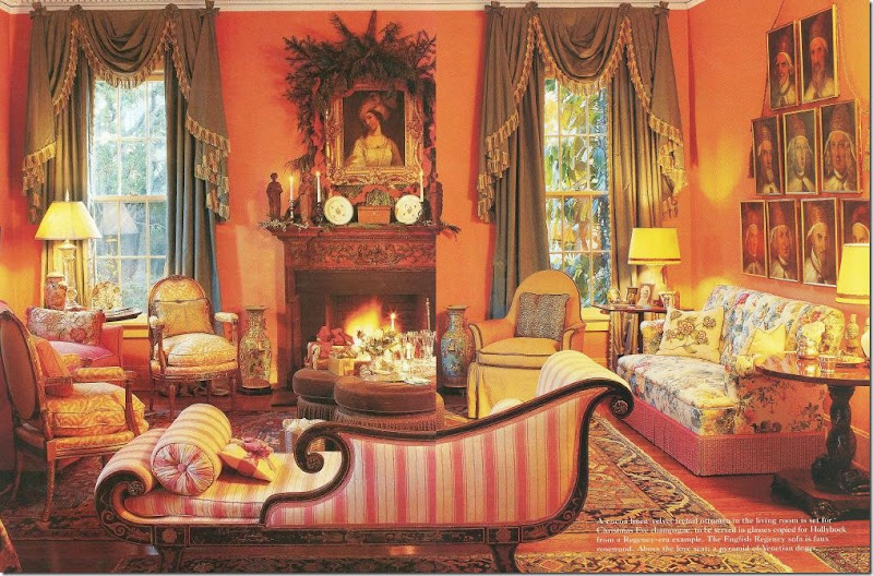
I love watching the evolution of Suzanne’s L.A. house.   For instance, in the early 80s, her living room had persimmon walls and green curtains with pink striped upholstery.


image

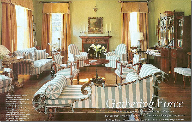
Today, wearing its summer slips in blue and white stripes, the room is now painted a soft green.   All the furniture is the same, moved from room to room.  Much came from her and her husband’s family.  Design is generational in both families.   Suzanne learned about decorating and gardening from her mother and grandmother.    Her husband shares her love of art and antiques and their vacations are spent looking at both.  (Sorry this is such a poor scan!)


image

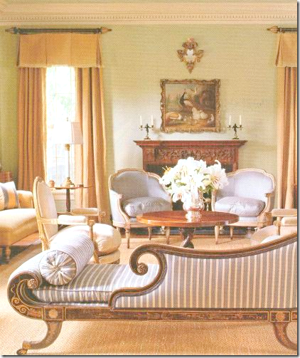
And here, without the slips. 


image

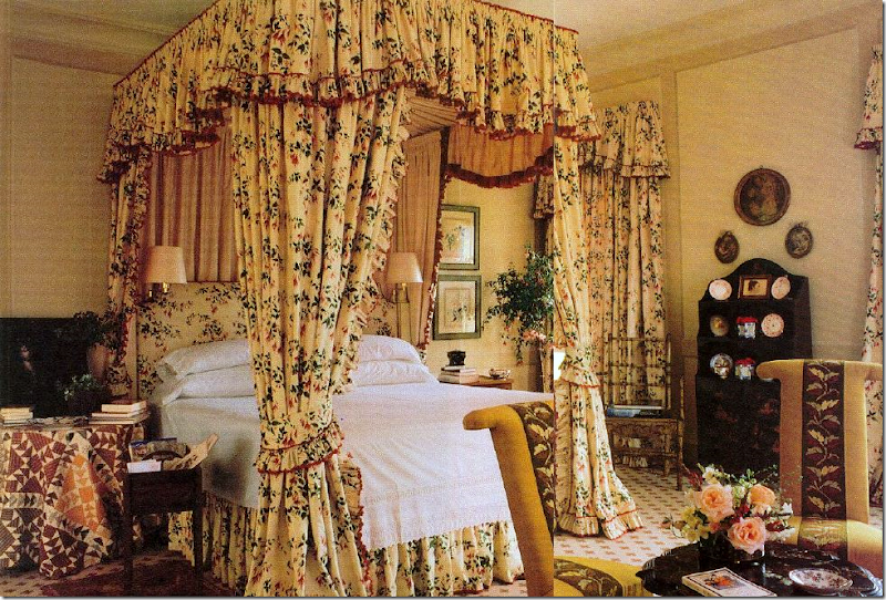
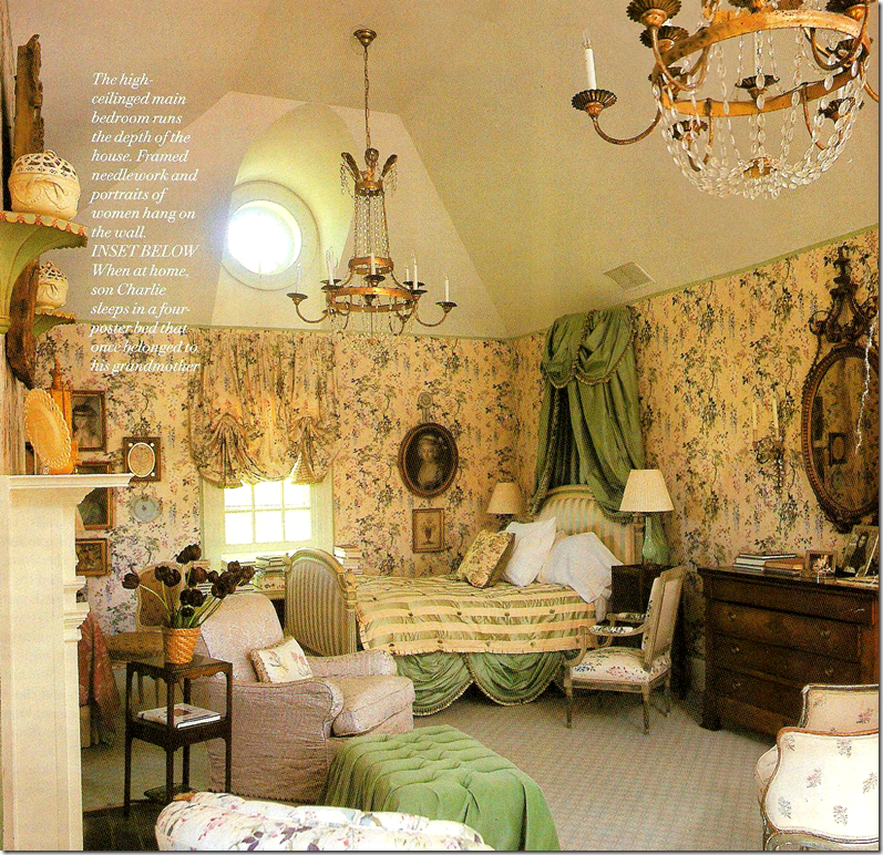
Another big change is in her bedroom – here in the 80s and 90s, her bedroom was all English chintz to perfection.


image

As it is today shown in At Home:  it’s more French, soft and romantic with a painted floor by Bob Christian.  


image 

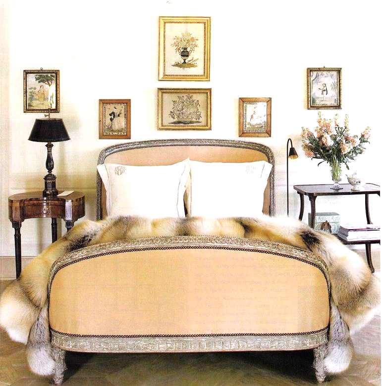
Another view of her bedroom today.  Something tells me that fur is not from Pottery Barn!!!!   It’s gorgeous.


image

The Virginian farm:  over the years Suzanne has remodeled the house, but the master bedroom always remained the same.  Why mess with perfection?    So, it  was a surprise to see the room completely redone in At Home.


image

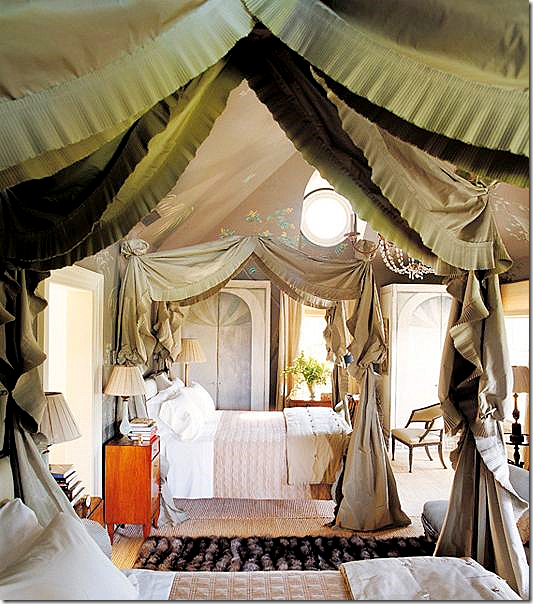
The newly refurnished master bedroom with twin canopies.


image

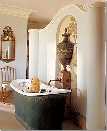
Another surprise in At Home:  the Virginian master bathroom, never seen before.  Notice the Bob Christian mural behind the gorgeous urn.  And notice the faucet coming out of the pedestal.  That tub!!!  


image

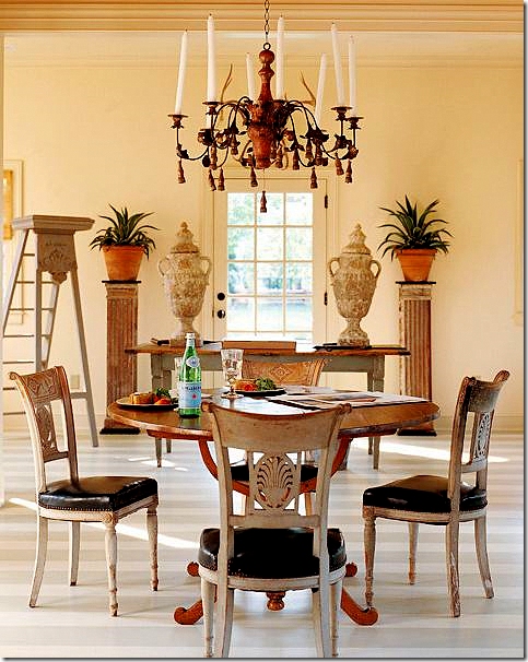
In At Home, another never seen before interior:   The “Garden Office” located in a small cottage on the Virginian property.  Notice the striped floors.  And I love how Suzanne put the urns on the table and not on the columns.  I love the French library ladder.  Doesn’t every garden office need one?


image

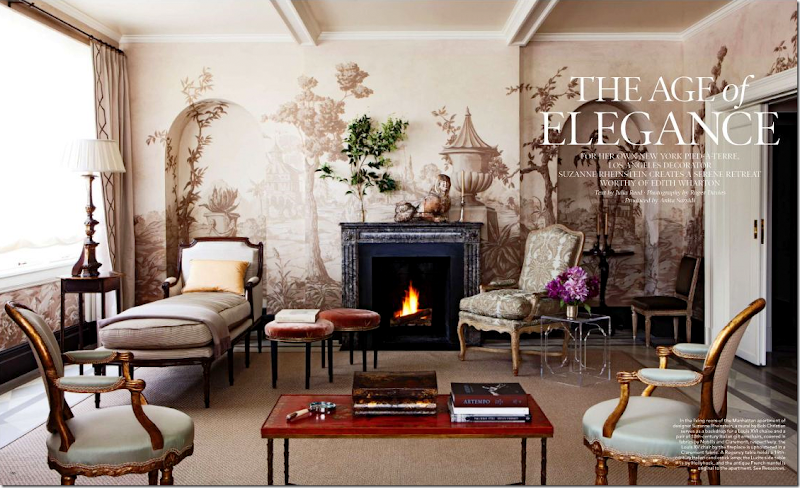
The living room in Suzanne’s NYC new apartment – seen both in At Home and Elle Décor.  The heart stopping grisaille mural was painted by Bob Christian.  Isn’t it beautiful????  You will never find anything trendy in Suzanne’s decorating.   I love this quote of hers, talking about Axel Vervoordt:  “The man has the most amazing sense of art and style. I believe his influence will endure long after the flood of China-made Belgian-esque furniture has ruined that look for many people.”  Hear that Restoration Hardware?


image

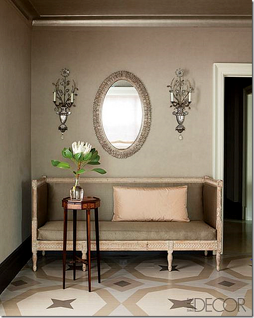
Christian also painted the floor in the foyer.   The Swedish sofa is to die for!  I love the blush peach pillow against the taupe fabric.  Those sconces!!!!


image

A corner of the living room with inherited chairs. 


image

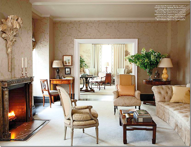
The library.   Notice how beautiful the fireplace mantel is!  I love the touch of peach. 


image

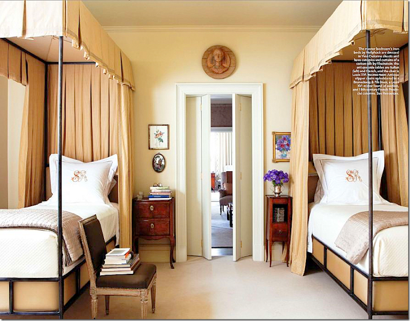
Twin canopy beds are the focal point in the master bedroom which moves from the mushroom color to peach.   I love how she uses the French chair as a book stand!


image

To listen to the Suzanne Rheinstein interview on The Skirted Roundtable, go HERE.


To purchase At Home, click on the book’s title below:


Two In Houston

67 comments


If you live in Houston, you may have seen these two homes already – both were featured in a local magazine – Houston Lifestyles & Homes –  but, since many who read the blog aren’t from Houston, I thought I would share them with you.   Both houses are quite beautiful and reflective of the “Houston look,” although one house is dressier than the other.   Enjoy!


House #1

image

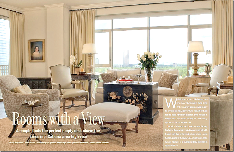
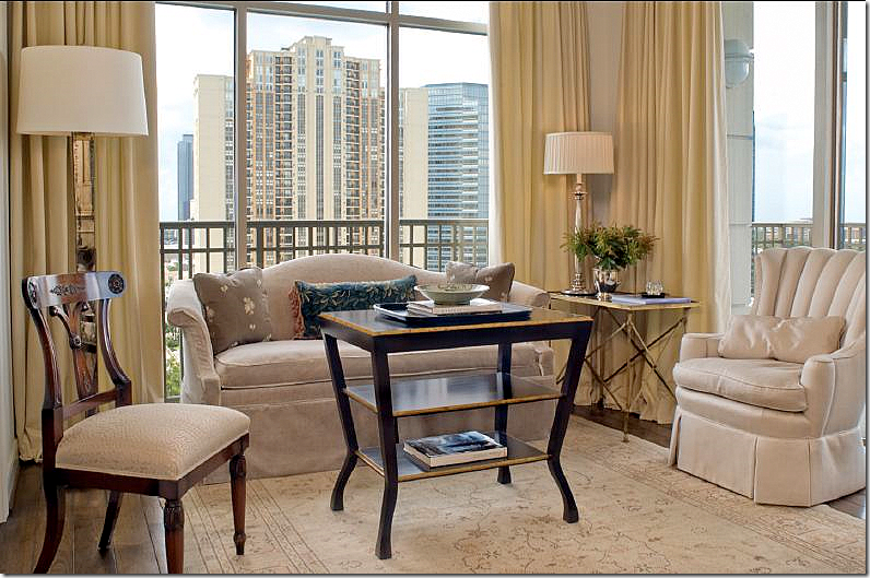
The first house, decorated by Ginger Barber, is located in the Montebello – a rather new Houston highrise.   This project is around five years old and I’ve loved it since first seeing it on Ginger’s web site.     Most highrise apartments in Houston are either contemporary or dowdy.   This, is neither.    It’s warm and cozy and youthful – something not usually associated with living in a newly built penthouse.   Though empty nesters, the owners are much younger than typical highrise dwellers in Houston.   For this project, they bought two units and combined them for a total of 5,000 sq. ft. – which is quite large for a condo.   The owners left most of their furnishings in their old suburban house, bringing only a few inherited antiques.   How nice must it be to hire Ginger and get all new furnishings too?!!    I love Ginger’s easy going style and she certainly brought that feel to this condo.   Everything is so perfectly designed, the décor stands as a textbook on how to furnish a  condo filled with French and Swedish antiques that is not stuffy or pretentious. 

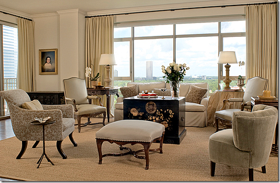
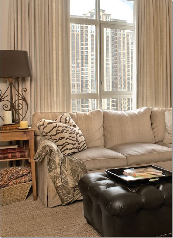
In the living room above, Ginger used soothing neutrals.   The large black painted chest serves as the only accent color.   Cream drapes add softness – so many people don’t use curtains in highrises, which is a shame.  The fabric goes a long way to warm up all the cold glass, without covering up the view.   I love the skirted table in champagne taffeta – it’s so full and luscious.   And I love the French ottoman with its trendy nailheads.   But it’s the oriental styled chest that really stands out – its beyond fabulous!    The seagrass really helps to keep it all  young and fresh looking.    Just beautiful!!!!!


image

A smaller picture – without all the writing over it!!


image

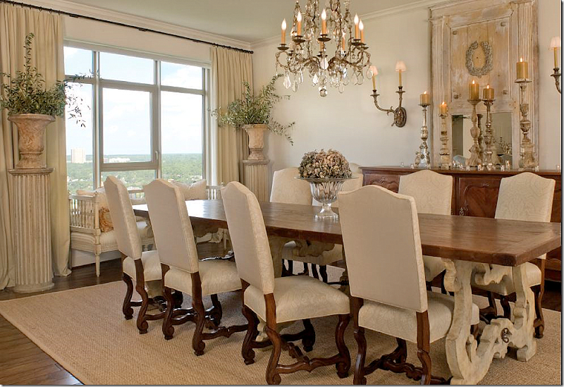
The dining room is a favorite of mine, a mixture of French and Swedish furnishings.   The table had to be dismantled to fit into the elevator – a concern when planning a high rise.   Creamy damask covers the large French chairs and an antique mirror hangs above the French enfilade.  The chandelier is also antique.   The big surprise is the Swedish sofa that Ginger placed in front of the window. 


image

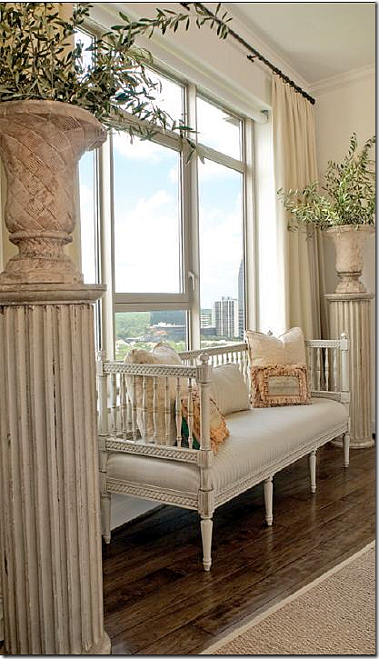
Again, not your grandmother’s penthouse!   A painted Swedish sofa sits between two fluted columns topped by urns.   Sooooo charming!!!!!


image

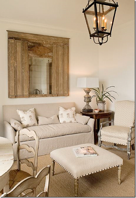
Off the living room, the music room is filled with inherited furniture which Ginger recovered.   The traditional sofa got a youthful slipcover.


image

The breakfast/sitting room off the kitchen is adorable.  I love this room!!!    Meals are taken at the painted table with its painted chairs. 


image

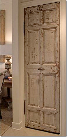
In the kitchen, an antique door closes off the pantry.   Seriously, have you ever seen a rustic antique door in a penthouse?   Touches like this really help cozy up the home.


image

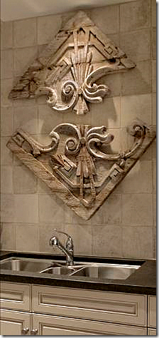
In the kitchen, the piece above the sink came from Round Top.  The backsplash is made of tiles from Chateau Domingue


image

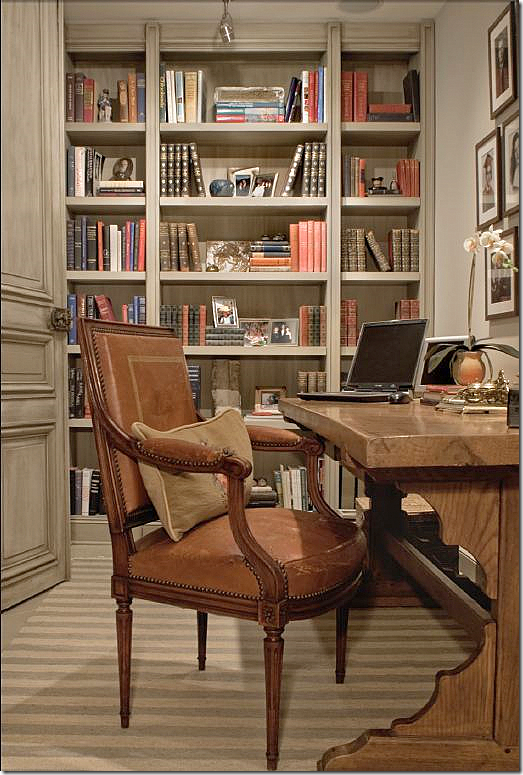
The wife’s office has a muted striped dhurri rug along with antique doors  from Chateau Domingue.  Shelves are filled with the sentimental photos too precious not to display.    I love that desk! 


image

The “media” room is where the couple relax, watching a TV that is hidden in a French armoire. 


image

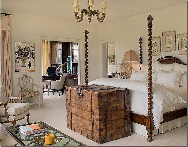
I’m wild over the master bedroom – which is so Ginger.  The barley twist bed piled with white linens anchors the room.   The bed was custom ordered from Brian Stringer Antiques which is now closed.    The rustic chest, a Ginger trademark, is fitted with a hidden TV.  The room is large enough for a sitting area.   By filling up the space with furniture, the room seems cozy instead of cavernous.   A secret to successful oversized rooms is to fill them up with furniture!   A mistake many people make with today’s extra large spaces is not using enough chairs, sofas, and tables.   The husband’s office adjoins the bedroom. 


image

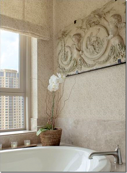
The master bathroom appears to be covered in a Rose Tarlow print, but it’s not credited.   The piece above the tub is romantic and again, typical Ginger.  She loves to mix concrete and stone with wicker and linen.


image

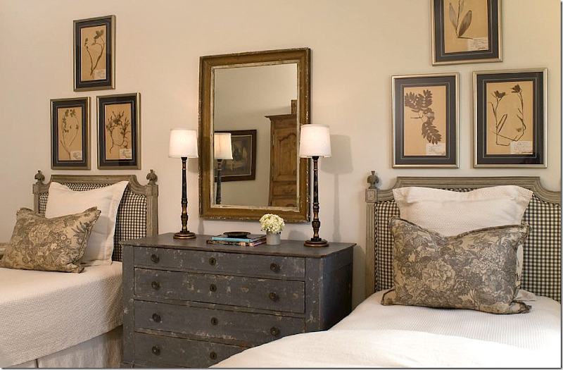
The guest room is beyond adorable with its gray painted French headboards and chest.   Framed antique botanicals hang from the wall.   I love the crisp check fabric mixed with the gray toile on the pillows.   The adorable matching chinoiserie lamps are from Ginger’s shop:  www.gingerbarber.com

I hope you enjoyed this peek at Ginger Barber’s foray into slick highrise living.   As you can see, highrise living doesn’t have to be cold, dowdy, or contemporary.  Instead it can be warm, inviting, interesting and cozy!   Photographs by Janet Lenzen.   To read the original article, go HERE.


House #2

Next is a large custom built house in the Memorial area.   The builder was Parker House Inc. and Sarah West was the architectural consultant who tweaked the plans for the homeowners.    Cindy Witmer designed the interiors along with the homeowner.  Together they went to the Round Top Antiques Fair and bought furniture that anchored the expansive rooms.   The walls were plastered by Leslie Sinclair of Segretro  Finishes.  Leslie’s wall treatments are unparalleled – the subtle texture adds a depth to the walls that adds a quality that is hard to define.  I would love for Leslie to do my entire house – her plaster is just that gorgeous!!!!   The rugs and carpets came from Creative Flooring.  Lighting came from BROWN, AREA, and Tara Shaw.  The window treatments were designed by Linda Falk and all upholstered furniture was custom designed by Cindy and made by Hein Lam Upholstery.   All these beautiful photos are by Wade Blissard HERE.  To read the original story, go HERE.


image

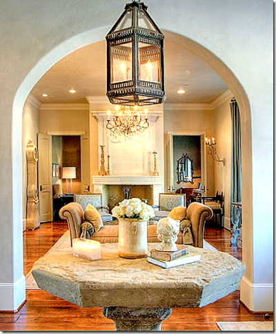
An antique stone table from Chateau Domingue stands in the entry hall under a lantern.  Love that!     The living room is straight ahead.


image

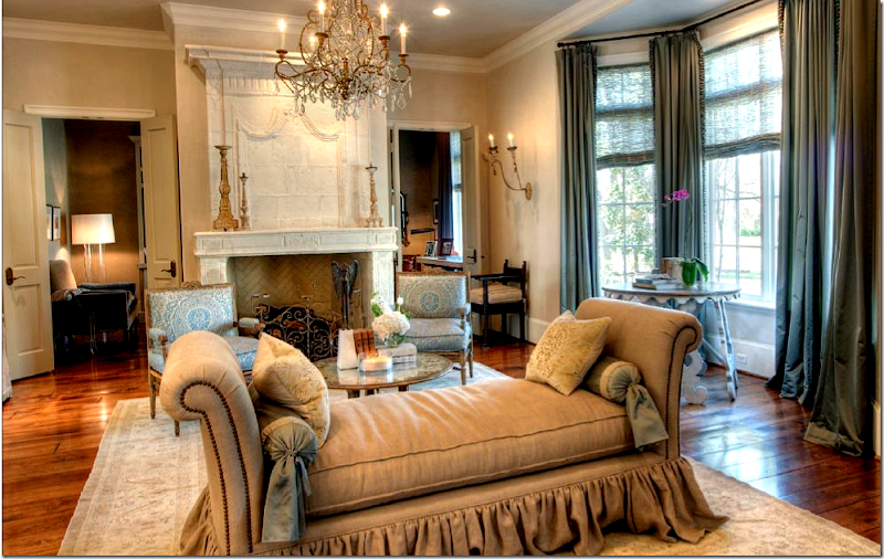
Love!!!  I love the floating day bed – by Hein Lam.  They make the prettiest skirts and flourishes.   Love the fireplace from Chateau Domingue.  The room is dressy, yet approachable at the same time.   The beautiful chandelier is from Tara Shaw and the chairs are covered in Fortuny. 


image

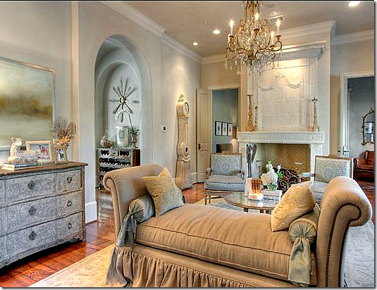
In this view, you can see the chest and into the next room on the left.  There’s that lamb again!!!  I have it and so did another house I showed last month!  It’s soo cute. 


image

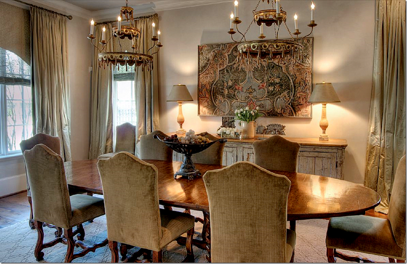
So pretty!   The house is dressier than many like it because rugs were used as opposed to the seagrass that Houston so  loves.   Here, two fixtures from Round Top hang over the large wood table.   Instead of slipped chairs – they are upholstered in a chenille.   The sideboard is antique from Belgium.   The silk curtains are fabulous!!!!!!  


image

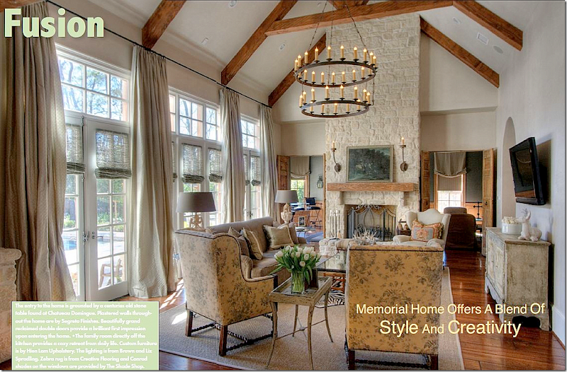
The family room is wonderful.  I love the lush curtains and the chairs covered in Bennison!  So pretty.   These chairs are from Hein Lam and I just love them The large fixture is from BROWN.  I like that they resisted putting the TV on the fireplace.  Well, it looks like seagrass did make it to this room!   A zebra is layered over it. 


image

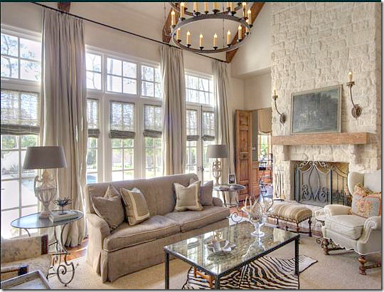
A closer look at the sofa and stone fireplace.  The media/billiard room is through the doors next to the fireplace.


image

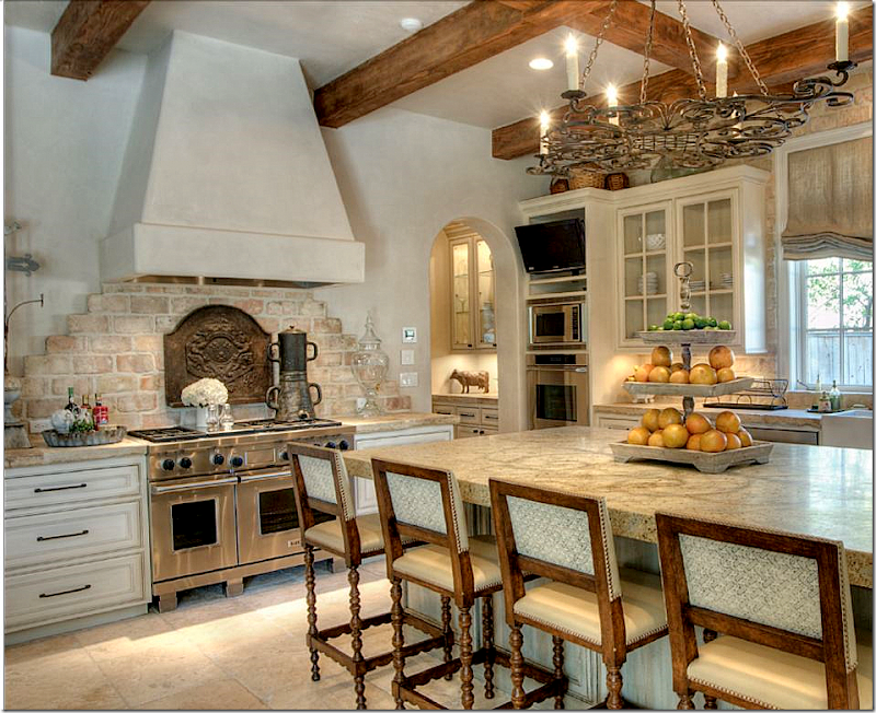
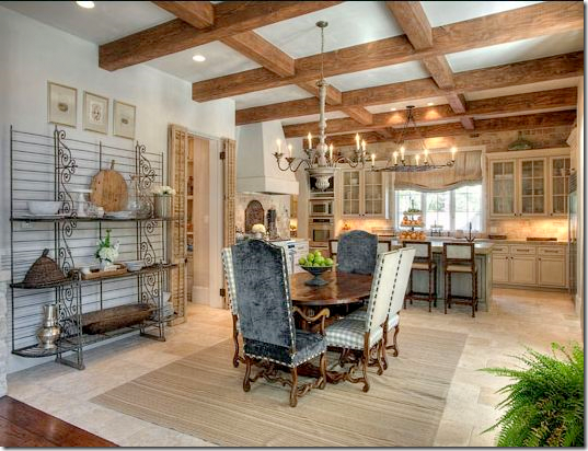
Off the family room is the large kitchen and breakfast room.  The back wall has reclaimed brick and stone from Chateau Domingue.  Segreto did the walls and the cabinet finish.


image

This shows the breakfast table with the chairs in velvet and check fabric with nailheads.   The light is from AREA.


image

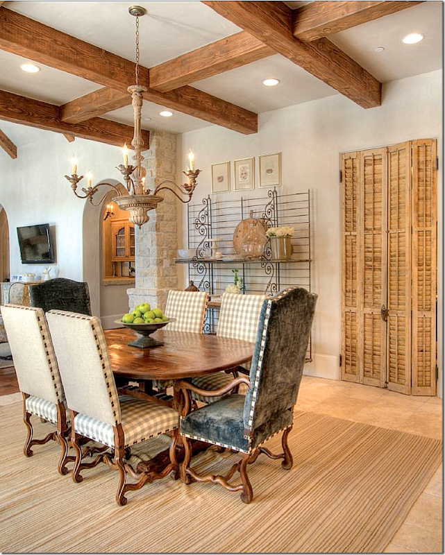
The bakers rack and antique shutters are from Chateau Domingue.   Hidden behind the shutters is the office.    You can see the family room on the left and how it leads into the kitchen.  And you can see the large bar at its right. 


image

And looking from the family room into the kitchen.


image

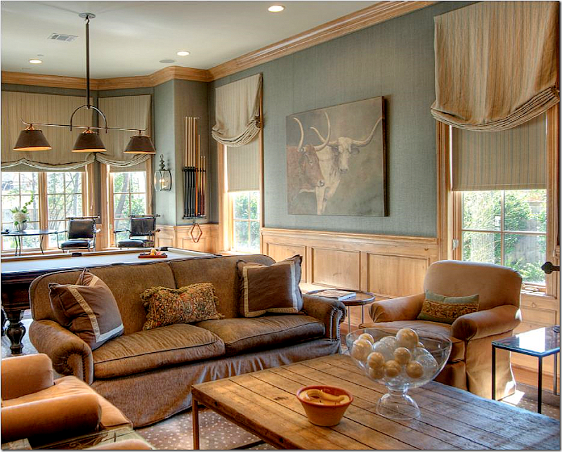
The media/billiard room’s light fixture is from BROWN.   Great rug!    The painting and coffee table are from AREA.  


image

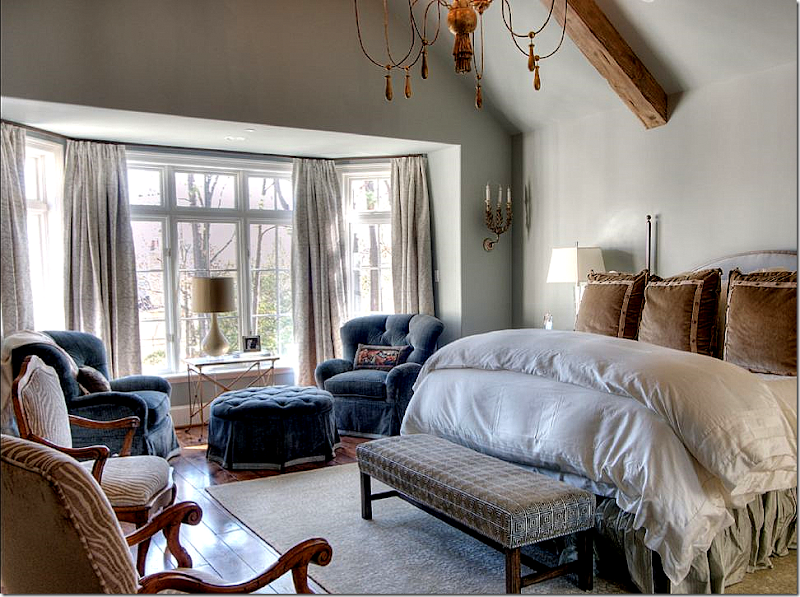
I love the velvet that is found throughout the house.  It makes everything just a little dressier.   The tufted chairs and ottoman are wonderful – so soft and cozy loooking.    The soft blue walls are by Segreto.  


image

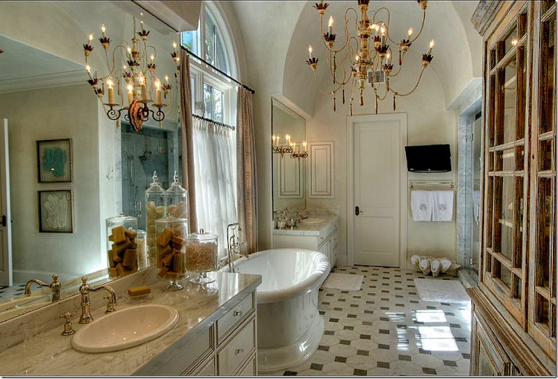
So pretty!  The floor just looks old – its really new.   The chandelier is from Tara Shaw.  I love the shell filled with towels.  Cute idea. 


image

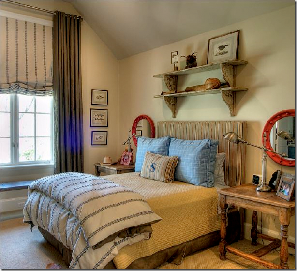
The son’s room.


image

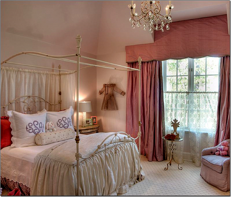
The daughter’s room is especially cute in pinks and purples.   Cute dress hanging up on the wall.


I hope you’ve like these two Houston homes.  The Ginger Barber highrise is a good lesson on how to decorate a condo for a young couple and make it look trendy and cozy.  The second house shows that not all Houston is just seagrass and slipcovers.  The house is more dressy than most, but it still is fitting for a younger couple with small children.


An Incredible Renovation!

244 comments


image

BEFORE:    This foreclosed house was a mess and in need of a total redo.    Outside, there was no real landscaping, just a few bushes.  Still, the owner knew she could make it home.


A friend of mine sent me pictures of a remodeled house that she had recently seen saying “You’ll love this one!”   She was right!   After looking at a zillion “before” pictures, the first “after” picture had me stunned.  I couldn’t even believe it was the same house.   I love a good remodeling story and know that many of you do too.  So, I begged the homeowner to let me show her pictures and she graciously agreed to open her doors to us! 

This story starts with a family looking to downsize a bit.    The owner is a mother of 2 teenagers who will soon be leaving for college.  The house is located in a suburb of Houston where most houses are around 10 to 20 years old now – just old enough to be looking a bit dated and in need of a facelift.     In fact many houses in the neighborhood have been updated somewhat.    Which is exactly what she didn’t want.   She was looking for a house that she could put her own stamp on.   She didn’t want to buy something that had already been remodeled because she wanted to redo everything, down to the doorknobs.    Luckily, she found her “dream” house in foreclosure, which was even better on the pocketbook.   Her friends and family thought she was crazy when she bought it.   It was a wreck.  Dated, dirty, and with no curb appeal – it was perfect for her!   She likes to remodel:  she grew up in an old, Victorian house in San Francisco that her parents had completely redone on their own.     Living in a half finished house seemed normal to her.   

Despite the homeowner’s history with remodeling, the task at hand was huge for a number of reasons.   She was pressed for time and  she was on a tight budget and had to prioritize.   The biggest savings was not hiring a contractor.  She had only 20 days to finish the job.   During the closing process, she started ordering flooring, lighting and hardware to save time – even knowing she might be risking the money.  But by ordering before she closed on the house – she was ready to start the demo on day one.  Friends pitched in to help with the frenzied redo.    She saved money by going to Lowe’s and buying from catalogues like Ballard Designs.    She removed the light fixtures and curtains from her old house before it was sold – which added more savings.    And most amazing – the homeowner is not a designer, she works in the health industry.   The owner does admit that she has five very creative friends and a daughter who all helped her with decorating decisions.   I think she is just being humble.    

I hope you enjoy these pictures as much as I did when I first saw them!!!!


image

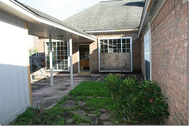
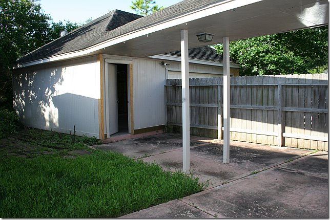
The back yard was in even worse condition than the front.   Boarded up windows added to its “appeal!”


image

There was a fence between the house and the garage – which was immediately removed by the new owner!!


image

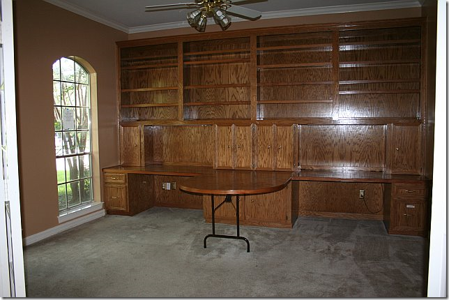
Walking in the front door, to the left was an office with paneling and a built in desk, along with old carpet.   Luckily there were a pair of French doors that closed off the room and provided a bit of charm.    After closing, the built in desk was immediately torn down.


image

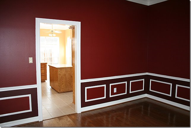
To the right was a red dining room that led into the kitchen.   Love all the different shades of red in the molding.


image

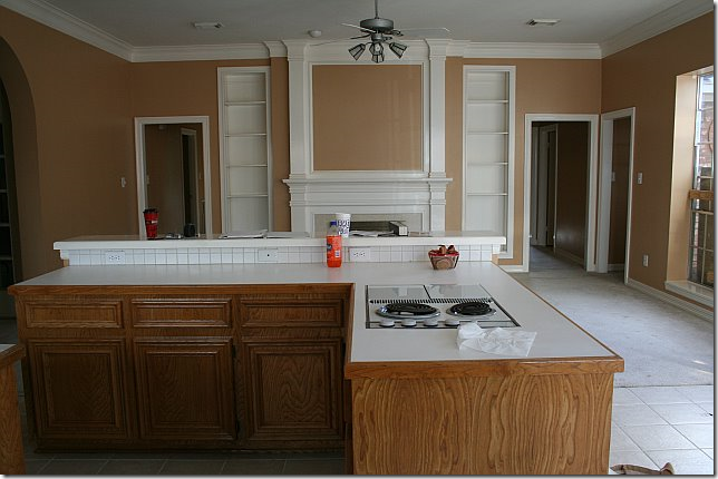
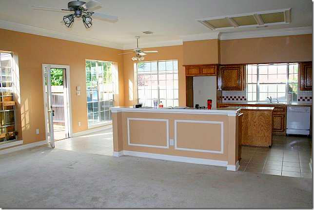
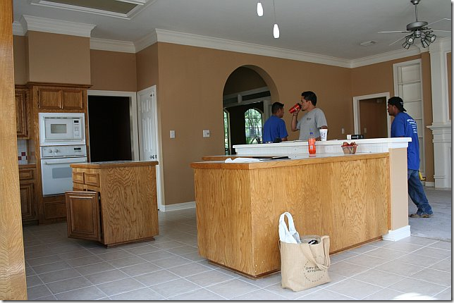
The kitchen had never been updated.  It was stuck in the 90s with its light oak stain, white appliances, checkerboard backsplash and tiny island.    You can see the door to the dining room before it was removed.


image

The kitchen is across from the family room.   The front door, study and dining room are through the archway on the left.


image

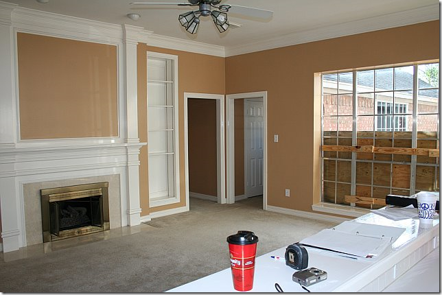
The family room with its sea of carpeting and ceiling fan had a dated fireplace though the molding was as asset.    The 3 bedrooms are off the doors in the corner.


image

Looking back from the family room into the kitchen with its dated white tiled floor, ceiling fans, and fluorescent lighting.  


image

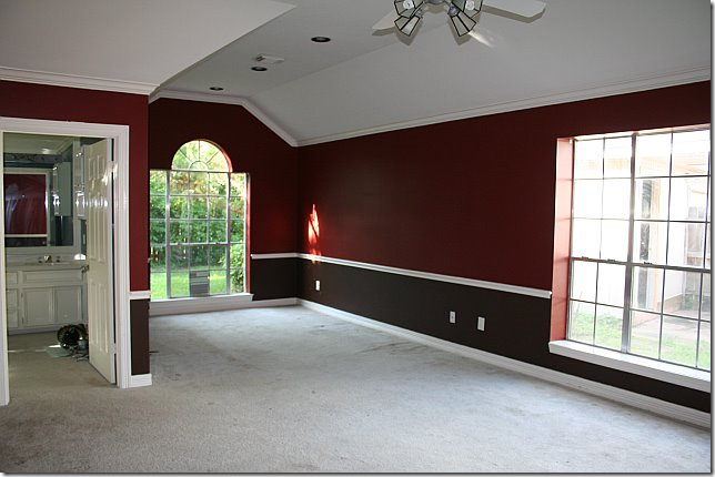
The master bedroom was painted like the dining room in two tones of red.  It is large with an attached sitting area.


image

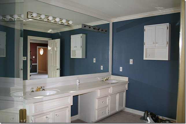
A blue bathroom to match the red bedroom?   Strange decorating!


image

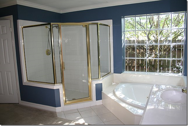
The blue master bathroom was large, with a tub and shower and carpeting and tile and brass. 


DEMOLITION:

image

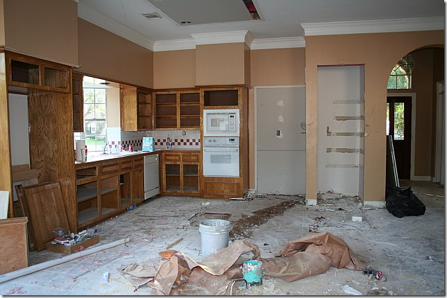
The demo on the kitchen was extensive.   The door to the dining room was closed off and the island and bar were removed.  The owner was able to reuse the cabinetry which was another huge savings. 


image

Without the island and the bar, it already looks so different!


image

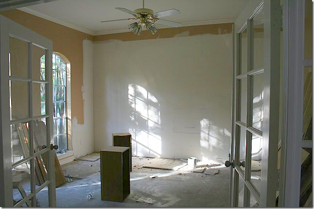
The front study without the paneled built in desk.


image

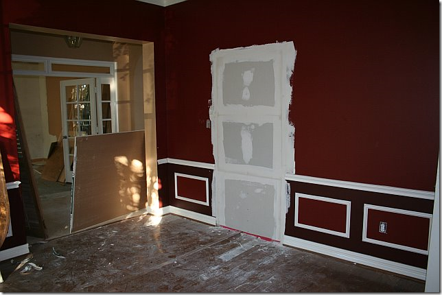
One of the changes was closing up the door to the kitchen, which allowed for much needed counterspace.


JUST TWENTY DAYS LATER, THE FAMILY WAS READY TO MOVE INTO THEIR NEW HOME:


image

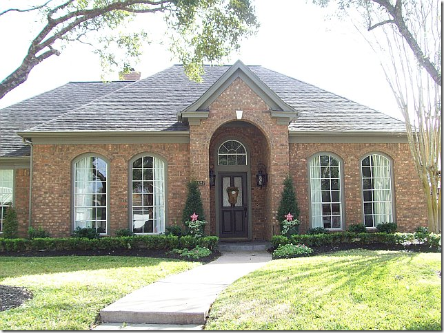
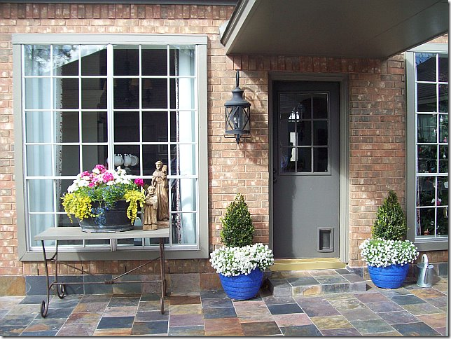
New landscaping was installed.   The trim was painted a deep gray.   New lanterns were installed next to the door.   Ready to go inside????


image

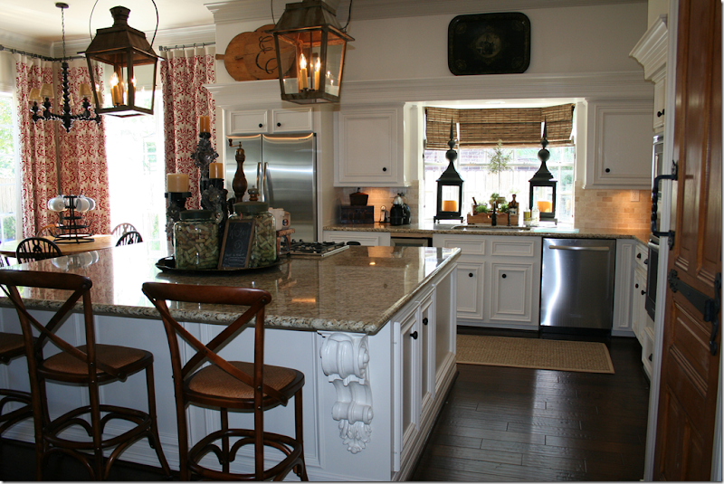
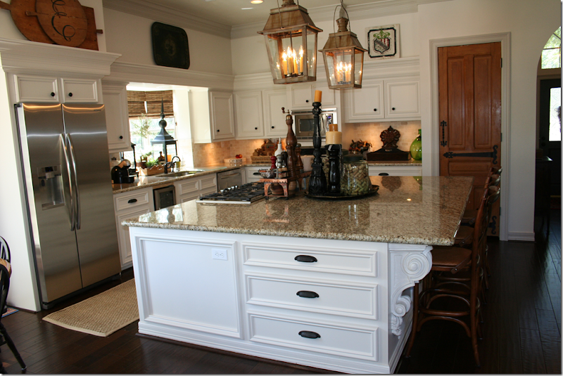
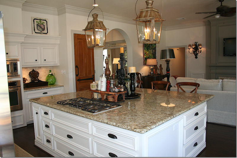
I told you!!!!!   Can you believe this is the same house?????!!!!   First, the flooring and carpet was replaced with hardwoods.   Next, the cabinets were painted a fresh white.   New stainless appliances were added.   And instead of a bar and an island – one large island was built.     Next, granite countertops were added along with subway tiles.   The fabulous lanterns were the owners – she bought them at market 8 years ago and Alcon wired them for this house.   I love the lanterns in the sink window, along with the textured blinds – they add so much warmth, as do the curtains in the breakfast area.


image

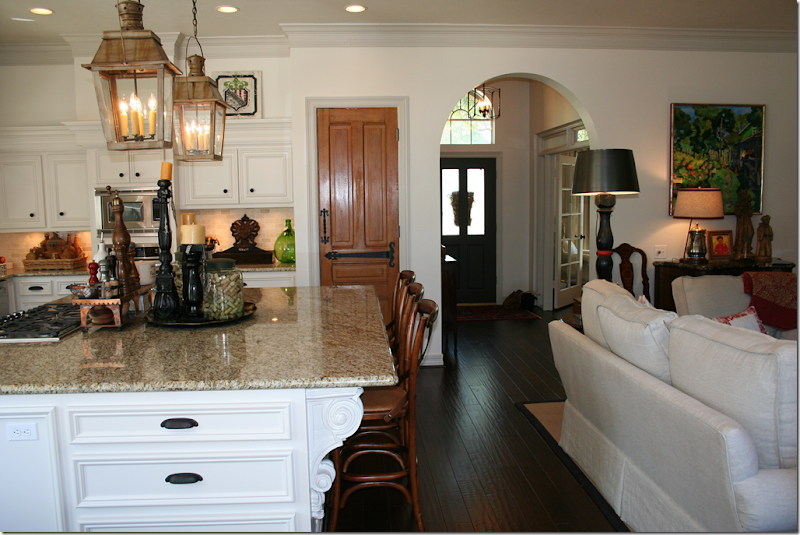
Looking towards the family room.   You can see where the added countertop space came from closing up the dining room door. 


image

And, notice the door to the pantry – it’s old and was bought at Atkins and new charming hardware was added to it. 


image

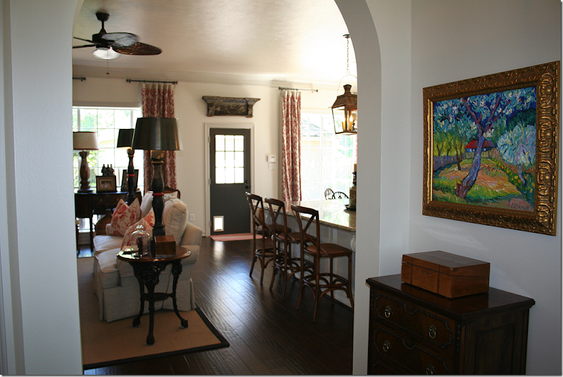
Looking towards the front door.  The study, with its French doors is to the right, the dining room is across from it.   Notice the lantern in the entry hall. 


image

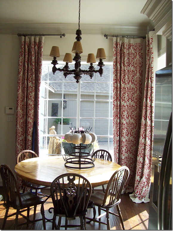
The breakfast room has a wood chandelier and red curtain panels hanging from pewter like rods.  


image

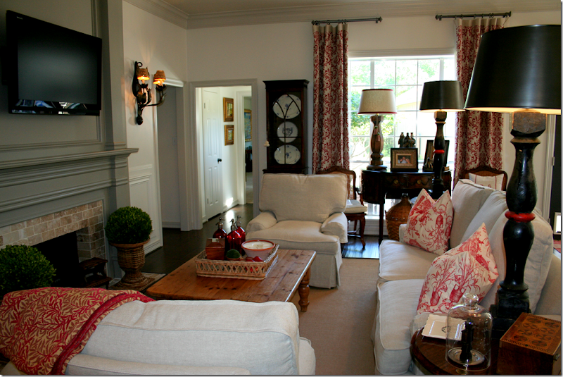
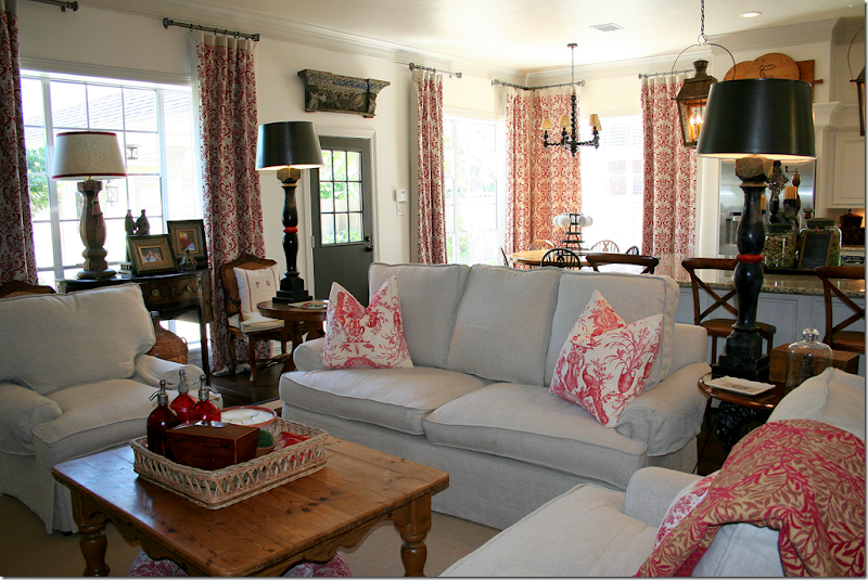
The family room and kitchen were painted white with gray trim.  The owner removed the built in bookcases next to the fireplace and painted the mantel a deeper gray.   The fireplace was also redone – with a light brick.  Seagrass covers part of the new hardwoods.   The same curtains in the kitchen hang here for continuity.    I love the small antique cabinet – it looks like it was made for that space!   Love all the white slipped furniture – this room is so cozy and warm and inviting.  


image

Looking back towards the kitchen.    I really love the dark gray on the door and the fireplace with the lighter gray on the molding.  It’s so chic looking.   Love the antique piece in front of the window flanked by two chairs with trendy pillows.    And I love the old wooden piece over the back door.   Just darling!!!!!  Isn’t this the cutest ever???


image

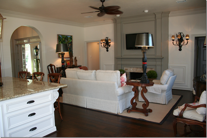
The owner installed sconces next to the fireplace and she added a new ceiling fan (it’s Houston people!!!)   By removing the bookcases, it all looks so much cleaner and bigger.   


image

Looking from the entry hall into the family room  


image

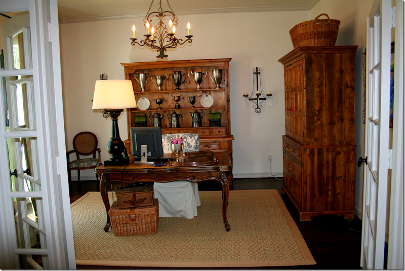
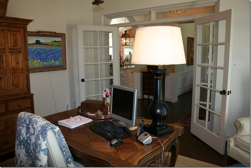
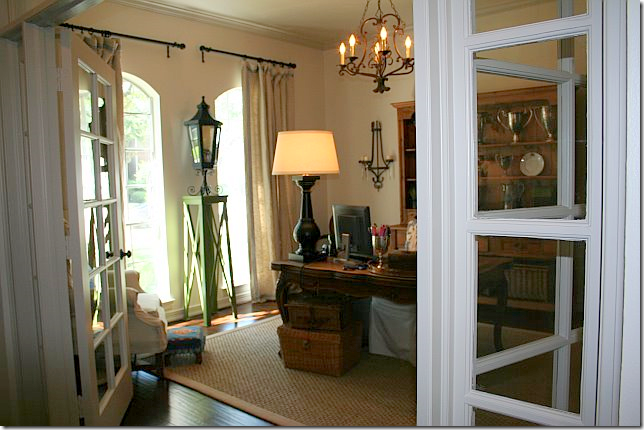
The front study used to have a wall filled with a paneled built in desk.   That was removed to make way for her collection of antique furniture.   The homeowner added a chandelier and sconces.   The French doors are a nice touch that came with the house.


image

Looking back towards the entry hall and dining room.  


image

And looking out the two front windows.   Cute lantern!


image

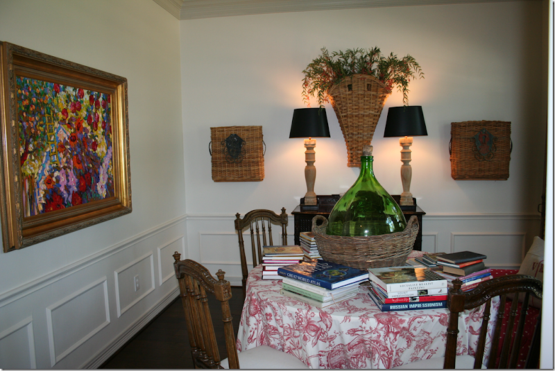
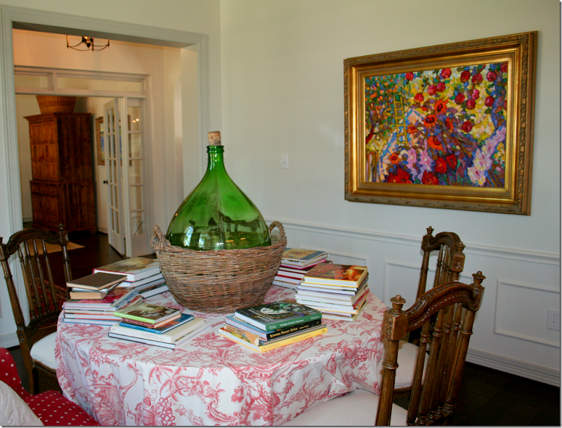
The dining room has a skirted table and an assortment of chairs surrounding it.   Cute baskets flank the console with its tall lamps.


image

Here you can see where the door to the kitchen was removed.  The owner uses her dining room as a library.  Love that wicker bottle.


image

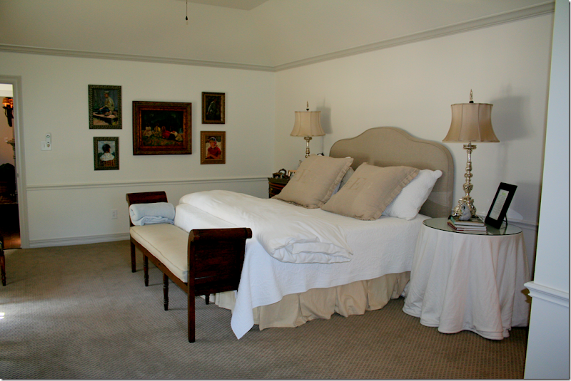
The once red master bedroom got new patterned carpet in a soft taupe.   Her bed is all white and taupe.  Love those silver lamps!!!!


image

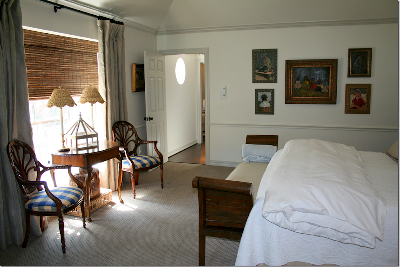
Overlooking the new back courtyard, the owner added linen curtains and textured shades along with her collection of antique furniture.


image

In the sitting area of her master bedroom, the owner added more white slipped furniture and an antique armoire along with the curtains and shade.   Cute scalloped wicker lamp shades match those in the bed area.


image

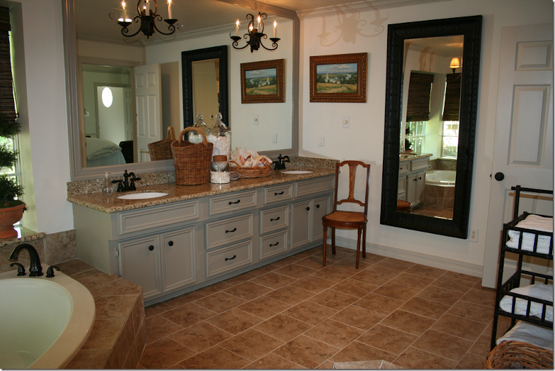
The once dark blue bathroom is now all white with the deep gray.  Granite was added to the countertops and new tile was placed on the floor and tub surround.   The mirror adds a cozy touch, as does her styling on the sink.   The bathroom vanity once had an open area to sit at, but she replaced it with more drawer space instead.  Gray painted molding added to the mirror makes it look more substantial. 


image

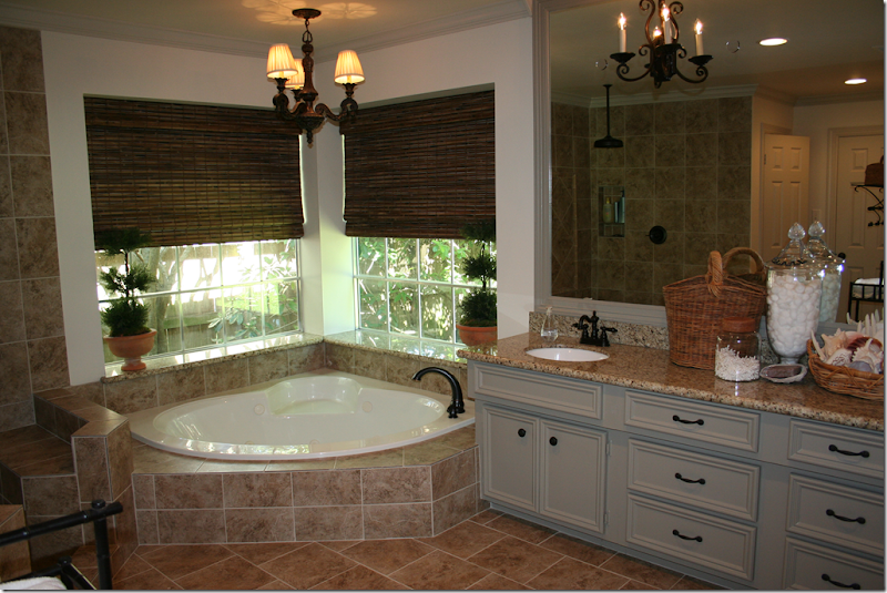
The owner added sconces and a light fixture over the tub, along with textured blinds. 


image

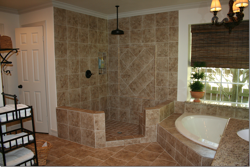
The dated brass doors were removed and the shower was given a complete facelift in the new tile.  New plumbing fixtures were added throughout the bath.


image

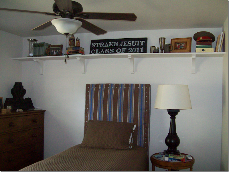
Here’s a peek at her son’s room with its cute striped upholstered headboard.


image

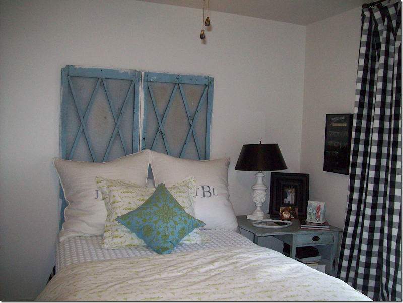
Her daughter’s room is darling with old shutters for her headboard, a charming blue painted side table and black and white check curtains.  So cute!


image

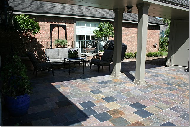
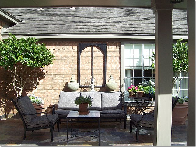
In the back, the fence between the garage and the house was removed, making room for a large courtyard, which was paved in slate tiles. 


image

The master bedroom overlooks the charming courtyard.


image

The back door today. 


image

Finally, it’s hard to believe – the house went from this…..


image

To this in just twenty days.   Unreal.


Thank you so very, very much to our homeowner who so graciously shared her house with us!!!