Beautiful antiques from Tone on Tone in Bethesda, Maryland. All the Swedish antiques in this story are from this wonderful store HERE.
Soon to be entering my fifth year of blogging, I have to confess it is sometimes hard to find new material to write about. I mean, how many times can I write about my formula for curtains (here?) Or why slipcovers were made for families with young children and pets (here.) Or about Grey Gardens (here and here.) Or Something’s Gotta Give (God, who knows how many times I’ve written about THAT house – but this story shows you how to get the same look here!)
So, always desperate for new stories, when someone gives me a tip, I jump on it and hope readers will be interested. Sweet Artie from Colour Outside the Lines has given me some great stories throughout the years. Why, I have no idea? But bless him – he comes through when I have no idea what to write about. A few days ago, he showed me a couple of articles about a house in Chevy Chase, Maryland whose interiors actually looked more like a Houston house. Artie thought it was a simple story about a house, but as I started delving into the story it was one surprise after another – the best kind in real estate sleuthing there is!!!!
The simple story begins with an article about a couple who bought a house in Chevy Chase. I’m struggling how to explain the story and tell it – should I should just lay it all out at once or let it evolve like I discovered it and allow the surprise to play out naturally. I think I’ll do that. So….let the fun begin:
House #1: The Gatehouse
This is the story is about a prominent couple who moved from Missouri to Maryland. Their home in Missouri was filled with English antiques, many inherited from the owner’s mother who actually built the house the couple lived in. Linda, the wife, wanted a lighter look in her new home but was stumped as to how to go about the change from dark mahogany furniture to the newer, brighter, more neutral interiors. Luck would come from a visit to Tone on Tone, an antiques shop in Bethesda that specializes in Swedish furniture. Together, owner and designer Loi Thai and Linda came up with a plan to first refurbish the house and then the furniture.
Much of the darker English pieces were sent back to their base home in Missouri where they eventually plan to move back to. Their new Chevy Chase, Maryland house was originally a gatehouse on a large estate, built in 1937. It had good bones – beautiful molding and tall windows which attracted the owners. Linda liked the cozy feel of the house and knew it could have more of the casual, country atmosphere that she now desired.
Meeting Thai brought everything together – the light, painted Swedish antiques he sold were unpretentious and had the patina she was seeking. As soon as the papers were signed, work on the house began. First, the dark hardwood floors in the house were stripped and whitewashed to a light color. Next, the walls were painted a soft gray. Thai kept a few of the wood pieces to anchor the rooms – most notably one of a pair of sofas and the dining room table. Light linen was chosen for the upholstery and a dressy gray silk became curtains – adding a sparkle, much like jewelry, in contrast to all the painted, peeling surfaces. Old, gray and whitewashed architectural elements were added, as were botanicals in lieu of oil paintings. Much of the silver and china, including a large collection of Old Paris was inherited from the mother-in-law and fit in perfectly with the new décor.
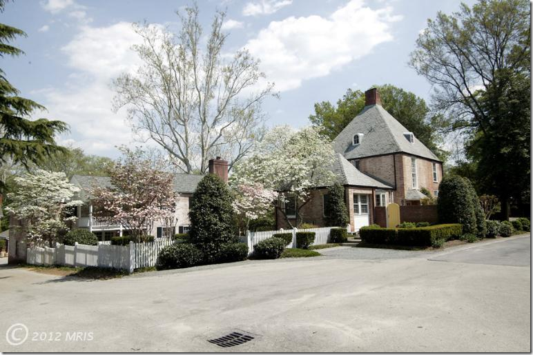
The 1937 former gate house sits at the top of a small hill.
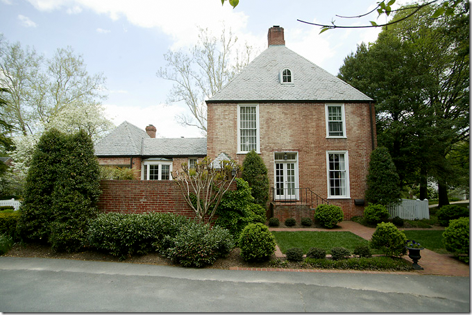
A side view of the house shows the decidedly French roof. Behind the brick fence is a terrace.
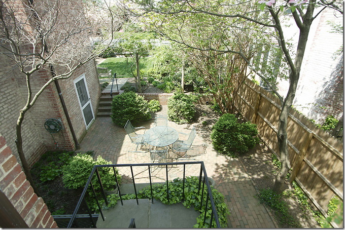
One of the brick terraces on the side of the house. There are several different terraces on the property.
The back yard is set inside a white picket fence.
As luck would have it – I was able to find the original real estate listing for the Gatehouse – which shows exactly what was changed when updating the house.
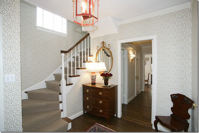
BEFORE: This is how the entry hall looked when the house was bought – dark hardwood floors, wallpaper, and dark English furniture. Pretty, but dated.
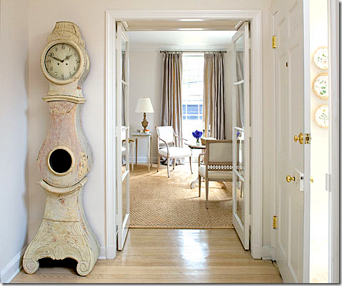
AFTER: Linda and Thai lightened the floors and painted the walls a soft gray. The antique Mora clock is the iconic piece of Swedish antiques. Here, glass French doors open onto the long living room. The room has several seating arrangements – the one seen here overlooks the front yard.
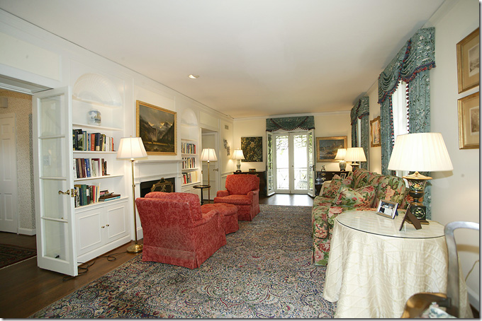
BEFORE: The living room is rather long and narrow. The fireplace divides the space. Traditional curtains with cornices hang at the windows and French doors.
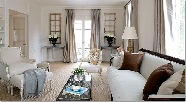
AFTER: Wow. What a difference!!!! The living room is updated with a textured diamond patterned seagrass rug. Gray silk curtains hang at the windows adding sparkle. Light linen covers the furniture. Antique shutters, salvaged from a Swedish castle, sit above Swedish demi lunes while framing the French door. The sofa, one of two (the other is in Missouri) anchors all the lightness. Dark brown pillows pop on the light fabric. I love the new décor with all the Swedish and French antiques. It’s so soothing and quiet – yet cozy at the same time. It really does look like a Houston house.
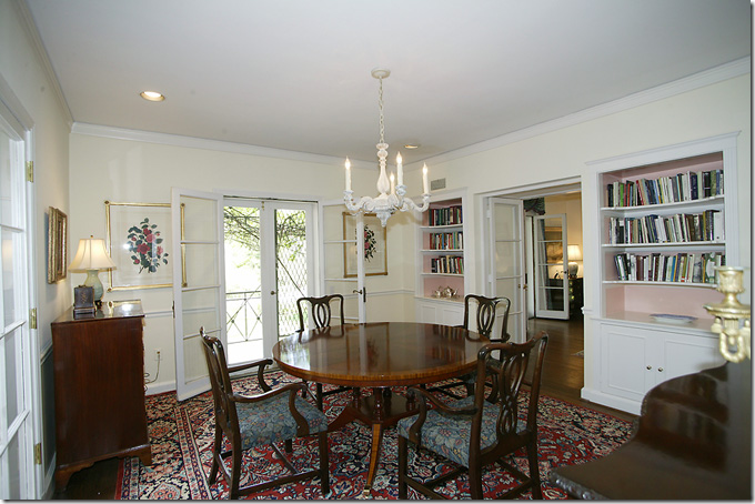
BEFORE: From the living room you enter the dining room with its French doors that open to a balcony.
AFTER: The dining room with the original dark dining table is now paired with light Swedish side chairs. Tall columns with urns flank the window. Love those!!! And a bell jar chandelier gives off soft light, along with sconces.
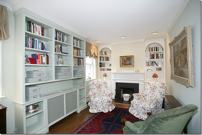
BEFORE: The library with built ins and a classic fireplace mantel.
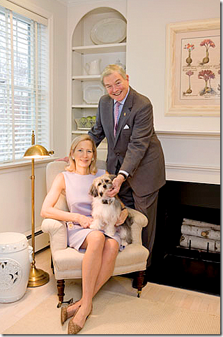
AFTER: The couple pose in the library – with its whitewashed floors and seagrass rugs. Above the mantel botanicals in light frames hang instead of oil paintings. White garden stools are used in different rooms instead of side tables – a great, economical choice.
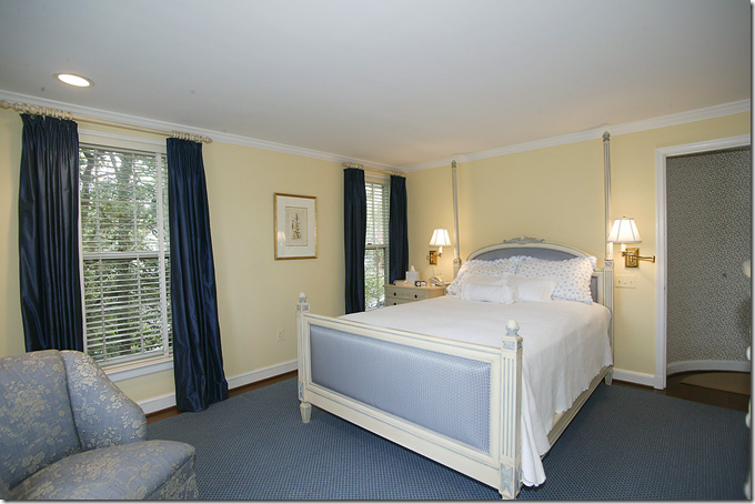
BEFORE: The master bedroom was blue and yellow.
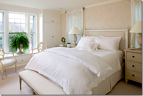
AFTER: The bed was placed on another wall, between the two windows. A Louis XVI style headboard is paired with Swedish antique chests.
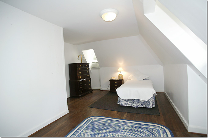
Before: the guest room with eaves wasn’t decorated.
AFTER: The once barren room is now a charming French styled bedroom with blue and white toile wallpaper. So cute! One all over pattern wallpaper is great in a room with sloping eaves. The pattern tends to camouflage all the strange angles – as you can see here.
Linda and her her husband happily lived in the Gatehouse for two years, but in 2009, a For Sale sign changed everything. Linda, who had had her eye on a nearby Tudor, saw the For Sale sign one day and quickly snatched it up. Moving to a new house just two years later made things easier – Linda contacted Thai at Tone on Tone to again help out with the new house. Just like before, the Tudor needed remodeling and some new furniture, though much of the same pieces were reused.
But, before we take a look at the Tudor, luck came into play, AGAIN. The couple who bought Linda’s Gatehouse in 2009, just put it up for sale again. Which means we can get a glimpse of how much the new owners changed Linda’s Swedish Gatehouse:
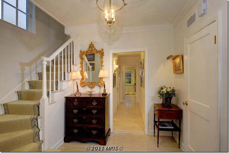
Here is how the Gatehouse looks today. The new owners kept the light floors and light walls. They changed out the stair runner and instead of light Swedish furniture, the house is once again filled with dark English case goods.
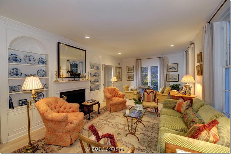
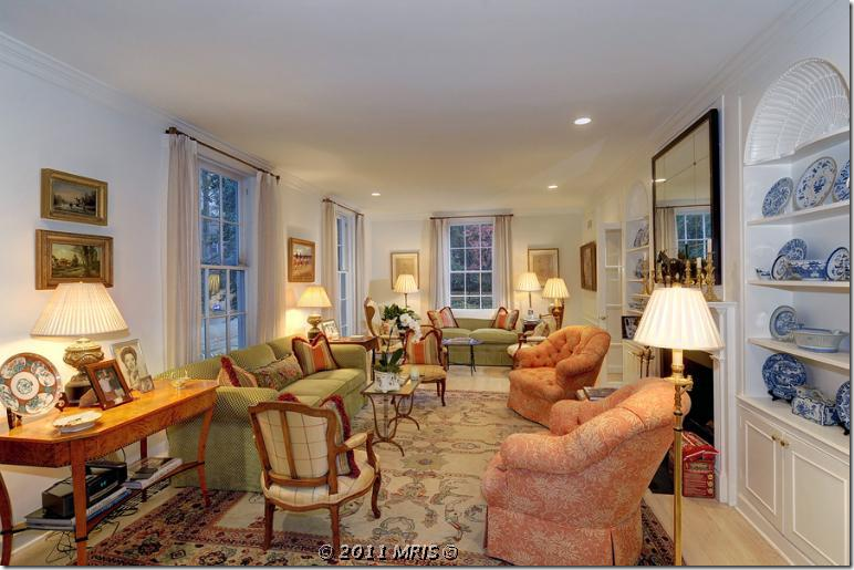
What a huge difference the living room looks with the new homeowners!!! It is now a riot of color with Oushak rugs and orange and green fabrics. Blue and white porcelains fill the shelves. The curtains are a plain linen – something of a surprise.
Looking the other way. What a difference from Linda’s Swedish interior. It is so bright and cheery. Beautiful burled wood side table.
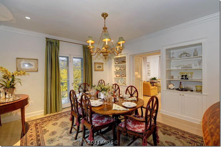
The dining room has another patterned rug and a brass chandelier. The curtains here are green stripes.
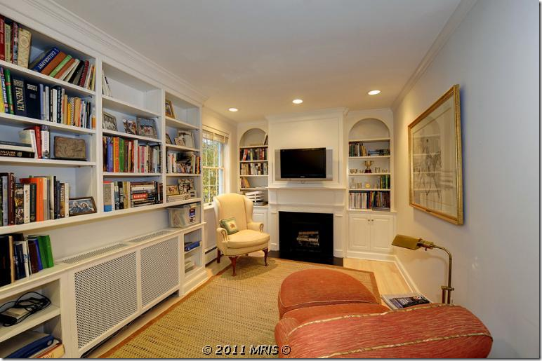
The tiny library has a seagrass rug and more orange and yellow fabrics.
The master bedroom is green and yellow. They kept the same furniture arrangement as Linda had it. They added a window seat cushion.
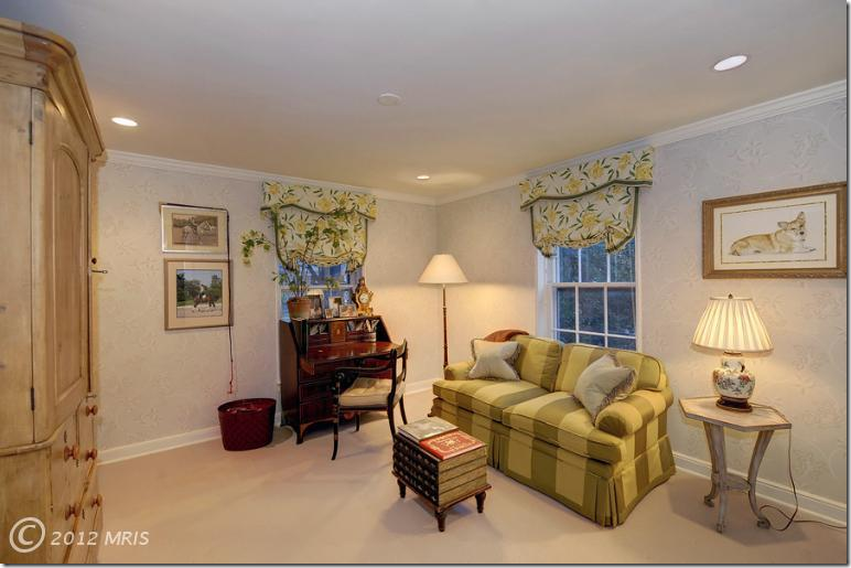
Off the bedroom is the sitting area with matching sofa and window treatments.
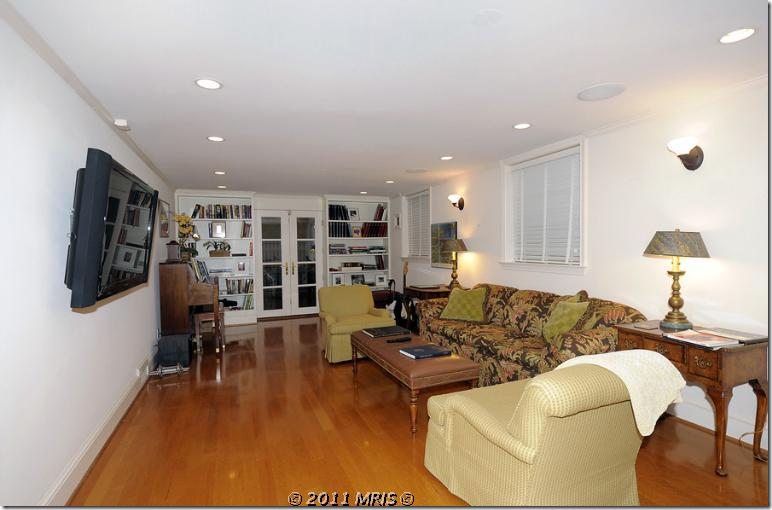
The den, which I have no pictures of from when Linda live here, unfortunately.
So…..which décor of the Gatehouse do you like best – Linda’s clean, light Swedish décor, or the bright, colorful English décor of the new owners? You know which one I prefer – but I also do like the colorful décor.
House #2: The Tudor
Now, where did Linda and all her Swedish furniture move to?
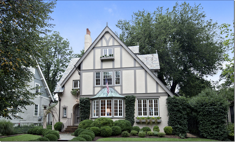
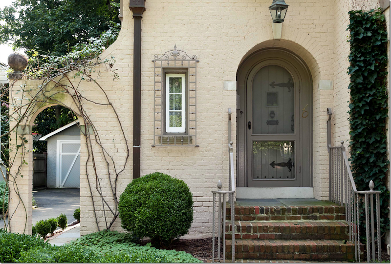
This is the 1920’s Tudor that Linda coveted before it was even put up for sale. Once the for sale sign went out – Linda and her husband bought it and moved in, after upgrading the interiors – which only took a month! Notice the charming third story window and window box and the beautiful patina covered copper awning. There’s an arch on the left side of the house and a vine covered gate on the right. Boxwoods are just the right simple landscape for a Swedish interior.
A view of the side of the charming Tudor with the basement windows on view.
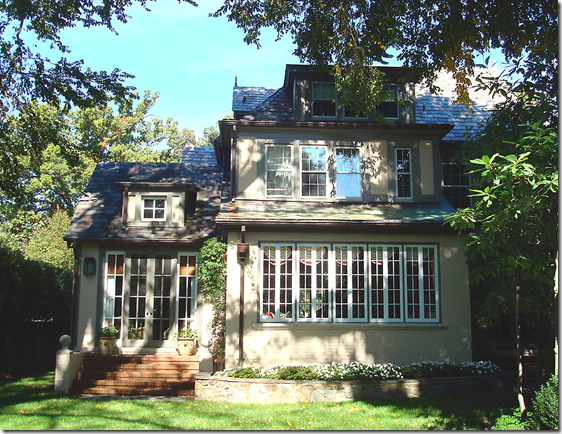
And the back view – with the many original latch windows.
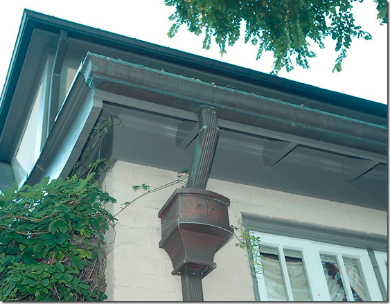
A close of the patina covered copper drains and gutters.
The front door is wood panels with original large hinges. Notice the charming window with its grill. On the left notice the cute new garage door that Linda installed. The Tudor is about twice as large as the Gatehouse, but, at 4 Ready to go inside? But, wait…..
As luck would have it yet AGAIN, I found the original real estate listing so we can see what the Tudor looked like before Linda and her husband moved in.
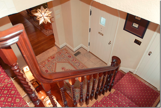
BEFORE: The entry hall with red patterned carpet and stone floor. Veddy English – including the star chandelier.
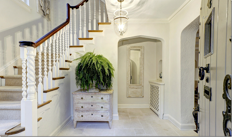
AFTER: “It was charming and unusual,” Linda tells why she was attracted to the Tudor. “There was no big addition, no kitchen-family room combination. It retained a lot of its original character.” The Tudor is also almost twice the size in square footage as the Gatehouse. Notice all the changes made – the gray paint, the lighter trim, and the painted staircase which really shows off it’s beauty now that it is painted white. The floor was replaced and is now a white limestone. A neutral carpet covers the steps. An antique Swedish chest and mirror finish out the new décor.
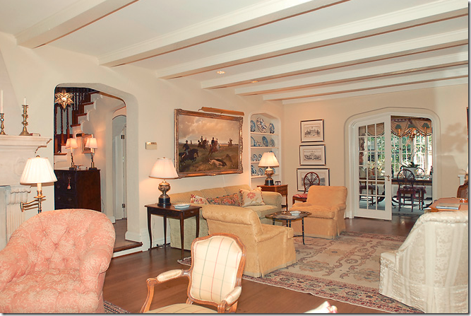
BEFORE: The living room – this room is also long and narrow just like the Gatehouse. So bright and cheery. Hmm…
And like the Gatehouse, it is broken up into a few seating areas. Gee, something seems familiar….
The view from the opposite direction. Something really DOES feel familiar here?????
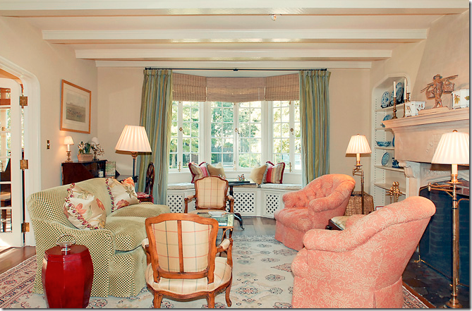
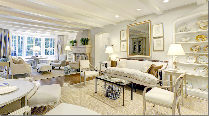
AFTER: The beautiful living room – Linda painted the walls, but kept the floors dark here! She used the same wood framed sofa and Swedish chairs. In order to make the same large rug work here – she cut it into two pieces. In the mirror’s reflection you can see another tall piece not previously seen before. Isn’t this just a wonderful room? Do you like this living room better than the Gatehouse living room? I do.
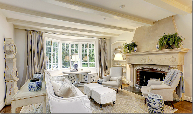
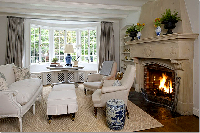
In the front part of the living room that overlooks the street, a white painted frame sofa sits in front of the beautiful stone fireplace. A Swedish console table sits behind it – as does the Mora clock. Two antique chairs flank the fireplace – with blue and white garden stools next to them. I love the table in the window – and all the blue and white used in this part of the room. Just beautiful!!!! Notice she used the same curtains here – she had to cut down some rods and also paint some in order to reuse them here in the Tudor house.
And,again, cute slipcovered ottomans take the place of a coffee table. Love the roaring fireplace.
Close up of the two antique arm chairs that flank the fireplace.
Linda poses in the opposite side of her living room. Notice the two demi lunes are now pushed together to make a round table. Some of the new fabric Thai chose for Linda is off white indoor-outdoor fabric that is a good alternative to slipcovers.
This bookshelf holds her mother in law’s collection of beautiful Old Paris with its white and gilt colors, so pretty with Swedish décor.
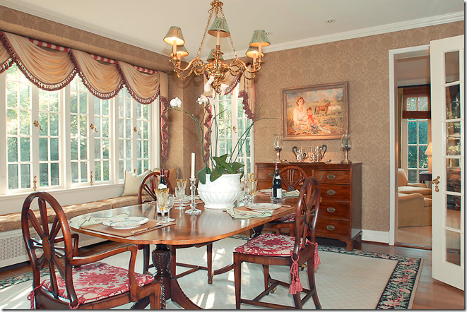
BEFORE: The dining room. Hmmm – does the light fixture and table and chairs look familiar? OK !!! I finally put it all together. The people who sold this house – the Tudor – toLinda, bought Linda’s old house, The Gatehouse!!!! Go look back at the pictures of the Gatehouse that is now for sale!!!! In other words, they traded houses. AND what is really strange – is that after only two years – BOTH houses are now for sale AGAIN!!!!! Do you have this all straight? I kept emailing Artie – saying, “you won’t believe this,” because he thought this was just about one house – not two – and certainly not two families who traded houses. It’s interesting to me how much prettier the colorful furniture looks in the Gatehouse – as opposed to the Tudor! Agree? It could just be the photography. But, I think they both made a good trade.
Picture a friend of yours in their house – and then, picture trading their house with yours. How would the two houses look with each other’s furniture? Can you think of someone you would trade with and vice versa. Well, I’d love to trade houses with Pam Pierce – but something tells me she wouldn’t want to!!! Plus, I would want to keep Pam’s furniture for myself. She can keep all my old furniture – have at it!!
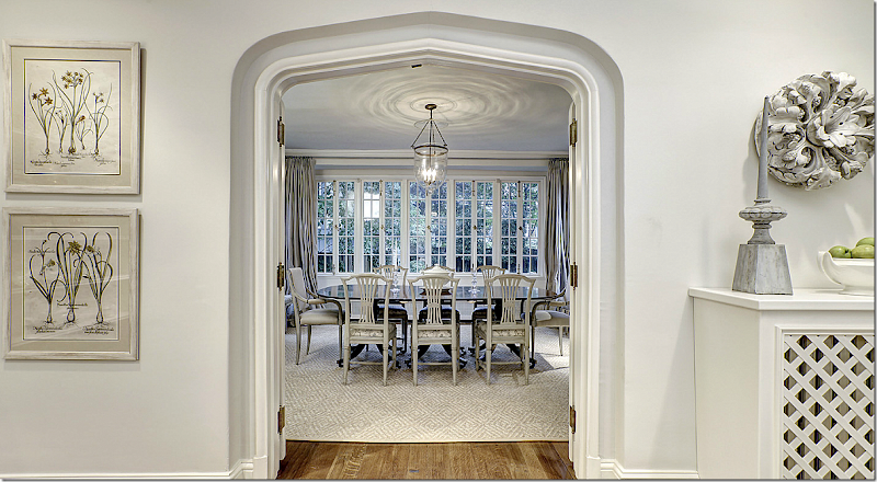
AFTER: From the living room, the French doors open into the large dining room.
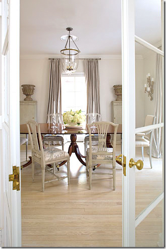
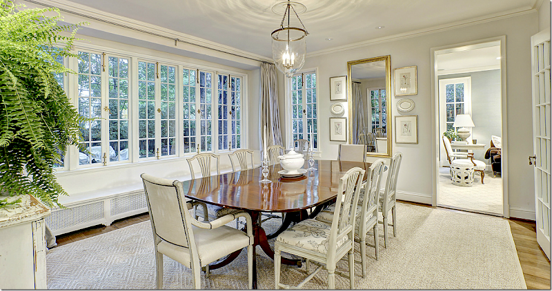
AFTER: I love the subtle fabric on the side chairs. The beautiful set of windows overlook the back yard. It’s all so gorgeous – I just love what Linda and Thai did with this house.
Another view showing the table set smaller, with less chairs around it.
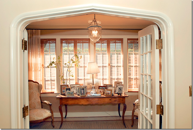
BEFORE: Off the living room is the small sun room, filled with French furniture and another bell jar chandelier. This chandelier ended up in the foyer at the Gatehouse.
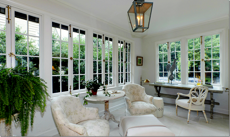
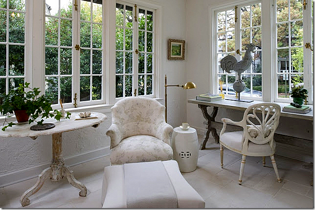
AFTER: Perfection! New white limestone floors set off the light Swedish furniture. The antique arm chairs are covered in a muted fabric with touches of blues and green – perfect to pick up those colors in the Swedish antiques. Beautiful lantern – just right for the sunroom – as is the zinc rooster.
Another view of the room – just perfect for morning coffee.
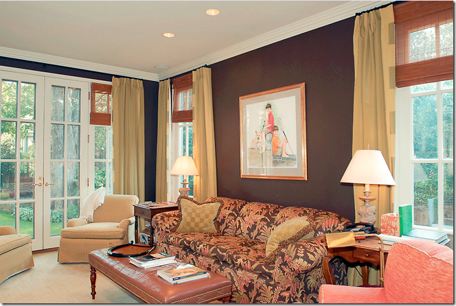
BEFORE: The library is painted a dark brown with gold curtains. Go look back at the Gatehouse to see where this sofa ended up. It doesn’t look as good as it does here though. The orange chair is in the library, remember?
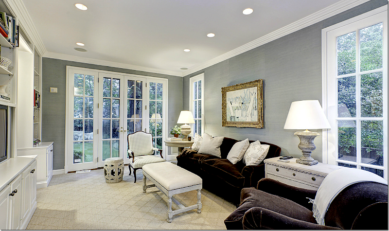
AFTER: The library has brown velvet furniture – perfect for major TV watching. Swedish chest and table flank the sofa – with wonderful urn lamps. The white garden stools reappear here. Patterned sisal rug.
The walls in the library aren’t painted – rather they are aqua colored grasscloth wallpaper.
BEFORE: The kitchen got a major remodeling. No way would Linda have dark stone and a yellow backsplash.
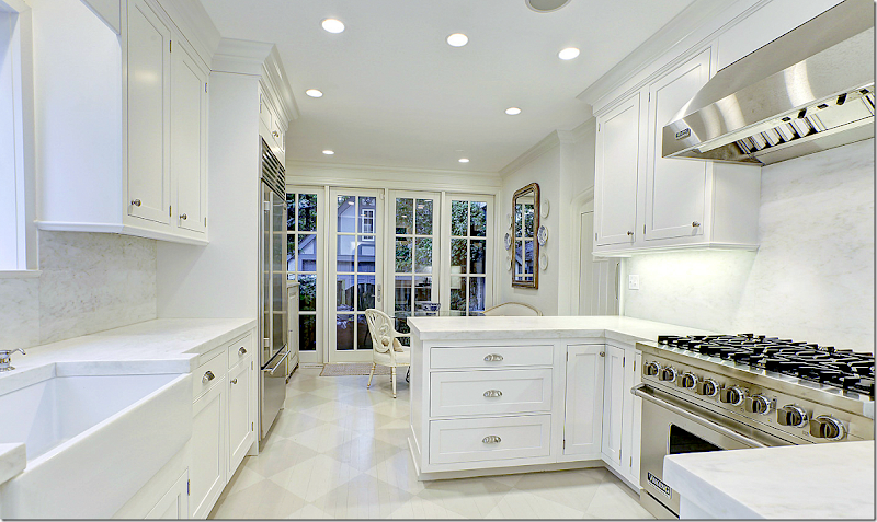
AFTER: The new kitchen was the biggest change. To save cost – Linda used builder grade wood on the floor, knowing it was just going to be painted over in a beautiful gray and white checkerboard pattern. White marble countertop and backsplashnand a farm sink, along with stainless steel appliances bring the kitchen into the 2010s.
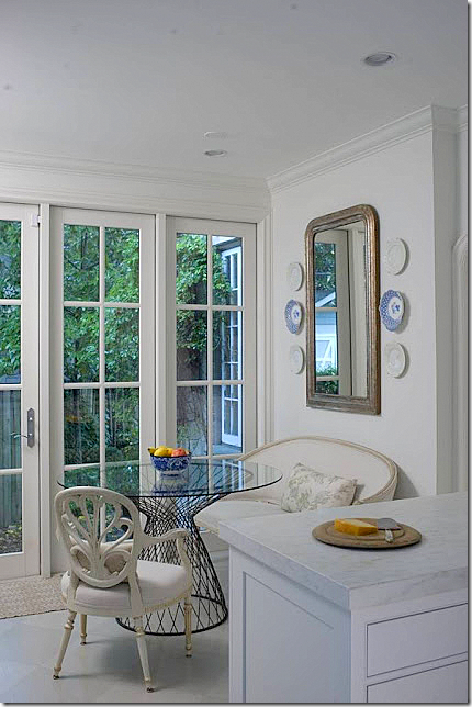
A French settee with a muted patterned pillow are paired with a contemporary wire table. Love all her mirrors surrounded by plates.
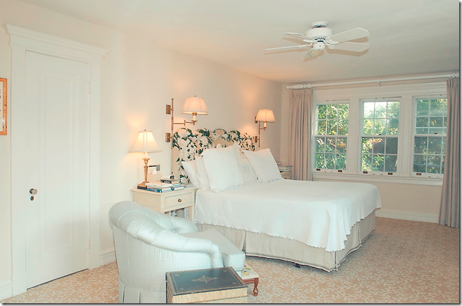
BEFORE: The master bedroom has the same headboard, but in a different fabric that is now in the Gatehouse. It looks like they used the curtains in this bedroom in the Gatehouse’s living room.
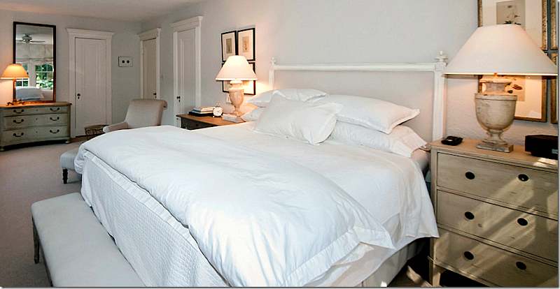
AFTER: An antique chaise sits in the extra seating area. Muted fabric is used on the windows. The bed is all white and ivory. Love the painted desk next to the bed and the two sets of four botanicals.
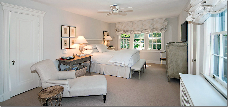
The bedroom from the other angle. Notice how pretty the molding around the doors is. Beautiful chest with mirror on the far left. Urn lamps – Linda really likes the urn shape – just like me.
The extra bedroom becomes a sitting room/office. Love the balloon shades. The walls here appear a little darker than most.
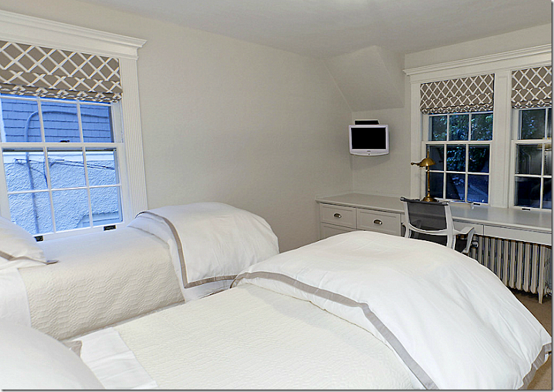
The blue and white toile is abandoned for white and grays in the guest room.
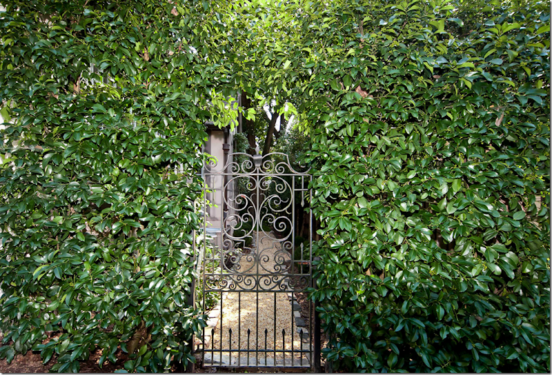
The vine covered iron gate leads to the side yard.
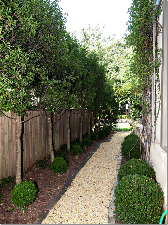
Perfectly manicured and landscaped side yard.
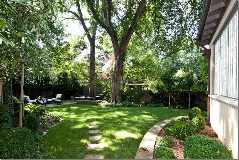
The shady back yard – the white covered fabrics tie in the outside with the inside.
The back terrace.
Both the Gatehouse and the Tudor house are now for sale, again. Linda and her husband are planning to move to a smaller space in Washington, since they are returning to their home base in Missouri. The other couple, in the Gatehouse – I have no clue where they are going. Maybe they will buy back their old house again? Who knows????
Swedish Decorating Tips from Linda and Loi Thai of Tone on Tone:
taken from the Washington Post article by Terri Sapienza.
If your house is dark and your color scheme is red and blue and yellow – how can you make the change to a light, neutral house easily?
1. Start small – if you are worried about making the commitment to such a big change, start with a small space in your house such as the entry hall or guest room.
2. Paint the walls in a lighter color. Thai’s favorite neutral colors are Benjamin Moore Classic Gray and White Dove and Farrow and Ball – Clunch. These two BM colors are used throughout the Tudor house.
3. To introduce Swedish painted pieces – start slow. Replace the furniture that you like the least, first. Thai says sometimes 1 or 2 pieces may be all you need to freshen up your space. If you like the look – keep changing into the more public areas of your house.
4. Don’t go overboard – too much Swedish furniture will eventually look dated. Mix Swedish with other styles – collect and mix. Mix painted Swedish with mahogany – Thai finds it more interesting.
5. If your sofa is dark, add light accent pillows and drape a neutral throw over the back.
6. If you have a matching set of furniture – break it up and use the pieces in different rooms.
7. Slipcover with light neutral fabrics, add patterns with pillows and throws (and drapes, says me.)
8. Linda uses blue-and-white French ceramic tiles instead of coasters – what a great idea!
9. Instead of built ins, use furniture like the sideboard Linda uses in her kitchen.
10. Kooboo wicker baskets are used everywhere – to hold towels and magazines and the dog’s toys.
Links to the stories above:
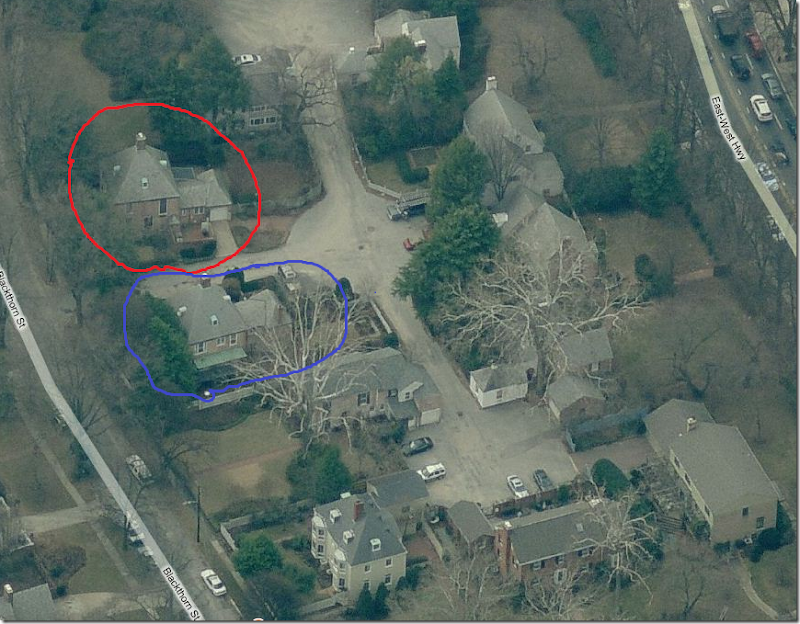
An interesting tidbit about the Gatehouse. According the Linda, the 1937 house was actually the gatehouse for either a larger estate – or the Chevy Chase neighborhood. When looking at the property on Google maps, I was stunned to see there were actually two identical gatehouses – on each side of the street. According to the real estate brochure, the Gatehouse is cited in the Library of Congress – as: “one of two Christopher Wren 18th century English architect residences inspired to function as a gatehouse to the courtyard and community within.” The gatehouses do look rather large for the neighborhood behind them, perhaps over time, it was made smaller by the highway expansion behind it.
Here are the Google maps pictures of the two identical gatehouses! Hard to imagine what a luxury they were back in time.
The blue house is the Linda’s gatehouse that is now for sale. The red house is the identical gatehouse across the street. The back portions of both houses were probably added on at a later date.
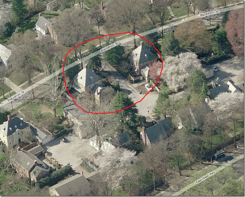
This view shows the back side of the two twin gatehouses. You can see how the roofs are identical, as are the attic windows and fireplaces. The houses are called English, but they look more French to me. That’s all, folks! Hope you enjoyed this story of these two trading houses.
And if you live in Florida, or will be visiting, please be sure to mark your calendars for this event!!! I wish I could be there!!!

















What stunning transformations of these two homes. I am completely charmed by the tudor...so much character inside and out. Love the outdoor areas - gate, paths, and terrace, and the warm and livable interior is fabulous!! The kitchen redo is stunning with all of my favorite elements and the dining room...amazing!!
ReplyDeleteLoved,loved,loved this exciting tale of two houses!!!! I would move into the tudor house in a heartbeat! I would love to swtich houses with a few different people but like you I'm afriad no one would be game! LOL Okay, I have to go back and look at all the wonderful eye candy....again!
ReplyDelete~Des
One of your best posts yet. Thank you!
ReplyDeleteThank you for this fabulous post. Lovely!!
ReplyDeleteSo charming and so interesting! I learn so many new things from you..thank you for the significant amount of work it took to put this story together. Love it.
ReplyDeleteFantastic Joni... The changes with the Swedish style really made all the difference... I still love a light interior... xv
ReplyDeleteWhat a TITiLATING tale of two houses!Super Sleuth Joni at your service! Yay Artie, too!
ReplyDeleteYou are such an amazing detective I love this story. While I love color after seeing the houses before and after Linda was finished with them I prefer Linda's version. The houses were so light and airy and evoked a sense of peace. Thank you to you and Artie for sharing.
ReplyDeleteHugs!
Debra
I really have to appreciate you for sharing this amazing information with everyone. The house looked beautiful and elegant in the Swedish style and the light interior made a huge difference in the house. I loved the pictures and the description of the pictures you have shared with everyone. I really enjoyed reading the blog it was really fun and also people can learn a lot from this blog.
ReplyDeleteThat was such fun! Thanks for sharing that, Joni. You put such effort into your posts and I, for one, love them! Thank you for all you do. As good as, if not better, than a lot of the magazines.
ReplyDeletejoni, this type of post is when you are truly at your best. thanks for all the sleuthing and for taking us on such a fun adventure!!!
ReplyDeleteJoni you are now officially Super Designer Sleuth!!
ReplyDeleteI adore the final Tudor makeover. As I was born in Missouri I can see why they will want to move back ....
PS Artie is just the best!!
xoxo
Karena
Art by Karena
Hands down, Linda's Swedish style is my choice. Thanks for including the real estate listings. I grew up in DC and was dying to know where these 2 houses are as I was reading your post. Now I know why we moved to Atlanta -- DC and the surrounding areas are way out of our league.
ReplyDeleteThanks for another great post!
Maureen in Decatur
I saw the Tudor in the Washington Post a few months ago and Linda's ideas are beautiful. I must tell you that all of the other decorating shown is totally Washington DC style. Dated or not, this is what you see in DC and its environs very often.
ReplyDeleteWow! What an fascinating post. I love Linda and Thai's style. Thank you.
ReplyDeleteMC
This was so fun. Thanks for the great read!
ReplyDeleteI find it extremely interesting to see people's design choices in the same house. It's fascinating to see how people view things differently. Great sleuthing job Detective Joni.
ReplyDeleteLoved this post thanks for sharing!
ReplyDeleteYou did this story much better than I ever could!
ReplyDeletexo,
A
What a fun way to begin my day!! A large mug of steaming coffee and this wonderful eye candy..its so funny as I was looking at the tudor house after the 2nd pic I thought it looked like they had traded homes..and sure nuff... Joni, thank you so much for always writing a wonderful blog..I always look forward to what you will share..you have taught me much.
ReplyDeleteSharon
Joni,
DeleteI am never disappointed when I come to your blog! Both homes are gorgeous. I have only been blogging for 7 months and I sometimes have blocks on what to post. I don't know how you do it after five years! You seem to deliver great material and beautiful images. Thanks for inspiring me for the last 5 years.
This post, and many more that you have written, are why I so love your blog. There are many niches for bloggers, dyi, family, fashion, etc., but no one does it better than you. You peal back the layers and analyze like no one else. Thank you.
ReplyDeleteWay to go Watson! I have been digging through and rereading many of your old posts in search of images for my new addiction pinterest. I was marveling at
ReplyDeletehow your extensive research, healthy dose of humor and your trademark personality enlighten every post. You never take yourself too seriously and that along with your fabulous taste sets you apart from all the other bloggers out there!! Bring back the Starbucks Route posts!!
thanks Cindy!! you are way, way too sweet!!!
DeleteJoni
Great to see such wonderful homes of our former Missouri Governor and US Senator, Kit Bond and his wife, Linda. Thanks for sharing! (You should see the Bond Family homes in Mexico, Missouri - gorgeous!)
ReplyDeleteYep! that's who it was. would love to see their home base.
DeleteWell Joni, we can all see how busy you have been digging and sleuthing; what fun! Fabulous post. Linda and Thai did a gorgeous job on both homes. Very interesting to see two completely different styles of decorating in each of the two homes. Thank you for sharing such a terrific story!
ReplyDeleteThis is a perfect example of why you are the best. I live in DC and read the Washington Post article but they didn't scratch the surface compared to you!! LOVE being able to see the two houses side by side with the different decors. My favorite is Linda's living room in the Tudor. Gorgeous!!
ReplyDeleteThank you, Joni, for all of the work that you do to make reading your blog such a pleasure and education!!!
ITA!!!
DeleteI love this new format for messages. thanks y'all.
DeleteGreat post; no sign of your struggles to find things to blog about here. Post really showed the befores and afters to great effect. In answer to the question, I think the Swedish/French inspired interiors were best, ethereal.
ReplyDeleteYour post and the stark differences in the images brought to mind an old movie, "June Bride" with Bette Davis and Robert Montgomery, wherein a family's stuffy Victorian home is made over for a bridal magazine spread. The fussy gingerbread trim and heavy hangings were banished and the whole smartened up with light, pale tones - very handsome and I am sure a subtle tongue-in-cheek homage to, or send-up of, Elsie de Wolfe and her followers.
One word.... Gorgeous!!! Love the swedish look and the shop Tone on Tone! Thanks so much for featuring these homes. The lightness of the swedish decorating is like a breath of fresh air compared with all of the typical decorating in Maryland.
ReplyDeleteKat
What an interesting and beautiful post. I think I fall somewhere in between the ultra light of the Swedish decor and the period English. I really liked both houses, but thought the gatehouse was exceptional and lent itself to the Swedish decor more easily. I have to assume that the home owners have become great friends throughout this process. Now perhaps they will give you a peek at their new digs in Missouri.
ReplyDeleteIn looking back over the pictures I focused on the fact that the fireplace in the Tudor home was not centered in the living room. Was there any indication that this space may have been two separate rooms at one time. The dining room in the Tudor is also beautiful with the lovely contrast of light and dark.
DeleteI don't think so = if you look at the real estate listing you can see the floor plans, plus linda says that house hadn't been added on to.
DeleteI absolutely love reading your blog. I checked this morning hoping to see a new posting and to my delight here it is. The houses are so beautiful - I prefer the Swedish style as it is lighter and fresher and also more serene. But even more than that, I so enjoy your writing. You have such a gift and should know that it brings immense pleasure to so many. I don't know what I would do if I didn't get a dose of you during the week.
ReplyDeleteThat was a fun post!! I can imagine how excited you were when you put 2 and 2 together! I love Linda's Swedish decor - maybe you can do a part 2 in the future and see where Linda ends up next - Thank you JonI!
ReplyDeleteThe tudor reminded me of Lars Bolander's work. These homes are so stunning, Joni. Amazing how much the redo did for the Tudor style home. Love the rugs throughout the first home. Just beautiful.
ReplyDeleteHave a nice day, and thank you for sharing these beautiful homes.
Teresa
xoxo
This is why I always look forward to getting your posts. They are the best! You don't recycle the same pictures we see in magazines or all over the internet - you constantly seek out interesting stories and beautiful homes. And, I'm forever grateful that you introduced me to Pam Pierce (figuratively speaking unfortunately). Love her style and I too would trade homes with her any day. Thanks Joni!
ReplyDeleteMaura Tierney
The chairs in the "After" photograph of the Tudor sunroom are covered in Bennison Christmas Roses, a perfect match with Swedish tones of celadon, pale grey and beige on oyster linen. It's a ravishing room.
ReplyDeleteThanks Gillian - Mrs. Bennison!!!
Deleteso sweet of you to comment. I thought that was the Christmas roses, but was hesitate to state it without being positive. thanks for confirming!
Joni
I want that Tudor house! To me there's nothing quite as charming as those Tudor Eclectic houses built in the 1920's. Love those casement windows and French doors. Though I typically don't like painting over the original stained mouldings in a Tudor, I do have to say Linda's style is lovely. My house was built in the same year and I have the original stained mouldings (which we lightened a bit in cleaning them) and dark floors. The warm wood tones just don't go with the cool gray colors, so though I like the Swedish look, I don't want to overhaul the original woodwork to obtain it. I think I have to settle for adding some painted pieces amidst the mahogany and walnut and lighter upholstery and floor coverings. Can't begin to compare to a former U.S. Senator's house, though. Interesting story, and I recognized the original furniture in the Tudor as a house swap immediately. Don't you just love uncovering funny little twists like that?
ReplyDeleteThis was really fun! I much prefer Linda's style. Much, much. I was so pleased to see the painted harlequin pattern on the floor. I have ugly engineered (orange) oak and I am getting braver by the day!
ReplyDeletexo
Andie
I'm so glad you continue to write even when you feel like you are in a rut. Your stories AND humor keep me coming back. =)
ReplyDeleteI'm stuck in a rut too and have a question about none other than Sally Wheat's home. Did she ever divulge the gray paint color used on her shutters and gate?? I would be thrilled to learn the name if you happen to have it!
Thanks so much!
Christi {Bennett}
christiwbennett@gmail.com
Thank you so much for this post Joni!
ReplyDeleteIt's funny that I really loved the look of Linda's decor much more than the English. I like a bit of color normally but Linda did such a great job, every room in either house she did was beautiful! I don't think I can even say I liked one house better over the other, her decorating really MADE the house.
BTW, you are a great detective! Guess if you ever need a side job it could be a fun adventure.
Thanks again for spending the time to really show us both of these wonderful houses!
Belinda
I do enjoy your blog so much. It is so well written with wonderful stories and beautiful pictures. I differ in my opinion from everyone else about the neutral Swedish style, though. I much prefer the before pictures of the Tudor house, simply because I like color. There is just too much white in the Swedish remodel that the couple did. The gate house looked better when the new owners bought it and brought back color (like the before Tudor house). Beauty is in the eye of the beholder.
ReplyDeleteI think a lot of people prefer the color over the all white. I actually liked the look of the gatehouse all bright myself. it's just not my first pick, but i do like it.
DeleteJ
Every post you outdo yourself, Joni! What a great one and how ironic all the house switches and sales were. Quite the mystery but easy for an experienced blogging bloodhound like yourself! I loved the first house best and did like the Swedish look better, as well, versus the English. But, would happily live in either!
ReplyDeleteAdored the story & images. Such a great detective you are. Thanks xxpeggybraswelldesign.com
ReplyDeletegoodness gracious, this was a sight for sore eyes! there just hasn't been great stuff in the blogging world lately. this was needed and so enjoyed by me. the homes, the story, all of it. thank you, joni!! you were one of the very first blogs i ever started starting and you remain in a league of your own! xo, tessa
ReplyDeleteLove this post! So interesting, pretty and packed with wonderful ideas! Especially like the pairing of the light dining room chairs with the dark table...might have to try this. Thank you Joni!! Monica
ReplyDeleteOh wow! I loved so much of decor in this post~of course I preferred the neutral swedish best. Did you hear that our brains are at their smartest in our 50s??? You are a testament to that (me not so much)...
ReplyDeleteOutstanding detective work! Hours of enjoyment for us.
ReplyDeleteJoni, Thank you so much for another wonderful post. It is one to be read and reread and enjoyed again. I still wish you would consider writing a book. Your posts have more content than many design books!
ReplyDeleteWhat an enjoyable post dahhhling!
ReplyDeleteWow! This may be my favorite post yet. Exciting, beautiful, 2 different styles, gorgeous houses. Thank you for all of your work to bring these to us.
ReplyDeletesarah
I enjoy your blog very much and look forward to your emails with new posts and pictures. I just started Pinterest and pinning pics from your blog, but have just noticed it is not citing you as my source. I am very concerned about this. Please let me know if this is a problem. I have tried to find you on Pinterest, but either you aren't on it or I am still too new to it to figure out how to find you!
ReplyDeleteI have been trying to find a way to contact you, but this seems to be the only way.
BTW - I am going back in and adding "via cotedetexasblogspot.com" on all the pics
Deletethat's fine, don't worry about it! take whatever pictures you want to. for some reason, i can't link the blog to my personal pinterest. if someone knows how to do that?
Deletehelp!!!
Joni
Yet again, Joni, you have outdone yourself! Great post!
ReplyDeleteI love the lighter look and the Swedish furniture is fabulous. Thank you for sharing these beautiful homes with us.
ReplyDeleteThank you so much for your blog. I have learned so much from you!
ReplyDeleteToo bad they didn't use Mouse on House, that way we could see a floor plan, too.
ReplyDeleteHouse tour link has more pictures of the gardens, etc.
http://www.homevisit.com/mlsTour/?id=53842
Wonderful post! Is always fun to read you.
ReplyDeleteOnce again, an amazing post! No one is better than you. Thanks so much!
ReplyDeleteBarbara
What a gorgeous house!
ReplyDeleteSteve and I are planning a family trip to Maryland in April.
I already told him that I have to sneak away to visit Tone on Tone.
Loi Thai has the most amazing taste!
Thank you for spreading the word about our book signing at Lars Bolanders.
We wish you could come too!
xo
Brooke
Loved this post! Loved both houses - it sounds like I'm in the minority, but I loved the colorful English version, too!
ReplyDeleteYou are the best "house" detective ever. Thank you for all the time and effort you put into your posts. I always open yours first when it hits my screen.
ReplyDeleteThe fact is, dear Joni: We never get tired of looking at them! Keep it up. Congrats to 5 years of blogging. Keep it up!
ReplyDeleteSherlock, You sure followed the breadcrumbs on this one. I live in the area and Chevy Chase is one of the nicest areas. I like the lightness of Linda's homes, but the stove in the Tudor....send it here!
ReplyDeleteLOVE this post and your blog! Is there any chance you can find out the exterior colors used on the Tudor?
ReplyDeleteWhat a fun post! And of course, this would only happen to you...
ReplyDeleteI love both homes! I could be very happy in either! As far as who's furniture I would prefer... I would love to see them mix the two together. I love Linda's creams and whites, but it looks too much like a Ballard showroom. I fear I would soon tire of it. The colorful , cheery style would make great accents . Thanks for this post, it was fun to look at. Congrats on 5 years, hope you continue for at least another 5 ! I forgot to log in... Vicky at Decorating 101.
ReplyDeleteJoni,
ReplyDeleteYou are the best! Your blog is my favorite - makes me want to move to Houston from Indiana! Please never, never stop writing - your blog is the first place I come every morning!
I like the Linda's version of the tutor so much - but I kind of like the colorful decor in the gatehouse, currently.
AB
Thank you Joni for this and all your generous, illuminating posts! For me, the look of Linda's home is beautiful and serene, but too impersonal and colorless to live with. Eliminating all paintings in favor of pale, tasteful botanicals? No thank you! I certainly find the strong wall colors, dark red and blue orientals, hunter green upholstery, or intense floral patterns dated. But I am really interested to see talented designers working with color in fresh new ways.
ReplyDeleteI am with you Joni, I just love the cool and calming new interiors, yet I can appreciate the warmth. I would love to see a designers take on freshening the colorful eye? I always enjoy your post.
ReplyDeleteJoni, I think you could find a needle in a haystack! What an interesting story...and how lucky are those women to live in so many fabulous places? I prefer a neutral palette. Some tell me that is blah, blah, boring but it makes me happy!
ReplyDeletePure entertainment! Thanks for the great read! We are building and just received an antique Mora clock from The Country Gallery in Rupert, VT that I am using as inspiration. Love the before and afters!
ReplyDeleteDid the homeowners by chance use the same interior designer to incorporate their furnishings into each living space. This is such an unusual story and speaks volumes about the relationship between the owners. I am wondering if the owner of the Tudor might have also been a member of Congress. Not being a fan of some of the colors incorporated into the Gatehouse from the Tudor, I am suspecting that I would like it better were the colors softer. The designers in each instance did an outstanding job of listening to the owners. I really appreciate that there are designers who really are in listening mode, rather than in "throw out" mode. There is so much to appreciate in this story. Glad the owners were so willing to share and thanks for the heads up by your blogger friend and "fellow spy" ,Artie . Good sleuthing or should I say investigative reporting. Loved this post and love your large pictures. The pictures are such an asset to your blog.
ReplyDeleteWonderful work, Ms. Joni. We live in DE (when we're not in wonderful Round Top, TX for Feb and March - like right now!!) so a trip to Bethesda and the beautiful shop is well worth it. It will be on my April to-do list. I prefer the Swedish pallette, but this shows how much can be done with paint and fabrics to completely change the look of the bones of a home. I loook forward to reading the post again in more detail.
ReplyDeleteone of your best pieces, joni. great to see all the before and after shots. and you even included paint colors. that was a real bonus. I kept thinking, as I was reading, what are those grays? so thanks a lot - I know a LOT of time went into that one. donna
ReplyDeleteLOVED this post - thanks for all the time and detective work that went into it!!
ReplyDeleteJ.
Wow both are truly beautiful old homes! The Gatehouse has a stunning exterior and has gone through quite the transformation inside. Thanks for sharing all these great photos.
ReplyDeletexo E + J
Such an interesting read. These are both wonderful homes and have obviously been loved. My favorite room is the library with the brown velvet sofa. Love that contrast and richness. These houses should sell like hotcakes!
ReplyDeleteYou blog has made miracles for me and my frustrations for making my home as pretty as it can be. thank you!
ReplyDeleteFAB-U-LOUS story ... I knew what was going on as soon as I saw the round back peachy living room chairs... wonder why they are both moving again? Maybe they are switching back????
ReplyDeleteWow, Joni. What an amazing story. I am so glad you decided to reveal the surprise as the story unfolded...better than some mysteries I have read. And thanks to Artie too. Anyone who follows his blog knows what a generous guy he is. As for design, I much prefer the transformation made by Linda and Thai. It is so light and breezy and updated. That said, I do like incorporating some mahogany and gilt and some soft color here and there so that I will not tire of a "look." I know people like Lars Bolander, the Gianettis and certainly Thai and Linda do this look very well, but the danger is most of us ordinary mortals might make it too cliche.
ReplyDeleteOn another note, what is up with these people who tire of their environs in two short years? They barely had time for the dog to mess up the upholstery.
Again, Joni, I appreciate how much time, effort and detail went into this post, but I also think I am repeating myself because I seem to say that about virtually every post you write. Congratulations on nearly five years of blogging and please don't stop any time soon.
All the best...Victoria
Oh my gosh, that gatehouse used to belong to my grandmother! I knew the exterior looked startlingly similar but wasn't convinced until I saw it on the map! What a coincidence. She moved out in the late 90s, so there must have been another owner between her and Linda. My mother and I just dissected the pictures and she pointed out things my grandmother had done that were still there (the built-ins in the living room, et c) and all the things that had changed. It is wonderful to know the house has gone to at least 2 good owners! Thank you so much for posting,
ReplyDeleteKatie
I am SO sad I just came across this post as I totally would have trekked down to West Palm for the event! Lovely post! http://adventuresofdutchandme.blogspot.com/
ReplyDeleteNice Blog and also Horizon Concept serviced apartment Orizzonte Hang Out Greater Noida
ReplyDeleteStainless metal, chrome, robinet bronze or polished brass - each faucet is a lot like a breathtaking masterpiece of robinetterie cuisine, simply delaying with send the style quotient inside the Robinetterie Antique galloping south. There are contemporary, traditional plus classic faucets that insert a dose of glow into any interiors.But Accessoires de salle is very the eye-popping, jaw-dropping costs that rob the display. The fabulous discountson these fixtures are the only succor when all of your tries to increase the appearance of the Robinetterie Vasque on a shoe-string budget have proven feckless.
ReplyDeleteI am absolutely in love with the tudor house. Do you have any idea what the paint colors on the exterior might be? They're perfect!
ReplyDeleteJust terrible with the new interior for the Tudor house. They ripped the soul out of the house by painting the whole place ghost white. Hate it, hate it, hate it.
ReplyDeleteMost of the blogs pretend themselves as most usable and updated blogs with new information but sometime truth might different. I want to share some facts related to this subject which will help people to enhance their skills.wallpaper ลายไทย
ReplyDeleteuseful information on topics that plenty are interested on for this wonderful post.Admiring the time and effort you put into your b!..
ReplyDeleteBathroom Sink Taps