In April of 2008, I wrote a story, HERE, that became one of the most popular stories on Cote de Texas. Called “Stalking the Wheats,” it was about my stalking a cute, French styled stucco house in West University. From my car, I peeked into their windows during dusk hours trying to see inside, and finally I gained entrance to take pictures for the blog. At the time, I had no idea how well received interior designer Sally Wheat’s house would be. But over time, after countless comments and emails, it became apparent that many readers loved her house, especially her gray kitchen. Her kitchen became so popular it inspired some readers to copy it: I’ve even shown a few of the “Wheat kitchens” HERE and HERE. Since that first story, Sally has been published in several magazines, most notably as the cover story of the premier issue of Modern Luxury Interiors - Texas magazine, a new magazine which features more contemporary decor.

When I first Sally, her house was a more typical “Houston Look” house with seagrass and linen slipcovers, very Belgian inspired. Yet, even back then, there were more hip elements that Sally brought to her design. Since Sally uses her house as a living laboratory, she changes her rooms endlessly and pieces move from one space to another and then back again. Many pieces are sold to clients or at her recently opened, fabulous booth at Memorial Antiques and Interiors (MAI.)
It took Sally a few years to transform her house from Belgian to Eclectic – each time I visited there was more and more color and less and less beige. It was all about following her heart. Her aesthetic leans more to the modern and she wanted her house to reflect that. Still, while her newer look may be more lean and less neutral, her pieces have provenance – Milo Baughman and Ward Bennett chairs, David Hicks fabrics, and Jonathan Adler lamps. And, most importantly, mixed in with all the 60s glam are antiques that lend elegance and warmth.
What was the final death knell to Sally’s seagrass and slipcovers? She told Modern Luxury Interiors that everything changed the day the new Restoration Hardware catalogue came in the mail. She was “done” with the Belgian look in that one afternoon. I’m not surprised. I could see pieces of moderne peeking out of the corners long before she fully embraced the look. The total change was made easier on the pocketbook now that she had a booth where she could sell things and a list of clients and friends who clamored for bits of her old “look.” I know because I was one of them. I had Sally schlep her gorgeous French settee over to my house, hoping I could use in my breakfast room. But, it’s size was so much bigger in my house than in hers and I had to return it. Tearfully, of course. It was such a gorgeous piece.
A year or two after that fateful Restoration Hardware day, after moving things around and reupholstering furniture, finally all the beige slipcovers are now gone, replaced with bright velvets and textured fabrics – some shiny python, some Mongolian fur. The aesthetic is more modern British than anything found here in the states. There’s even a pop art portrait of Queen Elizabeth in the dining room. Sally admitted to Modern Luxury Interiors that her favorite magazine is Living Etc, based out of London, where bright colors and a mix of styles follow no rules – something that she has long aspired to.
I thought it would be fun to take a look at Sally’s changing house from Before to After. I’ve been accused of only showing the Houston Look to the point of boredom, but I promise you, the Wheat house will not bore. It’s exciting and vibrant. Your eye travels from piece to piece and back again taking it all in. It’s all very inspiring – it makes you want to take another look at velvet in bright colors or cruise by a resale shop in hopes of scoring a perfect lamp from the 60s.
I will say this in advance. Sally was nervous about doing this story because she knows so many Cote de Texas readers were fans of her Belgian interiors and might not be as receptive to her new look. Sally is so sweet and humble and totally unpretentious. She worries people might be negative or mean. My readers – mean??? Nah. I think some of you will like the new rooms more than the old and some will like the old rooms more than the new. Others may like a combination of the old and new. But, with all the changes, there is one room that has remained constant – and that’s her beautiful gray kitchen – something we all can agree on: we love it!!! So, are you ready? Put your seat belts on……
The Wheat House: Before and After the Restoration Hardware Catalogue
The Wheat house is a two story stucco with French inspired shutters and an English styled gate. I particularly love the stacked stone base. Double wood doors are set dead center. Sally lives across the street from my sister-in-law’s sister, so I would cruise by at all hours trying to get a glimpse inside. It was seeing her antique English screen through her windows that initially sparked my interest.
THEN: The first Stalking the Wheats story was written in April, 2008 HERE. Wow – four years ago, almost to the day. They had just moved in a year or so prior, after customizing the house which had been already been under construction. At the time, Sally had four club chairs in the living room with a green painted chest. The seagrass rug hadn’t yet arrived when I took these pictures for the first blog story. Her curtains were sheer linen, unlined, a look that was just taking hold.
Across the back wall – was the six paneled antique screen that had grabbed my attention while stalking their house.

A few months later, the seagrass had arrived, as did a pair of Madeline Weinrib pillows – a hint of Sally’s true love of modern.
In August, 2009, – a year later – Sally’s house was photographed for the cover of a Houston magazine HERE. I went over to take pictures along with the professionals. Things around the house had changed somewhat – but Sally was still rocking the Houston Look. Here, her living room was very different. The four club chairs were gone – instead there was now the antique French settee sitting under the screen, minus 3 of its panels. Two vintage chairs were covered in the popular Kelly Wearstler Imperial Trellis fabric. There was now seagrass with a cowhide layered over it and a skirted table – all symmetrically placed between two concrete tables. Her big mirror was moved from the dining room.
And the living room reflected in the large mirror.
It wasn’t long after the photoshoot that Sally began experimenting with adding more modern touches to her house. Here was an early change that didn’t work out.

Here was her first serious change. A new sofa and a painting by Amanda Talley turned the room into a graphic vision. I absolutely adored this design!

And the reflection. Two new cleaned line contemporary slipped chairs were used along with a rustic console table.

As Sally’s love for the British look grew, her living room changed to reflect it. The sofa was recovered in a gray blue velvet and two chairs wore David Hick’s famous graphic fabric. The Serge Mouille lamp added a touch of classic provenance, while the pop portrait of Queen Elizabeth gave that touch of whimsy which Sally loves in her interiors. This was how the living room looked for the West University Elementary School home tour last year. This really does look like a room straight out of Living Etc. Photography by Laurieperez.com

TODAY: The living room today is a vision of elegance and femininity. When I visited the house this week, I was awe struck by how beautiful the room had become. After all the changes and shuffling around of furniture, Sally finally created, for me, the perfect look for her room and house. The colors – the whites and lilacs and touches of gold - are so soft and pretty. The Mongolian fur stools add texture and the 18th century French antique mirror gives that important mix of new and old. The curtains now are a lined white – the sheer Belgian linen is gone.

The colors for the room came from the beautiful canvas by Houstonian Kirsten McLean. McLean shows here work at Segreto’s Art Gallery. (To see her own house and more of her work, go HERE.) The art work adds so much to the room. It is luminous and so very pretty. The chair is by Tara Shaw, as is the antique mirror.

The scalloped table is also by Tara Shaw.
The vintage lamp with its gold and lilac coloring looks fabulous on the side table.
And, finally, the Mongolian fur benches add just a touch whimsy to the room – something that Sally thinks every room should have.
THEN: Leading off the entry hall is the dining room as it looked back in 2008. The large mirror is here, along with French chairs and a custom made wood table.
The chandelier was a wood Italian styled piece. The slips were beige with a slightly visible pattern.

For the 2009 photoshoot, the green piece in the living room and the large mirror in the dining room changed places. The curtains were the same as those in the living room, unlined Belgian linen.
Here, a softer tablescape and a large cross made of leaves.
Along the left wall was a large set of herbariums.
The biggest change came for the WU home tour last year. Sally covered the walls in a Cole and Son paisley paper and vintage chairs were done in an electric blue. The curtains were a sheer white. At one side was a bench with Mongolian fur and a French plaster chandelier provided her touch of whimsy. An antique chest and mirror finished the look – mixing the antique with the new.
The wood table remains. Both pictures by Laurieperez.com
TODAY: with the living room changes – some things in the dining room changed too. The David Hicks chairs were moved here and the bench was sold.
I love how the grapes pick up the blue velvet on the Milo Baughman chairs.
Along the front wall is a bar and an abstract that picks up the dark pink.
And, moved from the living room, Queen Elizabeth now has a fancy wood frame that really makes her pop. Again, the deep blues pick up the velvet fabric.
Sally will probably be mad at me for saying this – but I keep pestering her to get this marble topped Eero Saarinen tulip table for her dining room. For some reason I think it would look fabulous in there – but what do I know? I’m stuck in the land of seagrass and slipcovers!!

THEN: Looking at the entry – at the time of the home tour last year, Sally had a hot pink cowhide rug. Picture by LauriePerez.com
And the Dorothy Draper inspired chest paired with a graphic black and white print.

TODAY: Instead, today there is a traditional Moroccan rug in the entry, which I have to say I like so much better! It is much more elegant than the vivid pink cowhide. And it’s graphic quality really goes well with the dining room and living room. To order the Beni Ourain rugs, contact Maryam at My Marrakesh. Sally actually bought her rug directly from the charming Maryam!
The entry is much simpler now, with just a leopard covered bench and a butterfly print that picks up the blues of the nearby dining room.
In the staircase, this great painting of a stylized horse is by Houstonian James Farmer, who also painted Sally’s shutters.
THEN: In 2008, Sally’s family room had twin slipcovered sofas in linen. There was a bricklayer’s coffee table and a bench covered in purple. The curtains were the same as those seen up front – unlined Belgian linen. The focal point of her room is the beautiful fireplace mantel and the antique shutters that hide shelves. The shutters were painted by Houstonian James Farmer HERE.
A year later at the photoshoot, it was much the same, I just took better pictures by then! Sally makes the crosses out of driftwood she collects.
Looking from the kitchen into the family room – the doors are really stunning.
Along the stair wall, Sally collected portraits.
My favorite photo – I love the mirror, the pink roses, the green limes, the stone, the books, the candles, me in the mirror. So beautiful! This photograph inspired Artie from Color Outside the Lines to recreate his own mirror HERE.

For the West U home tour last year, Sally had the slipcovered sofas covered in a grayish blue velvet. The two white slipped chairs that were once in the living room were used here. A smaller glass topped coffee table is used and the bench is recovered in a bright pink fabric. The curtains are white. The focal point is the Amanda Talley painted that was once in the living room.

Looking towards the front, the portrait wall has been heavily edited. Both photographs by Laurieperez.com

TODAY: the family room has been edited down from last year’s home tour. All the pillows except one are gone. The Amanda Talley remains the focal point along with Serge Mouille lamp moved here from the living room. The slipped chairs have been changed out with these vintage Ward Bennett channel chairs in a faux suede. Notice the chandelier. I love this view from the kitchen – the juxtaposition between the antique shutters and the modern art is really striking.

I think all the new interiors look so much more “grown up” and more elegant than the Belgian look of before.

Instead of the upholstered stool, Sally now has a smaller piece covered in Mongolian fur.
The French lamp is more than a lamp – it’s a piece of sculpture. There’s a different chest, to the right, instead of the rustic piece that was once here.

The edited down wall of art. Hidden behind, is a small computer room for the kids.
THEN: In breakfast area, the first visit in 2008 showed a mixture of chairs – French and industrial looking Tolix chairs. A wooden chandelier mixed with graphic art work.
For the 2009 magazine photoshoot, two Panton chairs were added, along with the light fixture. The table is from France.

Back in 2009, a rustic painted cabinet stood between the family room and breakfast area.

TODAY: four Panton and two classic Starck Mademoiselle chairs surround the table. Photo by Laurieperez.com

THEN: From the first visit in 2008, Sally’s kitchen still looks the same with the exception of a few accessories. Something about the kitchen really struck a chord with readers and I can’t tell you how many emails and comments I’ve received over the years about it. One question asked over and over again: The paint color is Benjamin Moore’s Fieldstone!
Sally’s farm sink with its bridge faucet and the casement window inspired me to add these elements to my own kitchen.
TODAY: Styled for the 2011 WU home show. Photo by Laurieperez.com
I snapped her shelves because I love the way they are styled with a mixture of white and glass.
THEN: The backyard as it was in 2009.

TODAY: Laurieperez.com shot the backyard on a pretty, sunny day. The new pergola adds so much to the courtyard. The vines have really filled out now and the pattern is easily seen. So pretty!

When I visited, it was a rainy day – but the flowers were blooming!!

Laurieperez.com’s photographs are so beautiful compared to mine, that she inspired me to try a new lens. I’ll get it in a few days and I can’t wait to try it. Hopefully my pictures will look better from now on.

TODAY: Upstairs, the son’s room is so darling. A dark, dark gray, Farrow and Ball Down Pipe in on the walls and the ceiling is painted in stripes. Love the light fixture from Visual Comfort, too. Ikea bunk beds. I think Sally has a real talent for children’s rooms. I’ve seen so many that she has done and they are all great, like this one! Notice the tambourine. Sally’s husband is a huge fan of Prince and he caught this tambourine at the 1984 Purple Rain concert. Notice the wall art?

Framed albums of Prince’s hang next to the top and bottom bunk. Framed albums makes such great wall art. Both photos by Laurieperez.com

Sally’s daughter’s room is hot pink and white, mixed in with an antique Swedish chest. I love her room!!
THEN: In 2008, the guest room was warm and casual and a bit boho. This room has really changed!

TODAY: For the WU home tour, the guest room is now a sophisticated space with dark walls and a white tufted headboard. Notice that the Tara Shaw chair eventually was moved down to the living room. Which leads me to say – while rooms change at the Wheat house, mostly it’s just furniture moving around. In the pictures you can see chairs, art work, and accessories that have been used in different spaces. Sally tells the magazine that if you keep the background neutral, changing the interiors from room to room is a lot easier. In person, this room is a knockout. Sally also uses it as her office – her desk is against the right wall. I’m crazy about the horn lamp on the mirrored night stand.
THEN: On my first visit in 2008, the master bedroom looked like this.

For the photoshoot in 2009, this was the picture used. Today, this oversized mirror is in Sally’s entryway, next to the staircase.
TODAY: the master bedroom headboard is now covered in a Designer Guild fabric. The Dorothy Draper inspired chest moved from the entry to up here when a twin was found for the other side of the bed. Contemporary brass lamps and light fixture mix with python pillows and faux fur throw. Again, this room is now more elegant and dressier than it was before.

Get Modern Luxury Interiors – Texas online HERE to read the article in its entirety. There are all kinds of wonderful stories about Houston and Texas designers in this premier issue.

One last word, while I do like the living room as featured above on the cover of the magazine – I prefer the way it looks today with its lilacs and golds and whites. I think it’s so elegant and feminine. It’s also a lesson in mixing fine antiques with classic modern pieces. Contemporary doesn’t have to be cold and minimalist, this room is layered with many wonderful accessories.

While I liked the Wheat house when it was all Belgian seagrass and slips, I have to say this décor is more exciting and vibrant. And, it’s more elegant, without a doubt. It fits Sally’s personality and represents her true design aesthetic, something that everyone should strive for when decorating their house. Instead of following what your neighbors have, make your house reflect your true love.
To visit Sally Wheat’s web site and peruse her large portfolio, please go HERE.
And, La Dolce Vita has a story on Sally’s latest magazine article HERE.

FINALLY, a note about the Gypsy Market in Houston coming this next weekend:
I posted inaccurate information about the market. While there is an early buying day on Friday afternoon, the true date for the market is this Saturday, the 28th- 9am until 6pm.
Note the difference in entry prices.
Another GYPSY MARKET!
April 27th and 28th
Bigger and better ... more dealers!
more variety of great antiques, jewelry and clothes ...
TWENTY SIX TWENTY
2620 Joanel
713 840 - 9877
Friday, April 27th 4pm - 8pm EARLY SHOPPING
$25 per person ... early buying, wine and little bites.Saturday, April 28th 9am - 6pm...$5 entry
...dogs get in free
BE THERE!
STALKING THE WHEATS–PART III


")


Bloody Marys and All the Latest News!
Labels:
Olivine
,
Veranda
67 comments

Olivine’s old fashioned storefront

I stopped by Olivine the other day looking for accessories and lamps for a client. I love Olivine – with its overflowing and layered displays. You have to go around the store two or three times just to see everything – so much merchandise is hiding about. I found some great sconces from Aidan Gray and a white female bust for my client – along with tiny glasses in rattan shelves just for me! And, not stopping after a few glasses, I bought some new candles too. But… what really caught my eye was a big display of Bloody Mary mix! WHAT????
The mix is called Garden District Bloody Marys and it’s been gaining fame after it was recently featured on Marlo Thomas’ Huffington Post blog HERE. It’s such a great story about how the mix came to be. Naturally, it features a flamboyant Great Aunt Gladys from New Orleans whose mix was quite popular in the Garden District. Fast forward several decades and Aunt Gladys's great niece Stephanie Sonoja found herself out of work after toiling away in the advertising and marketing business. Her mother had somehow finagled from Aunt Gladys the super secret recipe with its 21 ingredients. The long trip from idea to grocers shelves took several years. Stephanie learned that there are 8 ingredients in a Bloody Mary mix that when mixed with vodka causes it to burn and turn bitter. Once Stephanie’s chemist was able to overcome that hurdle (Garden District Bloody Marys is one of the few mixes that does NOT turn bitter!) the next roadblock came from the bottler. A large order from Costco had to be turned down when the bottler wanted to put the mix in a typical decanter. Of course, the marketer Stephanie had other ideas. In the end, she designed a beautiful carafe for the mix that is as useful empty as full. It even has a illustration of the infamous Great Aunt Gladys.
Since Olivine’s owner, Helen, is from Louisiana, she was naturally drawn to the mix, which she drinks while visiting her restored historic Galveston house. What a perfect place to drink Bloody Marys since the architecture of Galveston’s historical districts is so similar to New Orleans's Garden District. AND being such a huge fan, this Friday, the 20th, Helen is hosting a party at Olivine to introduce the mix to Houston. The event is open to the public, so please drop by for a taste of what is promised to be the best Bloody Mary you will ever have!! Along with the Bloody Mary mix, Olivine is also hosting a trunk show for Petite Bohemians jewelry.

The invite to the party this Friday!
Now, if you can’t make it to Olivine, Garden District Bloody Marys and Petite Bohemian jewels will also be at the Gypsy Market the following Friday, April 27th. The Gypsy Market is Houston’s newest antique/decor market hosted by 2620 at 2620 Joanel. Ideally, you should probably make it to both events. Go Houston!

And here is the invite for the Gypsy Market at 2620 Joanel – NEXT Friday, April 27.
Of course, I want to show a few of my favorites in store right now at Olivine. They have so many headboards and these great coronas. Some are old and some are new. Too cute!
Great chandeliers – like this Italian style that is so popular right now.
These lanterns are great for the tabletop or outside. BUT BUT BUT – if I were looking for an electric lantern, I would buy this for under $300, and take it to a lamp man and have him electrify it. For under $500 – you could have a fabulous lantern. And if you didn’t want it black – paint it! This is a great buy.
I liked this pair of lamps.
This gray gate leg table would be great in an entry hall piled with books, or as an end table next to a sofa. It would also make a cute high coffee table.
There is so much to see – this isn’t even 1/2 of the store!!
Cloches and birds and rattan wrapped candles.
Vintage kidney styled dressing table. I wish I was doing a bedroom now.
I bought the prettiest angel there awhile ago. Now, she has a Joseph in stock. At least I THINK this is Joseph!
And the prettiest Madonna. Look at the base and her crown.
I wish my baby was still a baby! This tulle and silk dress in blush pink is to die for. It also comes in blue.
NOW, don’t forget to join Helen at Olivine for a taste of Garden District Bloody Marys this Friday, from 4 to 7 pm at 2405 Rice Boulevard. For more information, see Olivine’s web site HERE.
Leon Max in England by Henrietta Spencer Churchill. Minimalist? NEVER!!
A little news from the publishing world. Have you seen the new May issue of Architectural Digest? What is going on with this magazine? It keeps getting better and better and better. Margaret Russell has really turned this once tired publication around and made it so elegant with the most outstanding houses and photography. The pictures are big and clear – no more small, boring pics. Russell is a genius. If you have ever doubted the importance of the Editor in Chief – the new Architectural Digest should settle it for you. There is a world of difference between the last editor and Margaret and boy, does it ever show.
The master bedroom sitting room at Easton Neston! Must be nice. Notice the desk with the attached clock. Photography by Oberto Gili – a master with the camera. His own recent book is gorgeous HERE.
This month’s Architectural Digest issue is called “Grand Tour – Ravishing Homes Around the World.” If you are a minimalist, don’t bother. The interiors are filled with clutter and antiques of the best kind. The cover story – Easton Neston by Mitchell Owens is drop dead gorgeous. OMG! Talk about just bring a toothbrush and move in, I’m ready!!! I loved this sentence from Leon Max, the owner of Easton Neston: “All the tables should be old and the chairs should be new if one can help it.” Spoken like a man. Men HATE antique chairs because man is so much bigger today than man was a few hundred years ago. (Which is so weird when you think about it. Why are we so much bigger today? I mean, I know why I am bigger – too much candy and cheeseburgers, but why is man – the species – so much taller than man was just a century ago?)
Interior designer May Daouk’s Beirut Villa – photography by Simon Watson. Notice the console on the left piled high with blue and white porcelains.
There are EIGHT houses featured this month. EIGHT. When was the last time you saw a magazine that featured EIGHT houses? The funniest thing is at first I counted seven and thought that was incredible. But I went back and recounted and was stunned to discover it was EIGHT! Now, if only they would change the font, I’d never say a bitchy word about AD again.
Timothy Whealon in Monte Carlo. Simon Watson.
And on top of all this – there is a new AD web site with huge photographs. Hear that House Beautiful? Vogue and Architectural Digest (both Conde Nast) have finally embraced the digital age and have given us these beautiful images online. Thank you!
And finally, I received the best package in my mail yesterday. From Amazon. The new book by Lisa Newsom: THE HOUSES OF VERANDA.
Pick me up off the floor, I’ve died and gone to heaven. Drool is collecting on my chin. My eyes are in bugged out so far they may never recover. I look like I have Graves disease.
OK – people, listen. I’ve told you about some of my favorite books this year – Phoebe Howard’s and Segreto’s – both gorgeous. AND now, add a third one to the list. If you like Veranda, get this book. That’s all I will say. RUN. There’s nothing really new here. It’s all your favorite houses from past issues. But that’s the point, isn’t it? To have all your FAVORITE Veranda houses together in one HUGE book – with extra large photographs, without all the writing over the pictures like it happens in the magazine. Just clean, huge, beautiful photographs of your favorite houses.
Like this. The most beloved cover story ever – it is the cover of the book and the first house featured. This house is the home of clothier Edourard Vermeulen. From Belgian (naturally) – it is a stunner. I’ve always loved that urn filled with roses. And that table – so hot right now in America, but this house was designed years ago.
The photographs are so much bigger than they are in the magazine! I LOVE IT!!!!!!!!!!! Each house featured – almost each single house in the book was a favorite of mine. Did I edit this book? I was wondering??? Ha! Seriously, Newsom picked out each house that I myself would have picked out for the book. There are tons of houses, 30 in all, and I think there were only two that weren’t absolute favorites over the years. And even those are beautiful.
The next house is a classic by Dan Carithers (my favorite of all his houses – well one of them!) I’ve always loved the curve of the sconce – it looks like sculpture.
The next is a house by John Saladino. Oh my. And on and on it goes. It’s a feast for the eyes.
You can throw out all those dog eared, yellowing and torn clips from Veranda. It’s all here in one place now – in this book. Some of the pictures were fresh again – it had been a long time since I’d seen them. Others were more well known. A real bonus - there are two gorgeous houses by the Houston great Babs Watkins, including the first house I saw of hers that made me fall hopelessly in love with her aesthetic. Such great memories. And that is what this book represents – memories. Memories of falling in love with design and designers. Remembering the first time you saw Bobby McAlpine’s work. Or those gorgeous aqua beach houses. A reader emailed me saying “I wish you lived here so we could sit and look at the book together.” Yes – I understand what she meant. If you do too – this is the book for you.
Babs Watkins – the first house of hers that I had seen – Love at First Sight!
My only complaint? At 288 pages, it’s still not enough. Do it again, Lisa, come on, one more please!!! Volume II.
AND hint, hint, someone at Southern Living should do the same thing with all the great Southern Accents houses. If that would only happen….
To order the book click on the picture!


Segreto Finishes Does Joni Webb
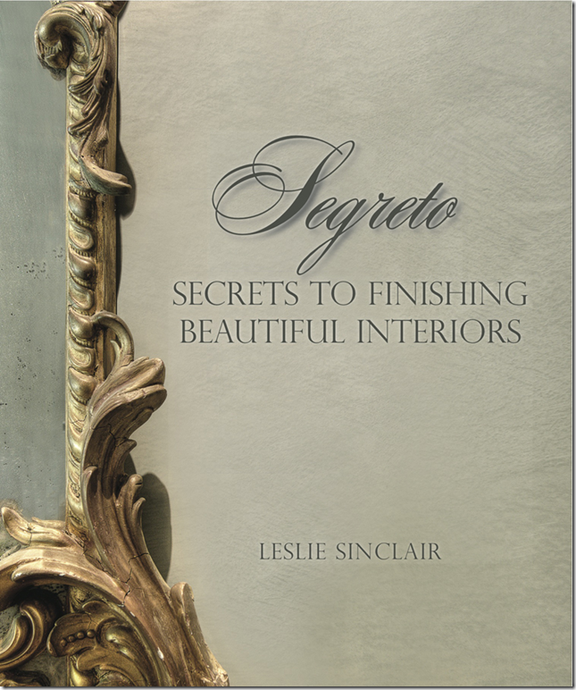
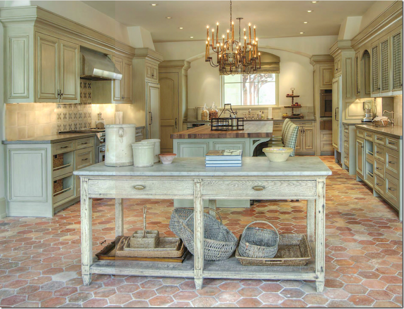
Sitting area of bedroom in a house I designed.A few years ago I worked on a house (above) where Leslie Sinclair painted some of the finishes. Her company, Segreto Finishes, provides some of the most beautiful paint finishes you could ever find. At this particular house, her crew changed plain cabinetry into a work of art. The finish had depth and texture – and added so much to the rooms! I was hooked and became a huge fan of Leslie’s. And why not? She is one talented lady. She is also an incredible businesswoman – today she employs over 25 people who help her run Segreto Finishes. Her specialty is a plaster finish that you have to see to believe how gorgeous it is!Besides the paint finishes business, she has an art gallery. Recently, we had Leslie on the Skirted Roundtable to talk about her latest endeavor – her new book. If you haven’t ordered it – DO! It is absolutely gorgeous, page after page of the most beautiful interiors that Leslie has worked on over the years. It is remarkable. I can’t remember seeing a design book that is so big, and so lush, and just so wonderful. On top of all her accomplishments, Leslie is also a wife and mother to three grown children, some in and some out of college. But, most importantly, she is a nice person, one of the nicest that I’ve been truly blessed to have known.SOOOO, imagine my delight and sheer excitement when Leslie called to tell me she was having her photographer Wade Blissard take pictures of the house I designed that Leslie had worked on. And imagine my further delight when she informed me the house might be published soon in a national magazine!! I am still reeling from the news. And, to top all that, Leslie has featured me on her blog, Segreto, The Secret to Beautiful Living, HERE where she shows pictures of that house!!Will you please click over to Leslie’s blog and read her story “Classic Design – Joni Webb?” I would really love for you to help me show support for her story!Also, starting today, you can now order Segreto on my blog.Leslie’s book – large and lush. Page after page of beauty!The book is filled with images like this gorgeous kitchen. Kara Childress design

And this beautiful foyer with its faux walls. Joyce Horn Antiques

To order Leslie’s book, please go to the upper left corner of my blog for the link. Look for the cover, pictured above. When you order the book, you will be asked “How Did You Hear About Us?” – please write “Cote de Texas” there.Note: Leslie will be signing books this April 19th in Baton Rouge. More information about the signing can be found on her blog.If you missed it the first time around, please listen to Leslie Sinclair on the Skirted Roundtable, HERE.AND,to read the story “Classic Design Joni Webb” on Leslie’s blog – please go HERE.I know I don’t say this enough, but I truly appreciate all the love and support you have shown me through the years!
